時系列データの分析にトライしてみました。

はじめに
私は印刷会社で研究企画職の業務に携わっています。
業務の中で、データ分析や機械学習、AI関連のことは聞かない日がなく、これからの会社の事業には必ず必要になるものと感じております。
そうなると、自分自身の業務で活用する機会は今後増えるとも思います。しかし、これまで実際に業務で触ったことはなく、本を読んだり無料ツールを使ったりして自分で勉強をしてきました。
ただ、無料ツールで進めるには中々限界があり、分からないことをネットで調べるにしても的を射る回答を得ることも難しかった状況でした。
そこで、オンラインで学習ができ、幅広い教材とプログラミング実行環境が備わっており、適宜カウンセリングを受けられる「Aidemy Premium Plan」に申込み、データ分析手法について、実際に手を動かして学んでみることにしました。
本記事は、「Aidemy Premium Plan」の最終成果物としてトライした、時系列データの分析についてまとめました。
第1章 概要
まず、どういったデータについて取り組もうか考えたときに、これまでの業務を振り返り、また今後を見据えた中で、時系列データを取り扱う場面が多くなると感じました。そこで今回は時系列データの分析に挑戦することとし、データセットを探し始めました。
元々、私の中で「データからの異常検知/故障予測」に興味がありましたので、目的に合うデータセットがないか、kaggleで調べ、下記のデータセットを見つけました。
【データセット公開元】
Numenta Anomaly Benchmark (NAB)
About Dataset
The Numenta Anomaly Benchmark (NAB) is a novel benchmark for evaluating algorithms for anomaly detection in streaming, online applications. It is comprised of over 50 labeled real-world and artificial timeseries data files plus a novel scoring mechanism designed for real-time applications. All of the data and code is fully open-source, with extensive documentation, and a scoreboard of anomaly detection algorithms: github.com/numenta/NAB. The full dataset is included here, but please go to the repo for details on how to evaluate anomaly detection algorithms on NAB.
https://www.kaggle.com/datasets/boltzmannbrain/nab
本記事では、kaggleで公開されているコード【参考ページ】を参考にして、分析を行った結果をまとめました。拙い内容かもしれませんが、今後データ分析等を進められる方の参考に少しでもなりましたら幸いです。
【参考ページ】
Unsupervised Anomaly Detection
https://www.kaggle.com/code/victorambonati/unsupervised-anomaly-detection
第2章 実行環境
kaggleの上記データセットの公開元のページでNotebookを作成し、この環境でプログラミングと実行を行いました。
Pythonのバージョンは「Python 3」です。
第3章 作成プログラム
1. 事前準備
Notebookを作成すると次のコードが作成されます。
このコードを実行して、実行環境上にデータセットをダウンロードしました。
# This Python 3 environment comes with many helpful analytics libraries installed
# It is defined by the kaggle/python Docker image: https://github.com/kaggle/docker-python
# For example, here's several helpful packages to load
import numpy as np # linear algebra
import pandas as pd # data processing, CSV file I/O (e.g. pd.read_csv)
# Input data files are available in the read-only "../input/" directory
# For example, running this (by clicking run or pressing Shift+Enter) will list all files under the input directory
import os
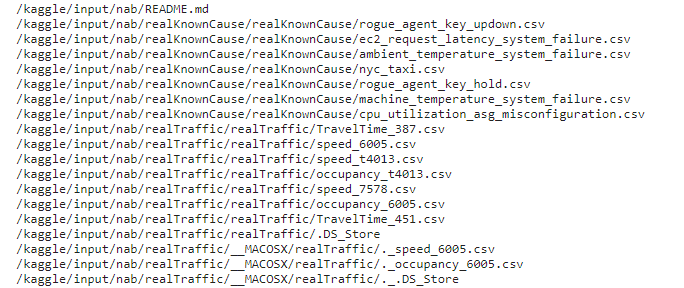
for dirname, _, filenames in os.walk('/kaggle/input'):
for filename in filenames:
print(os.path.join(dirname, filename))
# You can write up to 20GB to the current directory (/kaggle/working/) that gets preserved as output when you create a version using "Save & Run All"
# You can also write temporary files to /kaggle/temp/, but they won't be saved outside of the current session下記が出力結果の一部です。
このデータセットの中から今回は、「machine_temperature_system_failure.csv」を使用しました。
【データ説明】
Temperature sensor data of an internal component of a large, industrial mahcine. The first anomaly is a planned shutdown of the machine. The second anomaly is difficult to detect and directly led to the third anomaly, a catastrophic failure of the machine.
(産業用大型マシーンの内部部品の温度センサーデータ 産業用大型マシーンの内部部品の温度センサーデータ。最初の異常は計画的な機械の停止である。2つ目の異常は検知が難しく、3つ目の異常は機械の致命的な故障に直結する。)
2. 使用ライブラリ
今回使用したライブラリは次の通りです。
from urllib import request
from sklearn.cluster import KMeans
from sklearn import preprocessing
from sklearn.decomposition import PCA
import pandas as pd
import numpy as np
import matplotlib.pyplot as plt
import json
3. データ準備・内容
まずは、今回使用するcsvファイルと、分析に必要になるjsonファイルからデータを読み込みます。
# 対象のファイルを指定
data_source = '/kaggle/input/nab/realKnownCause/realKnownCause/machine_temperature_system_failure.csv'
# 読み込み
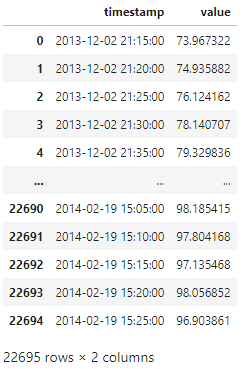
df = pd.read_csv(data_source)
df最後の"df"を書くことで、中身を確認することができます。
出力に下記のような表が出てきます。
'value'は温度のようですね。数値的にはおそらく「華氏(℉)」と思われます。
表からでは時間に対する温度変化が見えにくいので、グラフを作成します。
# 'timestamp'のtypeを変更(object⇒datetime64[ns])
df['timestamp'] = pd.to_datetime(df['timestamp'])

# 華氏度から摂氏度に変更
df['value'] = (df['value'] - 32) * 5/9

# グラフ作成
df.plot(x='timestamp', y='value')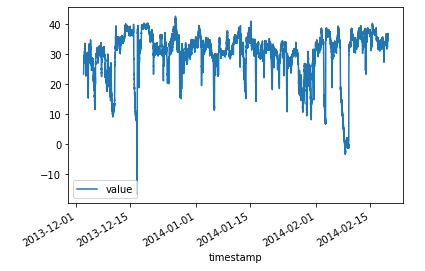
だいぶ変化がわかりやすくなりました。
4. データ特徴量の作成
機械学習モデル準備に向けて、特徴量を作成していきます。
今回のデータは日時と温度になりますので、一旦、日時側で色々作成を試みます。まずは、時刻に注目します。
# 時刻取り出し
df['hours'] = df['timestamp'].dt.hour

# 日中 (7:00-22:00)か夜間かを分類(日中の場合、'1'を返す)
df['daylight'] = ((df['hours'] >= 7) & (df['hours'] <= 22)).astype(int)

df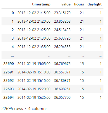
時間の値と日中かどうかの分類結果をデータに追加できました。
次は、曜日に注目します。
# 曜日を抽出 (Monday=0, Sunday=6)
df['DayOfTheWeek'] = df['timestamp'].dt.dayofweek

# 平日(0~4)か週末(5, 6)を分類(平日の場合、'1'を返す)
df['WeekDay'] = (df['DayOfTheWeek'] < 5).astype(int)

df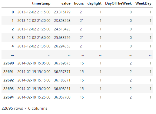
こちらも、曜日と平日かどうかの分類結果をデータに追加できました。
時間帯(日中か夜間か)と曜日(平日か週末か)の情報が出てきたので、これらを使用して分類を作ります。
# 時間帯(日中か夜間か)と曜日(平日か週末か)を用いて4つのカテゴリーに分類
df['categories'] = df['WeekDay']*2 + df['daylight']

a = df.loc[df['categories'] == 0, 'value']
b = df.loc[df['categories'] == 1, 'value']
c = df.loc[df['categories'] == 2, 'value']
d = df.loc[df['categories'] == 3, 'value']

# 各カテゴリーに対するヒストグラム作成
fig, ax = plt.subplots()
a_heights, a_bins = np.histogram(a)
b_heights, b_bins = np.histogram(b, bins=a_bins)
c_heights, c_bins = np.histogram(c, bins=a_bins)
d_heights, d_bins = np.histogram(d, bins=a_bins)

width = (a_bins[1] - a_bins[0])/6

ax.bar(a_bins[:-1], a_heights*100/a.count(), width=width, facecolor='blue', label='WeekEndNight')
ax.bar(b_bins[:-1]+width, (b_heights*100/b.count()), width=width, facecolor='green', label ='WeekEndLight')
ax.bar(c_bins[:-1]+width*2, (c_heights*100/c.count()), width=width, facecolor='red', label ='WeekDayNight')
ax.bar(d_bins[:-1]+width*3, (d_heights*100/d.count()), width=width, facecolor='black', label ='WeekDayLight')

plt.legend()
plt.show()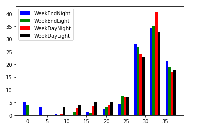
ヒストグラムができました。
これを見ますと、週末(WeekEnd)の温度にバラつきがあることがわかります。(0℃、5℃付近でも何度かデータとして残っています。)
5. モデル準備・分類
特徴量をいくつか用意できたので、モデル準備に向けて標準化をしてみます。
# 特徴量を標準化
data = df[['value', 'hours', 'daylight', 'DayOfTheWeek', 'WeekDay']]

min_max_scaler = preprocessing.StandardScaler()
np_scaled = min_max_scaler.fit_transform(data)
data = pd.DataFrame(np_scaled)

# 2つの特徴量に絞る
pca = PCA(n_components=2)
data = pca.fit_transform(data)

# 2つの特徴量を標準化
min_max_scaler = preprocessing.StandardScaler()
np_scaled = min_max_scaler.fit_transform(data)
data = pd.DataFrame(np_scaled)
今回、K-Means 法を用いてグループ化しようと思います。
クラスタ数(n_clusters)の設定するため、数を振ったときのscoreを算出してみます。
n_cluster = range(1, 20)
kmeans = [KMeans(n_clusters=i).fit(data) for i in n_cluster]
scores = [kmeans[i].score(data) for i in range(len(kmeans))]
fig, ax = plt.subplots()
ax.plot(n_cluster, scores)
plt.show()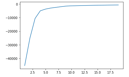
クラスタ数が15辺りからスコアの変化はほぼないことがわかりました。
それではクラスタ数を15に設定し、predict()メソッドを用いてクラスタ番号を出していきます。
df['cluster'] = kmeans[14].predict(data)
display(df)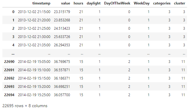
'cluster'列が追加されました。
次に、2つの特徴量でグラフ化し、適切な分類となっているか確認します。
df['principal_feature1'] = data[0]
df['principal_feature2'] = data[1]
fig, ax = plt.subplots()
colors = {0:'red', 1:'blue', 2:'green', 3:'pink', 4:'black', 5:'orange', 6:'cyan', 7:'yellow', 8:'brown', 9:'purple', 10:'hotpink', 11: 'grey', 12:'lightblue', 13:'lightgreen', 14: 'darkgrey'}
ax.scatter(df['principal_feature1'], df['principal_feature2'], c=df["cluster"].apply(lambda x: colors[x]))
plt.show()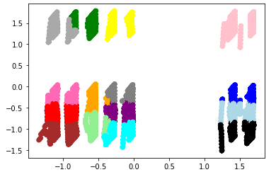
あまり上手く分類されていない模様・・・
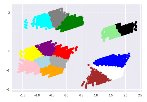
参考ページでは下記のようにきれいに分類されていましたが・・・
とりあえず、スコアが同等だったクラスタ数19に変えて、再度確認しました。
df['cluster'] = kmeans[18].predict(data)
df['principal_feature1'] = data[0]
df['principal_feature2'] = data[1]
fig, ax = plt.subplots()
colors = {0:'red', 1:'blue', 2:'green', 3:'pink', 4:'black', 5:'orange', 6:'cyan', 7:'yellow', 8:'brown', 9:'purple', 10:'hotpink', 11: 'grey', 12:'lightblue', 13:'lightgreen', 14: 'darkgrey', 15:'lime', 16:'fuchsia', 17:'slateblue', 18:'orchid'}
ax.scatter(df['principal_feature1'], df['principal_feature2'], c=df["cluster"].apply(lambda x: colors[x]))
plt.show()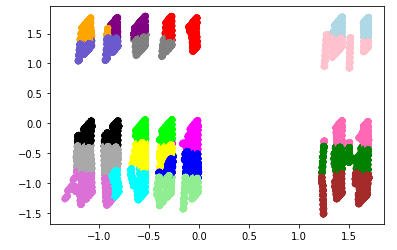
こちらもあまりうまく分類しているとは言えず・・・
クラスタ数を変えるだけではうまくできないようです。
他の分析手法に変えてみて、どうなるかでしょうか。
と、ここからの進みが分析の醍醐味かもしれませんが、受講期間の関係上、今回はここまでのまとめとなります・・・
もう不完全燃焼を感じずにはいられませんが、この後は期間外でやっていくこととします。
第4章 「Aidemy Premium Plan」学習振り返り
今回、「データ分析講座(6か月間)」を受講しました。
6ヶ月間あることと、Pythonの基本的な部分はわかっていたので、最終成果物への取り組みに十分な時間をとれると思っておりました。しかし、蓋を開けると、思いの外時間が取れなかったり、各コースの内容を理解するに時間がかかったりで、残り1か月はバタバタと駆け抜けた印象です。改めて各コースの復習をやりたい想いに駆られております。
あと、カウンセリングをもっと活用すればよかったなと思います。ただ、どういった質問を投げるか考えておくなど、受ける前に少し準備が必要なところもありました。また、カウンセラーによってアドバイスの内容が変わってしまうので、どうすればよいか悩むときもありました。
もっとカウンセリングを活用したかったと思う反面、あまり気軽にお願いができない印象も持ってしまいました。
それでもやはり、プロの方に色々聞いておくべきだったな、と後悔しております。
第5章 今後の活用
基本的な部分は学べたと思います。また、プログラミングの学習環境も構築できましたので、引き続き独学でスキルアップを続けていこうと思います。
もちろん、本記事のデータ分析も進めてまいります。
第6章 おわりに
まだまだ、初心者レベルだと認識しております。ですが、ここで終わりにせず、引き続き日々学習していき、業務に活用できるレベルまでいきたいと思います。
以上になります。
ここまでお読みいただきありがとうございました。
この記事が気に入ったらサポートをしてみませんか?