FlexBoxを使ってheaderとメインコンテンツとfooterの高さを調整する

ga実現したいこと
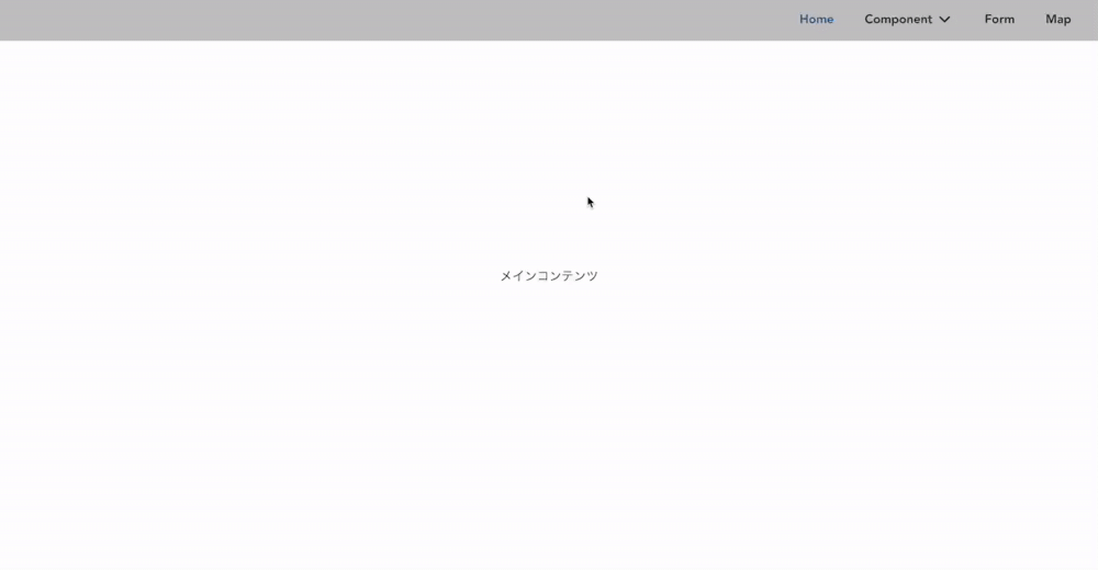
headerとfooterの間のコンテンツ(メインコンテンツ)の高さが低い時でも、常にheaderは画面上に、footerは画面下に固定して表示されている
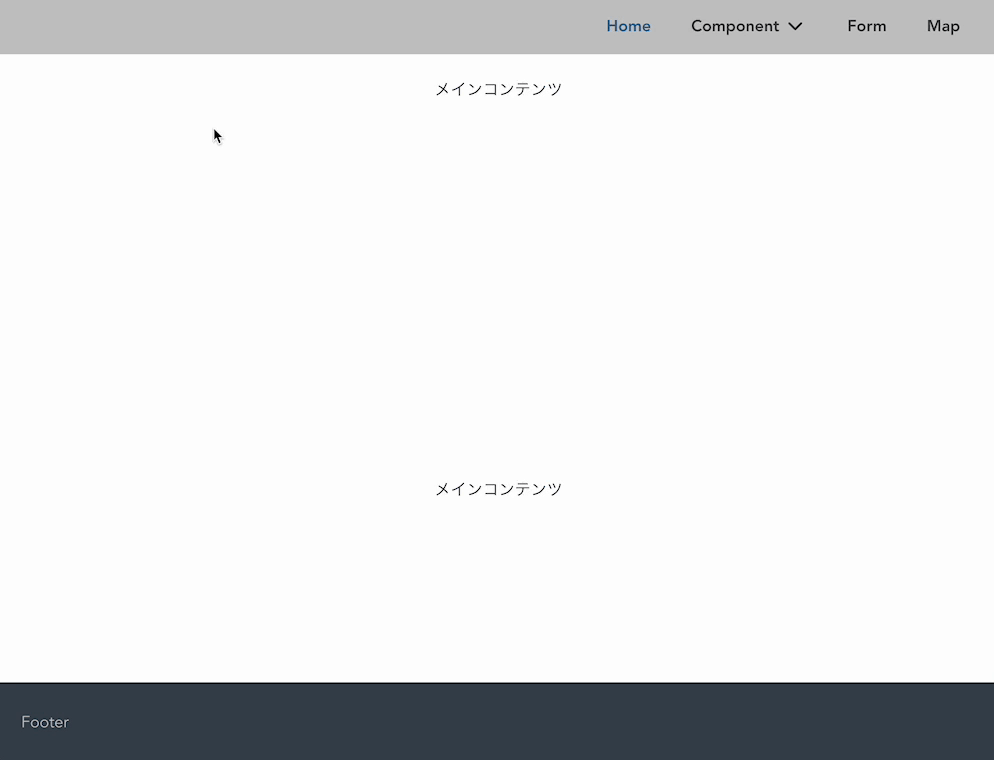
メインコンテンツの要素が増えて高さが出た時は、メインコンテンツの高さに合わせてfooterが画面下に表示されている
OKパターン

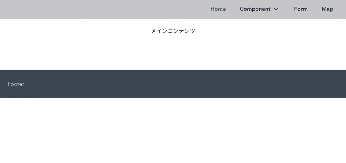
NGパターン
実装
index.html
<div class="container">
  <header>Header</header>
  <main>
    <div class="main">メインコンテンツ</div>
  </main>
  <footer>Footer</footer>
</div>全体を囲う container には display: flex; と min-height: 100vh; を指定
メインコンテンツの部分には flex: 1; を指定
.container {
  display: flex;
  flex-direction: column;
  min-height: 100vh;
  height: auto;
  width: 100%;
}

header {
  height: 56px;
  width: 100%;
  background: gray;
}

main {
  flex: 1;
  width: 100%;
}

footer {
  height: 80px;
  width: 100%;
  background: blue;
}この記事が気に入ったらサポートをしてみませんか?