
How to create a pixel art using ggplot2 in R

The other day I tweeted some pixel art that I created using ggplot2 and got a question about the code.
ggplot2 is excellent not only for data visualisation but also for dot visualisation and can be used to create traditional New Year's greeting cards🐅#RStats #ggplot2 #pixelart pic.twitter.com/TSjV3U4ykc
— ‹- わんこんわ %›% (@tsujiwancoshi) January 12, 2022
To be honest, creating R pixel art requires quite a bit of manual labor, and The first step is to actually create the pixel art in Microsoft Excel.
However, it is interesting to see how pixel art can be depicted in R code.
In this article, I will show you how and code to display pixel art in R's ggplot2 (and Excel).
The pixel art excel and csv files for the example used in this article can be obtained from the following shared drive.
Part 1. Create pixel art in Excel.
The first step is to create pixel art in Excel.
You can also use a web service to create a pixel art Excel from a picture.

Enter the x-coordinate and y-coordinate values in the first row and first column of Excel.
At this point, put a color and a number in each cell so that the color and the number correspond.

Part 2: Create a csv format that can be read by R.
Enter the following formula in Excel to convert the data from one cell one pixel at a time into numbers.
In the example Excel, it is entered in B91 cell.
=B$1&","&$A2&","&B2By the above formula,
[x-axis coordinates, y-axis coordinates, color information]
are stored in each cell.
For example [1,87,0].
Copy the input cells with the auto-fill function until the entire pixel art is covered.

Copy the entire cell containing the pixel data obtained by the above formula and copy it to a text editor that allows regular expression substitution.
In the example Excel, it would be from B91 cell to AX177 cell.

The following two steps of substitution are performed using regular expressions.
Replace "tab delimiters" with "line breaks".
The regular expression is "\t" to "\r\n".
Replace "comma" with "tab delimiter".
Regular expression from "," to "\t".
It will look like this

Copy and paste all of this into cell A1 of the csv file.
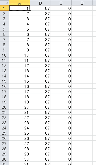
This data frame contains x-axis coordinates in the first row, y-axis coordinates in the second row, and color information in the third row.
Add a row name header to the first row.

Part3. Read the csv file in R and draw it with ggplot2.
Use the following code to read the csv file you just created and draw it with ggplot2.
rm(list = ls())
gc()
gc()

if(!require("pacman")){
  install.packages("pacman", dependencies=TRUE)
}
pacman::p_load("ggplot2",
               "readr",
               "dplyr",
               "ggthemes"
)

pixel <- read_csv(choose.files())

pixel %>%
  mutate(c = factor(c)) %>%
  ggplot(aes(x,
             y,
             colour = c
  )) +
  geom_point(shape = 15, size = 3) +
  scale_color_manual(values = c(
    "0" = "white",
    "1" = "#ADDF8C",
    "2" = "#8CAA52",
    "3" = "#9C9A00",
    "4" = "#FF5542",
    "5" = "#FFAA8C",
    "6" = "#DE3010",
    "7" = "#BD0000",
    "8" = "#525552",
    "9" = "#212021"
  )
  ) +
  theme_void() +
  theme(legend.position = "none")
If the image is cut off, you can fix it by adjusting the size of the image.
It is read by read_csv(choose.files()), but you can read it from the file path or do whatever suits your environment.
The point is to read the color information c column as a factor type.
Use scale_color_manual() to define the appropriate color information for each color value.
Of course, you can adapt the various features of R and ggplot2 to pixel art.
library(ggthemes)

p <- pixel %>%
  mutate(c = factor(c)) %>%
  ggplot(aes(x,
             y,
             colour = c
  )) +
  geom_point(shape = 15, size = 3) +
  scale_color_manual(values = c(
    "0" = "transparent",
    "1" = "#ADDF8C",
    "2" = "#8CAA52",
    "3" = "#9C9A00",
    "4" = "#FF5542",
    "5" = "#FFAA8C",
    "6" = "#DE3010",
    "7" = "#BD0000",
    "8" = "#525552",
    "9" = "#212021"
  )
  )

p + theme_excel()
pixel %>%
  mutate(c = factor(c)) %>%
  ggplot(aes(x,
             y,
             colour = c
  )) +
  geom_point(shape = 11, size = 3) +
  scale_color_manual(values = c(
    "0" = "white",
    "1" = "#ADDF8C",
    "2" = "#8CAA52",
    "3" = "#9C9A00",
    "4" = "#FF5542",
    "5" = "#FFAA8C",
    "6" = "#DE3010",
    "7" = "#BD0000",
    "8" = "#525552",
    "9" = "#212021"
  )
  ) +
  theme_void() +
  theme(legend.position = "none")
That's all. Have fun!
万が一サポート、感想、コメント、分析等のご相談などございましたらお気軽に。