How to create a website wireframe - 3 steps before opening Figma or XD

I recently created wireframes for a large 1500-page corporate website with a team that included a production manager, a designer, a technical director, and an assistant, all of whom had different skills and experience. I broke down the wireframe process so that everyone could work together and have a common understanding of how to create a wireframe. In this article, I will describe how I went about this process and approach.
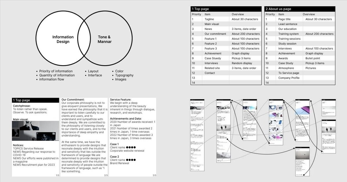
Separate "information design" and "tone and manner design" as two separate things.
Wireframes are like blueprints for a website. In most cases, wireframes are created before the design process. The difference between wireframes and design is that wireframes are mainly concerned with "information design". Therefore, when creating wireframes, you do not consider tone and manner design, the elements that create the impression and atmosphere of the website, but rather the purpose is to determine the information that will be published on the website.
Typical tools for creating wireframes include Adobe XD and figma. However, while these tools help us "give shape", they are rather poor at helping us "think". Wireframes can contain many different elements, so when you open the tool and start thinking and working on it, you will end up obsessing over fonts and layouts and time will quickly run out. It is important to do IA (information design) first, to make sure that you think things through before you put them into shape.
Here are some things to think about when designing information for your website.
Priority of information
Quantity of information
information flow
On the other hand, when designing tone and manner, you should generally consider the following.
Color
Typography
Images and illustrations
Layout
Interface
This does not need to be reflected as an element in the wireframes, as it can be considered at a later stage of design creation. (There are some layouts and interfaces, though.)
What you should be thinking about when making wireframes is "information design" anyway, not tone and manner. How should you think about information design before launching tools such as Figma and XD? Here are the steps and methods.
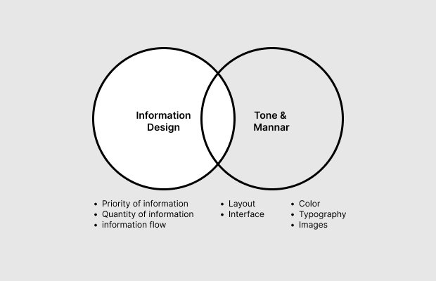
1. Consider priority of information
A spreadsheet or similar tool can be used to organize information priorities. Based on the "page list" or "site map" or "template map" that you should have created before starting wireframe, consider what information should appear on each page and in what order.
In the case of a 1,500-page corporate website, I created a list of about 30 pages, including the main pages and template pages.
The priority of information determined here will become the order of information on the website. Since the human eye moves in a Z- or F-shape on a monitor, I basically put the information in "vertical order" when the priority of the information is up or down, and put the information in "horizontal order" when the priority of the information is parallel. For example, when displaying three different colors of products, the granularity of the information is parallel, so the thumbnails of the three products are arranged horizontally (although this may change if one of the colors is a flagship model, for example). As another example, when displaying the "three features of the service," the way the information is arranged depends on whether the three pieces of information are parallel or whether you want to emphasize one of them.
If you cannot decide the priority of information, you can approach good information design by "asking the client" or by proceeding as is and, after creating wireframes, "observing behavior through user testing and then making changes". (In user testing, it is important to "observe user behavior" rather than "ask users for their opinion.)
2. consider the quantity of information
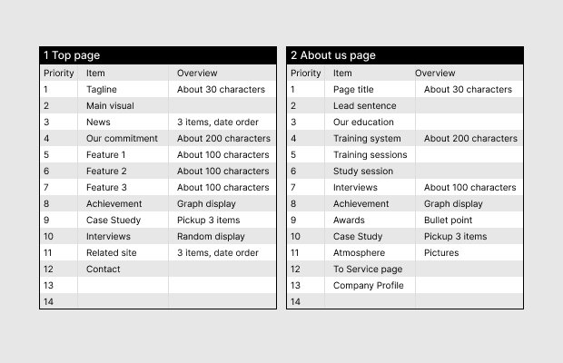
Once you have prioritized the information to go on each page in the spreadsheet, use Word or Google Docs to put the actual text and images. You will put the text and images you plan to publish, such as the tagline, main visual, and description. If you do not have the text you plan to publish at this stage, you can use text from a reference site. At this point, your focus should not be on the content of the text, but on whether the "character count" is likely to be about the same.
It is important to check the amount of information per page. The appropriate interface for the amount of information, such as using an accordion to store information in sections with a large number of characters, or a slide show for sections with a large number of images, will be discussed in a later step, so do not worry about it here.
At the same time as you check the amount of information, you will also adjust the priority of detailed information. For example, an article block has seven elements: thumbnail, title, summary text, publication date, author, number of views, and related keyword tags. Which of these elements is given higher priority depends on the site. By prioritizing even the smallest piece of information, the later design will be crisp and good.
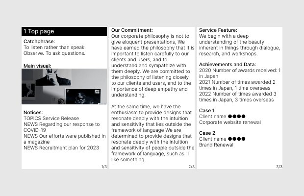
3. consider information flow
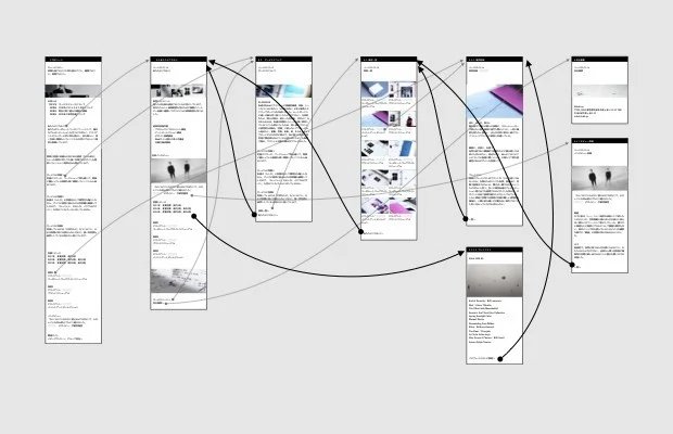
Once the priority and amount of information on each page has been determined, the next step is to confirm the user's navigation flow, i.e. from which page to which page the user should go. Obviously, it is important to make sure that there are no gaps in the main navigation paths that lead to conversions. Here, Add the often forgotten "detour" and "return" paths. (The black line in the diagram above)
For example, from the services page, you can go not only to "Case Studies" but also to "Introduction Flow" and "FAQ," and from the case study details, you can go back to "Client Testimonials" and "Services List.
After the website launch, you will continue to optimize the user navigation flow through repeated analysis and A/B testing, but in the wireframe phase, it is important to have empathy for the user and imagination to think, "If I can go through this information step by step, the user will understand more deeply," or "After this information, they will want to know more about this. It is important to have empathy and imagination for the user.
4. Wireframe the design
Finally, it is time to use Figma or XD. If you have done the above three steps, the only thing you need to think about at this stage is the interface. The interface here mainly refers to the way the information is stored, for example, the amount of information is too large, so you may want to add a filter function to narrow down the information, or you want to show many large images, so you may want to open a modal window for a slideshow.
And, should the layout of images and text be considered in the wireframe? I think that at the wireframe stage, a preliminary layout of just one column, stacked left-aligned or centered, would be fine. In practice, however, I am often asked to "check the layout in the wireframe," so I adjust the level of layout build-out according to the design skills of the project members and final decision makers.
Advantages of breaking down wireframe into 3 steps
The first benefit is that it is easy to see "where the problem is. If the wireframes you have created are "kind of hard to understand," it may be that the information is not prioritized, there is too much information and the cognitive load is too high, or the order in which you reach the necessary information is not good. We can quickly identify where the problem lies.
Also, if something is "not right" after the design is created, it is very important to distinguish whether it is a tone and manner issue or an information design issue. In my personal experience, when someone says, "I want to change the design because it's too cluttered and confusing," the problem is often not a tone and manner, but information design.
Hello we are Shhh inc. Shhh inc. is a design studio that prioritizes and cares deeply about the aesthetic qualities present in every single detail of all things. Feel free to contact us if you have any website create requests or inquiries, and we will be happy to discuss our strengths and production flow with you, along with various case studies.
● Shhh inc.
https://shhh.jp/
● Contact
info@shhh.jp
🤫
この記事が気に入ったらサポートをしてみませんか?