
The Importance of Data Story telling for Tableau Creators in AI Generation(Era)

This blog is a translation of the speaker's presentation manuscript given at the event of Analytics TUG, one of the largest Tableau user groups in the world, held on October 27, 2023.
You can listen to the speech on Youtube.
日本語
Hello, DataFam. How are you?
I'm Rika Fujiwara, and I'm thrilled to be here. A member of the Tableau community for over four years, I bring a wealth of experience as a BI Consultant at Slalom.
Today, I'd like to share insights on the importance of Data Storytelling. But first, I want to express my sincere appreciation to the event organizers for making today possible.
To the participants, your presence reflects your commitment to learning and growth, and I thank you for that.
One quick note: I'll save time for questions and feedback at the end. Please hold your questions until then, and I'll address them to the best of my ability. However, please feel free to write something in the chat box during my presentation.
Thank you for having me. Let's make this session enriching for all in the next minute.
Today, I will talk about “The Importance of Data Storytelling for Tableau Creators in AI Generation, Era”.
Let’s begin with Ice Breaker.

How would you describe AI in one word?
Please post your ideas in the chat! (There were a lot of positive comments on the chat. I was surprised!)

My next question is,,, Answer yes or no in the chat box.
AI does many things better than humans. However, I believe that humans need something to be moved or inspired to take action. But how? Data aren’t enough.
So, what is necessary to move people and organizations and influence them to take action?
We need STORIES.
And AI cannot tell a story the way humans can do it.

Type of Visualization and AI

With that in mind, To create a compelling story, we have to understand the 2 types of data visualization.
Some of you may probably know these: Exploratory type and Explanatory (or storytelling) type. In this presentation, I will refer to them as Explo and Expla respectively.
The Explo type is neutral, with no opinion or assertion in the visualization itself, and is often seen in business dashboards that monitor periodic KPIs.
On the other hand, the Expla type (or Storytelling type) is clear in its opinions and is often found in "works" by the author, such as IronViz or MakeroverMonday.

The difference between these two types, in my opinion, is in terms of "Who discovers the insights?".
In the explo type, the viewer finds insights on their own by exploring the data.
In the expla type, the creator finds insights by studying the data in advance and examining the background of the data, and then most effectively sharing their own opinions and findings with the audience.
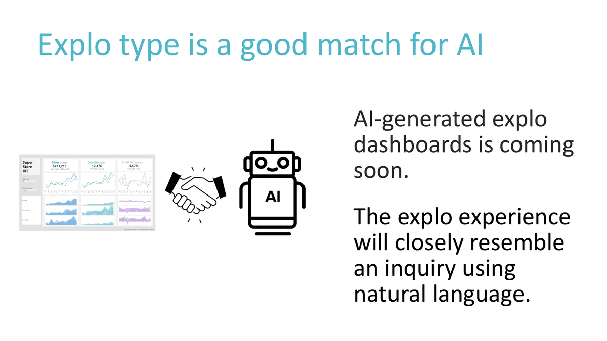
I feel that explo dashboards are a good match for AI because:
1: AI will be able to generate explo dashboards automatically shortly, so we can delegate that task to AI.
2: The explo experience will closely resemble an inquiry using natural language, such as asking, "What were our sales figures for the past week?” “Which day was the slowest?”
So, AI is good at explo.

On the other hand, it is difficult to rely on AI for the Expla type, because what is ultimately communicated is the "opinion" that the creator wants to convey to the audience.
It is similar to a certain type of journalism.
Originally, visualization was suited for one-to-many communication and moving purposes. Perhaps this is why mass media, such as TV news reporting, use visualization.
I believe that we, Tableau Creators, as storytellers, should be good at Expla visualizations to move people and organizations and make them take action.

To answer the question: What is necessary to move people and organizations to take action? I believe Expla Visualization Technique or in simpler terms, Data Storytelling is needed.
Who I am?
So, what exactly should we keep in mind? It’s,
Who I am.
Often forgotten, in the context of data storytelling, "Who I am" is very important.
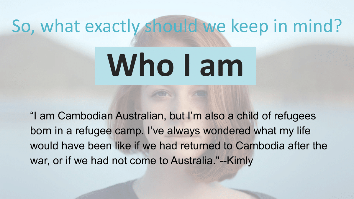
Remember Kimly's presentation IRON VIZ 2022?
Many of you may remember her opening statement.
“I am Cambodian Australian, but I’m also a child of refugees born in a refugee camp. I’ve always wondered what my life would have been like if we had returned to Cambodia after the war, or if we had not come to Australia."
As you might have noticed, she had started with who she was. And, She presented her visualization regarding educational inequality. The visualization was no longer hers alone. Due to strong interest and empathy, I felt that the viewers were actively attempting to embrace her visualization and story.
People seek reasons for their actions. As creators, we need to make sure that viewers understand who we are, and provide reasons and meaning for them to engage with our stories.
I was also impressed with her story so I voted for her. Anyway,

In storytelling, it is very important to be clear about who I am, what I am about, and why this topic is important for me to talk about. In other words, it is to provide reasons for the viewer to be involved in the story.
So, in keeping with this principle, here is my “Who I am” for this particular piece of work.

Tokyo Railway Network
This work of mine was exhibited in the Tableau Public Gallery at the Tableau Conference 2022 and described a map of Tokyo's railway and Metro system.
This is My “Who I am”
Growing up in rural Japan, I had no idea what awaited me when I first set foot in Tokyo. The sheer number of train stations and lines overwhelmed me. I thought I'd get used to it eventually, but even after living in Tokyo for 20 years, I'm still reliant on Google Maps to navigate the city's intricate train system. It's like a puzzle that I haven't quite solved yet, but I'm making my way through it with a little help from technology.
Now that you know who I am even just a bit, I believe that you can relate to me a little more than before.
Three Hows for Effective Data Storytelling

Here are the Three HOWs to be able to come up with a compelling story:
1. Interviewing, 2. Headlining, and 3. Drafting and Revising
As I mentioned earlier, storytelling is close to journalism. So, the journalists’ approach is useful for us. Let me talk about them one by one.

①Interviewing: data exploration and insight discovery
Imagine what a newspaper journalist does.
You know that the journalist goes to the sight to cover the facts and interview people, to learn the background of the incident. This is to find the "context" that enhances the facts in a story.
“The company's sales have been declining year after year. “This is the fact.
“Due to the rise of competing companies, that company's sales are declining year after year.” This is the contextual story.
This "context" is not necessarily found in one piece of data. You tend to need to look into other data, and if there is no data, incorporate your domain knowledge and what you have seen and heard. This kind of effort is often necessary.

Let’s have a look at what I did about the Tokyo Railway network data.
First, I carefully "covered" the data on the number of lines, number of stations, and station locations using Tableau, and obtained the fact that there are 26 lines and 71 stations within a mere 3 km radius of Tokyo Station.
Here again, “Who I am” comes into play. I live in Tokyo, so I know firsthand how complicated it is to take and change trains.
And the stories were born.
“In Tokyo, even local people have a hard time taking and changing trains. This is because Tokyo's train network is so complicated since there are 26 lines and 71 stations within a mere 3 km radius of Tokyo Station.”

Moving on to the second How, Headlining: Clear story and impactful title
Imagine a newspaper.
Readers are always busy. From among countless articles, they select and read the ones worth reading.
So, they check the headlines first.
The same goes for the dashboard. For example,
Instead of "Sales Report by Store (October)," how about "October Store Sales Report: 5 Stores Record Minus Last Month"? Then, the viewers will think to themselves. ”What? I want to learn more!” Don't you think?
Tokyo Railway Network is a simple headline, (I know) but the design supplements it with impact and context. I'll tell you the secret in the 3 Whys section later.

Let’s now talk about the 3rd How Drafting and Revising: It means Writing a draft on paper first, then rewriting it again and again, and finally using Tableau,
Imagine the process of a newspaper journalist writing an article. No one writes an article for a newspaper at once and immediately submits it for publishing. They start by making a draft, and revising it many times until the actual article satisfies the editor.
So, I recommend that before you start working on your visualization in Tableau, hand-draw your design using paper and pen as a draft.
Because Tableau is an intuitive tool, some of us depend on it too much. So I see many users start work without drafting. I find creating without a plan tends to take longer and the message turns out to be unclear.
In Tokyo Railway Network, I prepared the size and the placement of the title and the image of the map by hand-drawing the draft before starting the work.

Here are the Three HOWs to be able to come up with a compelling story:
1. Interviewing, 2. Headlining, and 3. Drafting and Revising
Design Tips in Tokyo Railway Network

Furthermore, there's another aspect we need to explore.
This time, I’d like to share with you the 3 WHYs that I answered to design the Tokyo Railway Network

Why did I make use of "Kanji", Chinese characters?
English speakers often recognize Kanji characters, even if they don't understand their meaning. When using Kanji characters in the title, it signals that the story is related to Japan or China. To make it clearer, I also included the English title next to the Kanji so that people can quickly realize it's about Tokyo, Japan.
Additionally, the Kanji script is visually appealing in its pure form, making it an effective attention-grabber or visual attraction.

2. Why did I also use text, not just charts?
The main focus of any data visualization is the charts. But to help the audience better understand, adding text with valuable background information can be effective. In the case of the Tokyo Railway Network, text is used alongside maps to enhance the storytelling.

3. Why did I allow interactivity?
As you know, the difference between visualization and infographics is interactivity. By providing the opportunity to engage with the viz as the viewer likes, the Creator gives the viewer the pleasure of self-discovery. This is a fun activity, as we Creators know.
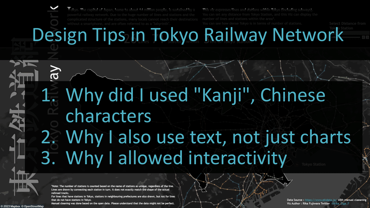
There I answered the questions WHY…I used Kanji, used text, not just charts, and allowed interactivity.
How to apply this approach to business context.

Moving right along, you may be asking yourselves this question now,
Sure, what you are talking about is a good approach to making creative visualizations, but I am not sure how to apply it in a business context.
It works! Let me explain.
The “Who I am”, and the 3 Hows (interviewing, Headlining, and Drafting and Revising, together with the ancillary 3 Whys work well even in a Business context.

If you are in charge of marketing, you must have a lot of marketing know-how that developers don't. It is so-called domain knowledge.
Marketers are the experts in marketing. They understand it better than the general audience, and there's no reason for their self-created stories not to be excellent.
It's easy: Who I am. And Interviewing, Headlining, and Drafting & Revising -Try it.

Even for some of you who work for a vendor company, you can tell your story.
When you finish your creation of the dashboard, you will make a demo for your client, right?
You might be saying this.
“(well)You can select the months here.” or “Here is the link to the next page.”
No.
“This is the KPI dashboard which you should check every morning. So, when you see this chart, you can find which stores reached target sales this week. Oops, this store marks minus the last 5 days. What happened to this store? ”
You see?
You have a lot of chances to tell a story and attract your audience!
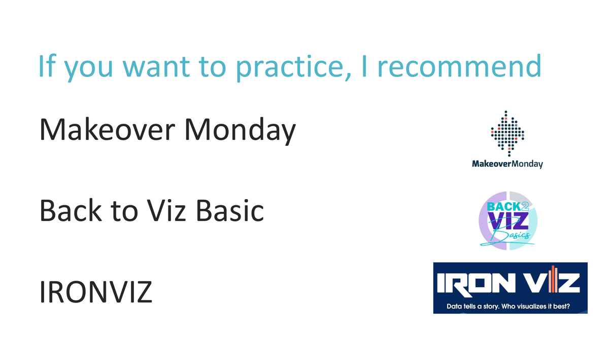
If you’d like to practice, I recommend Makeover Monday, B2VB and IRONVIZ, as a place to train

In conclusion
Sharing Your Own Stories can be a nerve-wracking experience.
The fear of misinterpretation can be paralyzing. However, it's essential to understand that even with potential misinterpretations, your narratives hold the power to emotions and drive change within organizations.
The anxiety you feel as Data storytellers is an inherent part of your journey to influence people and organizations positively.
It's a challenge you must embrace because it's the key to succeeding in a data-driven world.
When you encounter a misinterpretation, don't retreat; adapt.
Refine the accuracy of your data, seek additional domain knowledge, and implement corrective measures. Failure is not the end; it's a stepping stone towards growth and progress.
Let me end my presentation by saying,
banish your fears, and savor the experience. Embrace the art of self-discovery and expression, and let the world witness your courage to speak your truth.
Remember that the path to greatness is open to Data Storytellers like you.

Together, let's usher in a new era of Data Storytellers and transform the world through the power of our narratives.
Thank you.
この記事が気に入ったらサポートをしてみませんか?