
Qt 6 QML 和訳文書 P74~P101

Core Elements
Elements can be grouped into visual and non-visual elements. A visual element (like the Rectangle ) has a geometry and normally presents an area on the screen. A non-visual element (like a Timer ) provides general functionality, normally used to manipulate the visual elements. Currently, we will focus on the fundamental visual elements, such as Item , Rectangle , Text , Image and MouseArea . However, by using the Qt Quick Controls 2 module, it is possible to create user interfaces built from standard platform components such as buttons, labels and sliders.
要素は目に見えるもの(可視要素)と見えないもの(不可視要素)に分けることができます。目に見える要素(矩形のような)はジオメトリ(幾何領域)を持ち、普通はスクリーン上に領域を表現します。不可視要素(タイマーのようなもの)は、一般的な機能を提供し、普通は可視要素を操作するために使われます。現在、我々は基本的な可視要素に焦点を当てます。例えばItem, Rectangle, Text, ImageそしてMouseAreaです。しかしながら、Qt Quick Controls 2モジュールを使うことによって、ボタンや、ラベル、スライダーのような標準的なプラットフォームコンポーネントから作られるユーザーインターフェースを作ることが可能です。
Item Element
Item is the base element for all visual elements as such all other visual elements inherits from Item . It doesn’t paint anything by itself but defines all properties which are common across all visual elements: Geometry - x and y to define the top-left position, width and height for the expansion of the element, and z for the stacking order to lift elements up or down from their natural ordering. Layout handling - anchors (left, right, top, bottom, vertical and horizontal center) to position elements relative to other elements with optional margins . Key handling - attached Key and KeyNavigation properties to control key handling and the focus property to enable key handling in the first place. Transformation - scale and rotate transformation and the generic transform property list for x,y,z transformation, as well as a transformOrigin point. Visual - opacity to control transparency, visible to show/hide elements, clip to restrain paint operations to the element boundary, and smooth to enhance the rendering quality. State definition - states list property with the supported list of states, the current state property, and the transitions list property to animate state changes. To better understand the different properties we will try to introduce them throughout this chapter in the context of the element presented. Please remember these fundamental properties are available on every visual element and work the same across these elements.
アイテムは全ての可視要素の基本要素であり、他の全ての可視要素はアイテムを継承しています。アイテムは自分自身を塗ることは無いのですが、全ての可視要素に共通しているプロパティを定義します。
ジオメトリ(幾何領域)-トップレフト位置を定義するxとy、要素の展開のためのwidthとheight,自然順序で要素をリフトアップ、またはリフトダウンするスタッキングオーダーのためのz
レイアウト処理 - anchors(left, right, top, bottom, vertical and horizontal center)任意の境界とともに他の要素と相対的に要素を位置づけるもの。
キー処理 - キー処理を制御するための Key プロパティと KeyNavigation プロパティ、および最初にキー処理を有効にするためのフォーカス プロパティが添付されています。
変換 - スケーリングと回転の変換、x、y、z 変換の一般的な変換プロパティ リスト、および transformOrigin ポイント。
ビジュアル - 透明度を制御する不透明度、要素の表示/非表示を表示するために表示、要素の境界にペイント操作を制限するためのクリップ、レンダリング品質を向上させるためのスムーズ。
状態定義 - サポートされている状態のリストを持つ状態リストプロパティ、現在の状態プロパティ、および状態の変化をアニメーション化するための遷移リストプロパティ。さまざまなプロパティをよりよく理解するために、提示された要素のコンテキストでこの章全体でそれらを紹介しようとします。これらの基本的なプロパティは、すべてのビジュアル要素で使用でき、これらの要素で同じように機能することを忘れないでください。
TIP
The Item element is often used as a container for other elements, similar to the div element in HTML.
アイテム要素はしばしば他の要素のためのコンテナとして使用され、HTML内のdiv要素と似通っています。
Rectangle Element
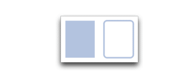
Rectangle extends Item and adds a fill color to it. Additionally it supports borders defined by border.color and border.width . To create rounded rectangles you can use the radius property.
矩形はアイテムを拡張し、塗りつぶしの色をそれに加えます。加えてborder.colorとborder.widthによって定義される境界をサポートします。丸い角の矩形を作るにはradiusプロパティを使うことができます。
Rectangle {
    id: rect1
    x: 12; y: 12
    width: 76; height: 96
    color: "lightsteelblue"
}
Rectangle {
    id: rect2
    x: 112; y: 12
    width: 76; height: 96
    border.color: "lightsteelblue"
    border.width: 4
    radius: 8
}
TIP
Valid color values are colors from the SVG color names (see http://www.w3.org/TR/css3-color/#svg-color (http://www.w3.org/TR/css3-color/#svg-color) ). You can provide colors in QML in different ways, but the most common way is an RGB string (‘#FF4444’) or as a color name (e.g. ‘white’). A random color can be created using some JavaScript
有効なカラーバリューは、SVGのカラーネーム(see http://www.w3.org/TR/css3-color/#svg-color (http://www.w3.org/TR/css3-color/#svg-color) )からの色です。QMLでは異なるやり方で色を提供することができますが、最も一般的な方法はRGBストリング型("#FF4444")あるいは、カラーネーム('white')です。ランダムな色はいくつかのJavaScriptを使って作ることができます。
color: Qt.rgba( Math.random(), Math.random(), Math.randoBesides a fill color and a border, the rectangle also supports custom gradients:
塗りつぶしの色や境界以外にも、矩形もカスタムグラディエントをサポートします。
Rectangle {
     id: rect1
     x: 12; y: 12
     width: 176; height: 96
     gradient: Gradient {
     GradientStop { position: 0.0; color: "lightsteelblue" }
     GradientStop { position: 1.0; color: "slategray" }
     }
     border.color: "slategray"
}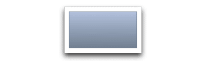
A gradient is defined by a series of gradient stops. Each stop has a position and a color. The position marks the position on the y-axis (0 = top, 1 = bottom). The color of the GradientStop marks the color at that position.
グラデーションは、一連のグラデーション分岐点によって定義されます。各ストップには位置と色があります。位置は、Y 軸上の位置を示します (0 = 上、1 = 下)。グラデーションストップの色は、その位置の色をマークします。
TIP
A rectangle with no width/height set will not be visible. This happens often when you have several rectangles width (height) depending on each other and something went wrong in your composition logic. So watch out!
幅が0で、高さが0の矩形は表示されません。これはあなたがいくつかの矩形の幅や高さを、それぞれお互いに依存させて決定しているときによく起きます。そして構成のための論理に何らかの間違いがあった時です。気を付けてください。
TIP
It is not possible to create an angled gradient. For this, it’s better to use predefined images. One possibility would be to just rotate the rectangle with the gradient, but be aware the geometry of a rotated rectangle will not change and thus will lead to confusion as the geometry of the element is not the same as the visible area. From the author's perspective, it’s really better to use designed gradient images in that case.
角度の付いたグラディエントを作ることはできません。(斜めのグラデ―ションのようなもの)このため、事前に定義されたイメージを使うのがよいです。一つの可能性は、グラディエントのある矩形を回転させるということですが、①回転した矩形のジオメトリ(幾何領域)は変化しませんし、そのために要素の矩形範囲として可視領域と同じではないので混乱する結果になります。著者の観点から申し上げれば、その場合は定義されたグラディエント画像を使うほうがよいです。(自分で角度のあるグラデーションを付けようとするよりは、そのようにした画像をそのまま持ってきた方がいいということです。)
①例えば、ある横幅の方が長い矩形を90度回転させると、全体の矩形範囲が変化します。
Text Element
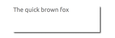
To display text, you can use the Text element. Its most notable property is the text property of type string . The element calculates its initial width and height based on the given text and the font used. The font can be influenced using the font property group (e.g. font.family , font.pixelSize , …). To change the color of the text just use the color property.
テキストを表示するために、Text要素を使うことができます。もっとも注意するプロパティはストリング型のテキストプロパティです。要素は初期の幅と高さを、指定されたテキストと使用されるフォントを元にして計算します。フォントはフォントプロパティグループを使って影響を受けます。(例えば、font.family, font.pixelSize, …).テキストの色を変化させることはcolorプロパティを使うだけです。
Text {
    text: "The quick brown fox"
    color: "#303030"
    font.family: "Ubuntu"
    font.pixelSize: 28
}
Text can be aligned to each side and the center using the horizontalAlignment and verticalAlignment properties. To further enhance the text rendering you can use the style and styleColor property, which allows you to render the text in outline, raised and sunken mode. For longer text, you often want to define a break position like A very … long text, this can be achieved using the elide property. The elide property allows you to set the elide position to the left, right or middle of your text.
「テキストはhorizontalAlignmentとverticalAlignmentプロパティを使って中心とそれぞれのサイドにテキストを整序することができます。テキスト表示をよりよくするには、スタイルとスタイルカラ―プロパティを使うことができ、テキストをアウトラインで表示することができ、アウトラインにはraisedとsunkenモードがあります。A very …のように長いテキストのためには中断箇所を示したい場合には、elideプロパティを使って達成できます。elideプロパティは左、右、中央にelide位置を設定することができます。
In case you don’t want the ‘…’ of the elide mode to appear but still want to see the full text you can also wrap the text using the wrapMode property (works only when the width is explicitly set)
あなたが…elideモードが出現するのを求めないのであれば、wrapModeプロパティを使ってテキストを行送りすることもできます。(widthが明示的に設定されている場合のみ作動します。)
Text {
    width: 40; height: 120
    text: 'A very long text'
// '...' shall appear in the middle
    elide: Text.ElideMiddle
// red sunken text styling
    style: Text.Sunken
    styleColor: '#FF4444'
// align text to the top
    verticalAlignment: Text.AlignTop
// only sensible when no elide mode
// wrapMode: Text.WordWrap
}
A Text element only displays the given text, and the remaining space it occupies is transparent. This means it does not render any background decoration, and so it's up to you to provide a sensible background if desired.
「テキスト要素は指定されたテキストを表示するだけで、それを占める残りのスペースは透明です。これは全く背景装飾を表示しないという意味で、もしお望みであれば、背景色を提供するのはあなた次第です。」
TIP
Be aware that the initial width of a Text item is dependant on the font and text string that were set. A Text element with no width set and no text will not be visible, as the initial width will be 0.
「テキストアイテムの初期の幅は設定されたフォントとテキストストリングに依存していることを意識してください。幅が全くないテキスト要素とテキストが全くないテキスト要素は、不可視であり、初期の幅は0になります。
TIP
Often when you want to layout Text elements you need to differentiate between aligning the text inside the Text element boundary box and aligning the element boundary box itself. In the former, you want to use the horizontalAlignment and verticalAlignment properties, and in the latter case, you want to manipulate the element geometry or use anchors.
あなたがText要素にレイアウトを設定したい時は、整列しているText要素境界ボックス内テキストと、整列している境界ボックスそれ自体の間を区別する必要があります。前者はhorizontalAlignmentとverticalAlignmentプロパティを使い、後者は、要素の幾何領域を操作し、あるいはanchorsを使います。
Image Element
An Image element is able to display images in various formats (e.g. PNG , JPG , GIF , BMP , WEBP ). For the full list of supported image formats, please consult the Qt documentation (https://doc.qt.io/qt6/qimagereader.html#supportedImageFormats) . Besides the source property to provide the image URL, it contains a fillMode which controls the resizing behavior.
イメージ要素はいろいろなフォーマットでイメージを表示することができます。(例えば、PNG, JPG, GIF, BMP, WEBP)サポートされたイメージフォーマットの完全なリストは、Qt documentation(https://doc.qt.io/qt6/qimagereader.html#supportedImageFormats) .を見てください。image URLを提供するsource propertyに加えて、サイズ変更のふるまいを管理するfillModeを持ちます。
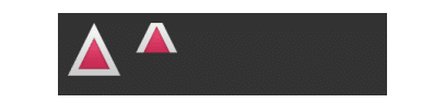
Image {
    x: 12; y: 12
// width: 72
// height: 72
    source: "assets/triangle_red.png"
    }

Image {
    x: 12+64+12; y: 12
// width: 72
    height: 72/2
    source: "assets/triangle_red.png"
    fillMode: Image.PreserveAspectCrop
    clip: true
}
TIP
A URL can be a local path with forward slashes ( “./images/home.png” ) or a web-link (e.g. “http://example.org/home.png (http://example.org/home.png) ”).
URLはスラッシュでローカルパスでもいいですし、ウェブリンクでもOKです。
TIP
Image elements using PreserveAspectCrop should also enable clipping to avoid image data being rendered outside the Image boundaries. By default clipping is disabled ( clip: false ). You need to enable clipping ( clip: true ) to constrain the painting to the elements bounding rectangle. This can be used on any visual element, but should be used sparingly (https://doc.qt.io/qt6/qtquick-performance.html#clipping) .
PreserveAspectCropを使っているイメージ要素はイメージの境界の外で表示されているイメージデータを避けるためのクリッピングも可能であるべきです。初期値ではクリッピングは無効です。(clip: false).クリッピングを有効にする必要があります( clip:true)ペイントを要素の外接する長方形に制限します。これは可視要素で使うことができますが、節約して使われるべきです。(https://doc.qt.io/qt6/qtquick-performance.html#clipping) .
TIP
Using C++ you are able to create your own image provider using QQuickImageProvider . This allows you to create images on the fly and make use of threaded image loading.
「C++を使ってあなたはQQuickImageProviderを使いあなた自身のイメージプロバイダを作ることができます。これはあなたがその場でイメージを作り、スレッド化されたイメージの読込を利用するようにできます。」
MouseArea Element
To interact with these elements you will often use a MouseArea . It’s a rectangular invisible item in which you can capture mouse events. The
mouse area is often used together with a visible item to execute commands when the user interacts with the visual part.
「MouseAreaを使ってこれらの要素と相互連絡をします。マウスイベントをとらえることができる矩形の不可視アイテムです。ユーザーが可視部分と相互連絡を取るときに、マウスエリアはコマンドを実行するための可視要素と共に利用されることがよくあります。」
Rectangle {
    id: rect1
    x: 12; y: 12
    width: 76; height: 96
    color: "lightsteelblue"
    MouseArea {
        id: area
        width: parent.width
        height: parent.height
        onClicked: rect2.visible = !rect2.visible
        }
     }
    Rectangle {
       id: rect2
       x: 112; y: 12
       width: 76; height: 96
       border.color: "lightsteelblue"
       border.width: 4
       radius: 8
}
TIP
This is an important aspect of Qt Quick: the input handling is separated from the visual presentation. This allows you to show the user an interface element where the actual interaction area can be larger.
これはQt Quickの重要な側面です。入力操作は可視表現と分離されています。これは実際の相互作用領域がより大きくなることができるインターフェース要素をユーザーに見せることができます。(これは、実際の作業領域が見た目よりも大きい領域にすることができます。)
TIP
For more complex interaction, see Qt Quick Input Handlers (https://doc.qt.io/qt-6/qtquickhandlers-index.html) . They are intended to be used instead of elements such as MouseArea and Flickable and offer greater control and flexibility. The idea is to handle one interaction aspect in each handler instance instead of centralizing the handling of all events from a given source in a single element, which was the case before.
より複合的な相互領域のためには、Qt Quick入力ハンドラを見てください。(https://doc.qt.io/qt-6/qtquickhandlers-index.html)
それらは例えばMouseAreaとFlickableのような要素の代わりに利用される意図があり、より大きなコントロールと柔軟性を提供します。以前のように特定のソースからのすべてのイベントの処理を単一の要素に集中させるのではなく、各ハンドラーインスタンスで1つの相互作用の側面を処理するという考えです。
Components
A component is a reusable element. QML provides different ways to create components. Currently, we will look only at the simplest form - a file-based component. A file-based component is created by placing a QML element in a file and giving the file an element name (e.g. Button.qml ). You can use the component like every other element from the Qt Quick module. In our case, you would use this in your code as Button { ... } . For example, let’s create a rectangle containing a text component and a mouse area. This resembles a simple button and doesn’t need to be more complicated for our purposes.
コンポーネントは再利用可能な要素です。QMLはコンポーネントを作るための異なる方法を提供します。現在、私たちは最も簡単な形式だけを見ます。ファイルを基本としたコンポーネントです。ファイルを基本としたコンポーネントはファイル内のQML要素を置くこと、ファイルに要素名を与えることによって造られるものです。(例えば、Button.qml).あなたはQt Quickモジュールから全ての他の要素のようにコンポーネントを使うことができます。私たちの場合、子コードの中ではButton{…}としてこれを使います。例えば、テキストコンポーネントとマウスエリアをもつ矩形を作りましょう。これは単純なボタンに似せており、目的をはずれる余計に複雑なものになる必要はありません。
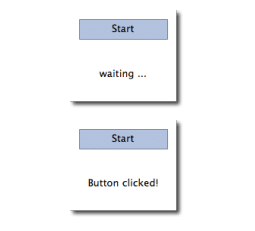
Rectangle { // our inlined button ui
    id: button
    x: 12; y: 12
    width: 116; height: 26
    color: "lightsteelblue"
    border.color: "slategrey"
    Text {
        anchors.centerIn: parent
        text: "Start"
     }
    MouseArea {
        anchors.fill: parent
        onClicked: {
            status.text = "Button clicked!"
        }
     }
    Text { // text changes when button was clicked
         id: status
         x: 12; y: 76
         width: 116; height: 26
         text: "waiting ..."
         horizontalAlignment: Text.AlignHCenter
     }
}
The UI will look similar to this. In the first image, the UI is in its initial state, and in the second image the button has been clicked.
UIはこれと似通っています。最初のイメージでは、UIは初期状態にあり、2番目のイメージでは、ボタンが押されました。
Now our task is to extract the button UI into a reusable component. For this, we should think about a possible API for our button. You can do this by imagining how someone else should use your button. Here’s what I came up with:
今や私たちの仕事は再利用可能なボタンUIを抽出することです。このために、私たちはボタンのための可能なAPIについて考えるべきです。あなたは他の誰かがどうやってあなたのボタンを使うべきかを想像することによってこれを行います。こちらが私が考え付いたものです。
// minimal API for a button
Button {
    text: "Click Me"
    onClicked: { /* do something */ }
}
I would like to set the text using a text property and to implement my own click handler. Also, I would expect the button to have a sensible initial size, which I can overwrite (e.g. with width: 240 for example). To achieve this we create a Button.qml file and copy our button UI inside. Additionally, we need to export the properties a user might want to change at the root level.
私はテキストプロパティを使ってテキストを設定したいし、私自身のクリックハンドラを実装したい。また、私はボタンが目的にかなっている初期サイズをもつことを期待していて、そのサイズは上書きできます。(例えば、width: 240)これを達成するために私たちはButton.qmlというファイルを作り、私たちのボタンUIを内側にコピーします。(コピーして貼り付けます。)加えて、ユーザーがルート段階で変化させたいプロパティをエクスポートする必要があります。
// Button.qml
import QtQuick
Rectangle {
    id: root
// export button properties
    property alias text: label.text
    signal clicked
    width: 116; height: 26
    color: "lightsteelblue"
    border.color: "slategrey"
    Text {
        id: label
        anchors.centerIn: parent
        text: "Start"
    }
    MouseArea {
         anchors.fill: parent
         onClicked: {
            root.clicked()
         }
     }
}
We have exported the text property and the clicked signal at the root level. Typically we name our root element root to make referencing it easier. We use the alias feature of QML, which is a way to export properties inside nested QML elements to the root level and make this available for the outside world. It is important to know that only the root level properties can be accessed from outside this file by other components. To use our new Button element we can simply declare it in our file. So the earlier example will become a little bit simplified.
「私たちはテキストプロパティとclickedシグナルをルート段階でエキスポートします。普通、参照をより簡単にするために、rootという名前をroot要素に付けます。私たちはネストされたQML要素の中にあるプロパティをルート段階へエクスポートする手段であり、これを外部の世界で利用可能にするQMLのエイリアス機能を使います。ルート段階のプロパティだけが、他のコンポーネントによって、このファイルの外からアクセス可能であるということを知っておくのは重要なことです。新しいButton要素を使うために、私たちはファイル内でそれを簡潔に宣言することができます。だから前に見せたエグザンプルは、ちょっと単純化されます。」
Button { // our Button component
    id: button
    x: 12; y: 12
    text: "Start"
    onClicked: {
        status.text = "Button clicked!"
       }
    }
    Text { // text changes when button was clicked
        id: status
        x: 12; y: 76
        width: 116; height: 26
        text: "waiting ..."
        horizontalAlignment: Text.AlignHCenter
}
Now you can use as many buttons as you like in your UI by just using Button { ... } . A real button could be more complex, e.g. providing feedback when clicked or showing a nicer decoration.
今Button{ …}を使うだけであなたのUI内は好きなように多くのボタンとして利用することができます。本当のボタンはもっと複雑になる可能性があります。例えば、クリックされるとき、あるいはよりいい装飾を表示するときにフィードバックを提供します。
TIP
If you want to, you could even go a step further and use an Item as a root element. This prevents users from changing the color of the button we designed, and provides us with more control over the exported API. The target should be to export a minimal API. Practically, this means we would need to replace the root Rectangle with an Item and make the rectangle a nested element in the root item.
Item {
    id: root
    width: 116; height: 26
    property alias text: label.text
    signal clicked
    Rectangle {
         anchors.fill parent
         color: "lightsteelblue"
         border.color: "slategrey"
    }
...
}
With this technique, it is easy to create a whole series of reusable components.
もしあなたが望むのであれば、さらなるステップを踏み、そしてItemをルート要素として利用できます。これはユーザーが私たちがデザインしたボタンの色を変更させないようにし、そして、エキスポートされたAPIを越えたコントロールを私たちに提供するものです。目的は最小限のAPIをエクスポートすることであるべきです。実践では、これは私たちがルートのRectangleを、Itemに置き換える必要があり、ルートアイテム内の矩形をネストされた要素にします。
この技術で、全体の再利用可能なコンポーネントを作ることができます。
Simple Transformations
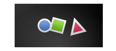
A transformation manipulates the geometry of an object. QML Items can, in general, be translated, rotated and scaled. There is a simple form of these operations and a more advanced way. Let’s start with the simple transformations. Here is our scene as our starting point. A simple translation is done via changing the x,y position. A rotation is done using the rotation property. The value is provided in degrees (0 .. 360). A scaling is done using the scale property and a value <1 means the element is scaled down and >1 means the element is scaled up. Rotation and scaling do not change an item's geometry: the x,y and width/height haven’t changed; only the painting instructions are transformed. Before we show off the example I would like to introduce a little helper: the ClickableImage element. The ClickableImage is just an image with a mouse area. This brings up a useful rule of thumb - if you have copied a chunk of code three times, extract it into a component.
変換はオブジェクトの幾何領域を操作します。QMLアイテムは、一般的に、移動、回転、そしてスケーリングが可能です。これらの実行の単純な形があり、より進んだ方法があります。単純な変換でスタートしてみましょう。こちらはスタート地点としてのシーンです。単純な移動はx, yの位置を変化させることによって行われます。回転はrotationプロパティを使って行われます。値は(0…360)度で提供されます。スケーリングはscaleプロパティを使って行われ、value < 1は要素が縮小し、>1は要素が拡大することを意味します。回転とスケーリングはアイテムの幾何領域を変化させません。x, yそしてwidth/heightは変化しません。唯一ペイント指示は変換されます。私たちが例を見せる前に、ちょっとした便利な道具をご紹介します。ClickableImage要素です。ClickableImageは丁度マウスエリア付きのイメージです。これは便利な経験則をもたらします - コードのチャンクを3回コピーした場合は、それをコンポーネントに抽出します。
// ClickableImage.qml
// Simple image which can be clicked
import QtQuick
Image {
    id: root
    signal clicked
    MouseArea {
        anchors.fill: parent
        onClicked: root.clicked()
    }
}
// TransformationExample.qml
import QtQuick
Item {
// set width based on given background
width: bg.width
height: bg.height
Image { // nice background image
id: bg
source: "assets/background.png"
}
MouseArea {
id: backgroundClicker
// needs to be before the images as order matters
// otherwise this mousearea would be before the other e
// and consume the mouse events
anchors.fill: parent
onClicked: {
// reset our little scene
circle.x = 84
box.rotation = 0
triangle.rotation = 0
triangle.scale = 1.0
}
}
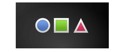
ClickableImage {
id: circle
x: 84; y: 68
source: "assets/circle_blue.png"
antialiasing: true
onClicked: {
// increase the x-position on click
x += 20
}
}
ClickableImage {
id: box
x: 164; y: 68
source: "assets/box_green.png"
antialiasing: true
onClicked: {
// increase the rotation on click
rotation += 15
}
}
ClickableImage {
id: triangle
x: 248; y: 68
source: "assets/triangle_red.png"
antialiasing: true
onClicked: {
// several transformations
rotation += 15
scale += 0.05
}
}
// ...
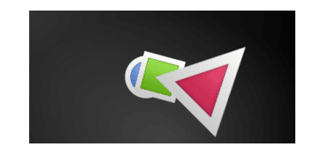
The circle increments the x-position on each click and the box will rotate on each click. The triangle will rotate and scale the image up on each click, to demonstrate a combined transformation. For the scaling and rotation operation we set antialiasing: true to enable anti-aliasing, which is switched off (same as the clipping property clip ) for performance reasons. In your own work, when you see some rasterized edges in your graphics, then you should probably switch smoothing on.
円はx位置をそれぞれのクリックで増加させ、四角はそれぞれのクリックで回転します。三角はそれぞれのクリックで回転とスケールアップをし、組み合わせの変換を実証します。スケーリングと回転のために、antialiasing: trueを設定し、アンチエイリアスを可能にしますが、パフォーマンスの理由で、スイッチが切られています。あなたが自分でする時には、グラフィックス内でラスタライズされているということがわかるようなときには、おそらくはスイッチをオンにするべきです。
TIP
To achieve better visual quality when scaling images, it is recommended to scale down instead of up. Scaling an image up with a larger scaling factor will result in scaling artifacts (blurred image). When scaling an image you should consider using smooth: true to enable the usage of a higher quality filter at the cost of performance.
イメージをスケーリングするときに視覚の質をより高めるためには、upの代わりにdownをお勧めします。イメージをより大きくするスケールファクターで拡大することは、スケール化している人工遺物(ぼやけた画像)という結果になります。smooth: trueを使うことを考慮に入れて行えば、パフォーマンスのコストで、より高度な質のフィルターの使用を可能にします。
The background MouseArea covers the whole background and resets the object values.
背景のMouseAreaは全体の背景をカバーしており、オブジェクトの値をリセットします。
TIP
Elements which appear earlier in the code have a lower stacking order (called z-order). If you click long enough on circle you will see it moves below box . The z-order can also be manipulated by the z property of an Item.
コード内で早い段階で現れる要素は、(zオーダーと呼ばれる)より下位のスタッキングオーダーを持ちます。もし円の上で十分長くクリックをすれば、それは四角の下へ移動します。z-orderもまたアイテムのzプロパティによって操作されることもできます。
This is because box appears later in the code. The same applies also to mouse areas. A mouse area later in the code will overlap (and thus grab the mouse events) of a mouse area earlier in the code. Please remember: the order of elements in the document matters.
これは四角がコード順でいえば、後から現れるからです。同じことはmouse areaにも当てはまります。コードの後ろにあるmouse areaはコードでより前にあるmouse areaに重なり合います。(そしてそれゆえマウスイベントを掴みます。)思い出してください。ドキュメント内の要素の順番は重要です。
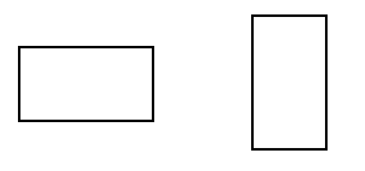
Positioning Elements
There are a number of QML elements used to position items. These are called positioners, of which the Qt Quick module provides the following: Row , Column , Grid and Flow . They can be seen showing the same contents in the illustration below.
アイテムを位置づける多くのQML要素があります。これらはいわゆるポジショナー Qt Quickモジュールが次の通りのものを提供しているものです:Row, Column, Grid and Flow. 下記のイラスト内で同じ内容を表示ししてみることができます。
TIP
Before we go into details, let me introduce some helper elements: the red, blue, green, lighter and darker squares. Each of these components contains a 48x48 pixel colorized rectangle. As a reference, here is the source code for the RedSquare :
詳細に入る前に、いくつかの役に立つものを紹介させてください。red, blue, green, lighter そして darker正方形です。これらのコンポーネントのうちそれぞれは、48×48のピクセルでカラーされた矩形を持ちます。参照として、こちらはRedSquareのためのソースコードです。
// RedSquare.qml
import QtQuick
Rectangle {
    width: 48
    height: 48
    color: "#ea7025"
    border.color: Qt.lighter(color)
}
Please note the use of Qt.lighter(color) to produce a lighter border color based on the fill color. We will use these helpers in the next examples to make the source code more compact and readable. Please remember, each rectangle is initially 48x48 pixels.
fill colorを基本としてより軽い色のborder色を生産するためQt.lighter(color)の使用を覚えてください。私たちは次の例でソースコードをよりコンパクトに、そして読みやすくするため、次の例でこれらの役に立つものを使います。それぞれの矩形は最初48×48のピクセルであることを、思い出して下さい。
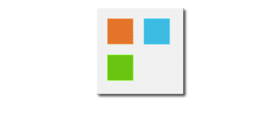
The Column element arranges child items into a column by stacking them on top of each other. The spacing property can be used to distance each of the child elements from each other.
Column 要素は、子項目を積み重ねて列に配置します。spacing プロパティを使用すると、各子要素を互いに離すことができます。
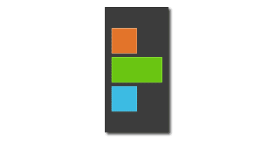
// ColumnExample.qml
import QtQuick
DarkSquare {
    id: root
    width: 120
    height: 240
    Column {
        id: column
        anchors.centerIn: parent
        spacing: 8
    RedSquare { }
    GreenSquare { width: 96 }
    BlueSquare { }
    }
}
The Row element places its child items next to each other, either from the left to the right, or from the right to the left, depending on the layoutDirection property. Again, spacing is used to separate child items.
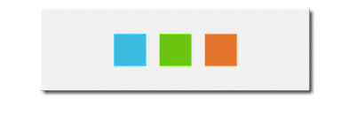
// RowExample.qml
import QtQuick
BrightSquare {
    id: root
    width: 400; height: 120
    Row {
        id: row
        anchors.centerIn: parent
        spacing: 20
        BlueSquare { }
        GreenSquare { }
        RedSquare { }
    }
}
The Grid element arranges its children in a grid. By setting the rows and columns properties, the number of rows or columns can be constrained. By not setting either of them, the other is calculated from the number of child items. For instance, setting rows to 3 and adding 6 child items will result in 2 columns. The properties flow and layoutDirection are used to control the order in which the items are added to the grid, while spacing controls the amount of space separating the child items.
Grid 要素はグリッド内で子を整理します。rowsとcolumnsプロパティを設定することによって、rowsあるいはcolumnsの数が制限されます。それらのいくつかを設定しないことによって、一方は子アイテムの数から計算されます。例えば、行を3へセットして、6つのアイテムは結局2列になります。プロパティのflowとlayoutDirectionはアイテムがグリッドへ追加される順番を管理するために使われます、一方spacingは子アイテムを分離するスペースの量を管理します。
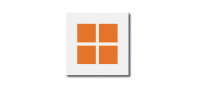
// GridExample.qml
import QtQuick
BrightSquare {
    id: root
    width: 160
    height: 160
    Grid {
        id: grid
        rows: 2
        columns: 2
        anchors.centerIn: parent
        spacing: 8
        RedSquare { }
        RedSquare { }
        RedSquare { }
        RedSquare { }
    }
}
The final positioner is Flow . It adds its child items in a flow. The direction of the flow is controlled using flow and layoutDirection . It can run sideways or from the top to the bottom. It can also run from left to right or in the opposite direction. As the items are added in the flow, they are wrapped to form new rows or columns as needed. In order for a flow to work, it must have a width or a height. This can be set either directly, or though anchor layouts.
最後のポジショナーがFlowです。その子アイテムをflowで加えます。flowの方向はflowとlayoutDirectionを使って管理されます。上から下へかけて、斜めに実行できます。左から右へ、あるいは反対に右から左へ実行することもできます。アイテムがflow内に加えられると、必要に応じて行送りになり、新しい行やカラムを形成します。flowを働かせるためには、widthあるいはheightを持たせなければなりません。これは直接設定するか、あるいはanchorレイアウトを通して設定できます。
// FlowExample.qml
import QtQuick
BrightSquare {
    id: root
    width: 160
    height: 160
    Flow {
        anchors.fill: parent
        anchors.margins: 20
        spacing: 20
     RedSquare { }
     BlueSquare { }
     GreenSquare { }
    }
}
An element often used with positioners is the Repeater . It works like a for-loop and iterates over a model. In the simplest case a model is just a value providing the number of loops.
ポジショナでよく使われる要素はRepeaterです。これはforループのように動き、モデルを配列処理します。最も単純なケースでは、モデルはループの数を提供する単なる値です。
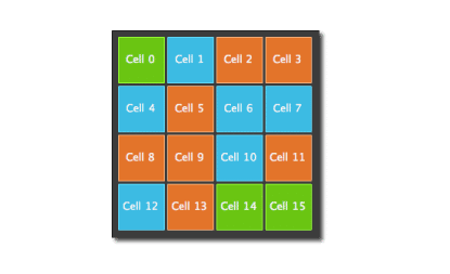
// RepeaterExample.qml
import QtQuick
DarkSquare {
    id: root
    width: 252
    height: 252
    property variant colorArray: ["#00bde3", "#67c111", "#ea702
    Grid{
         anchors.fill: parent
         anchors.margins: 8
         spacing: 4
         Repeater {
             model: 16
             delegate: Rectangle {
             required property int index
             property int colorIndex: Math.floor(Math.random
             width: 56; height: 56
             color: root.colorArray[colorIndex]
             border.color: Qt.lighter(color)
             Text {
                 anchors.centerIn: parent
                 color: "#f0f0f0"
                 text: "Cell " + parent.index
                }
            }
        }
    }
}
In this repeater example, we use some new magic. We define our own colorArray property, which is an array of colors. The repeater creates a series of rectangles (16, as defined by the model). For each loop, it creates the rectangle as defined by the child of the repeater. In the rectangle we chose the color by using JS math functions: Math.floor(Math.random()*3) . This gives us a random number in the range from 0..2, which we use to select the color from our color array. As noted earlier, JavaScript is a core part of Qt Quick, and as such, the standard libraries are available to us. A repeater injects the index property into the repeater. It contains the current loop-index. (0,1,..15). We can use this to make our own decisions based on the index, or in our case to visualize the current index with the Text element.
このリピーターエグザンプルでは、新しい魔法を幾つか使います。カラーの配列である、自己定義のcolorArrayプロパティを定義します。リピーターは一連の矩形を作ります。(16, モデルとして定義されているので)
それぞれのループごとに、リピーターの子によって定義されている矩形を作ります。矩形内では、JavaScriptのmath funtions: Math.floor(Math.random()*3)関数を使って色を選択します。
これは私たちに0..2からの範囲でランダムの数を与え、カラーの配列から色を選択するのに使います。早い段階で重要となるのは、JavaScriptはQt Quickの中核となる部分であり、例えば、標準ライブラリが私たちにとって利用可能であるということです。repeaterはrepeater内のindexプロパティへ介入します。それは現在のループインデックス(0, 1,..15)を持ちます。
私たちはこれをインデックスを基本とした自己定義をするために使い、あるいはText要素で現在のindexを可視化するためにこれを使います。
TIP
While the index property is dynamically injected into the Rectangle, it is a good practice to declare it as a required property to ease readability and help tooling. This is achieved by the required property int index line.
インデックスプロパティは動的にRectangleに介入される一方、読込みを容易にし、ツールを助けるために必要なプロパティとして宣言をするのはいい習慣です。これはint indexの行で必要なプロパティによって達成されます。
TIP
More advanced handling of larger models and kinetic views with dynamic delegates is covered in its own model-view chapter. Repeaters are best used when having a small amount of static data to be presented.
より大きなモデルのより進んだ処理、そして動的なデリゲートによる物理運動のビューは、それ自体モデルビューの章でカバーされます。Repeaterは表現される少量の静的なデータを持つ時に最もよく利用されるものです。
この記事が気に入ったらサポートをしてみませんか?