MACDのIC計算

参考
昔見たときは分からなかったけど、1行ずつ確認していったらなんとなく理解できたので記録。
確認作業はjupyterで行った。
準備
import numpy as np
import pandas as pd
import talib
import matplotlib.pyplot as plt

# ohlcvを用意してください
df = pd.read_pickle('C:/Pydoc/ohlcv/1min_Bybit_BTCUSD_2020-01-01 to 2021-11-30.pkl')
print(df)
# closeを配列に取り出しておく
close = np.array(df.close.values)

# diffと、diff.shift(-1)をdfに追加
# nextは次の足で価格がどう変化するかの答え
df["diff"] = df["close"].diff(1)
df["next"] = df["diff"].shift(-1)
print(df)
ICを計算
総当たりでMACDシグナルに対して予測値の精度を確認している
correlation = np.corrcoef(x, y)[0,1]について
参考:https://www.higashisalary.com/entry/numpy-corrcoef
# 全データを結合するdfを用意
results = pd.DataFrame(columns=["fast","slow","signal","IC"])

# shortが2~4のとき
for short in range(2,4):

    # longが3~8のとき
    for long in range(3,8):

        # signalが2~5のとき
        for signal in range(2,5):

            # df.nextをmatrixとして新しくdf化
            matrix = pd.DataFrame(df.next)

            # MACDをtalibで計算 MACDとMACDsignalはいらないから_,_にしてる
            _,_,matrix["histgram"] = talib.MACD(close, fastperiod=short, slowperiod=long, signalperiod=signal)

            # matrixからnanを削除
            matrix = matrix.dropna()

            # yをmatrix["next"]とする(予測値)
            y = matrix["next"]

            # xを定義 x = (x-μ)/σ 参考:https://bellcurve.jp/statistics/course/7801.html
            # 1.(matrix["histgram"] - matrix["histgram"].mean()):各データの値-平均値により偏差を算出
            # 2.標準偏差で割ることで、データの標準化を行う
            # 3.データの標準化と言う
            x = (matrix["histgram"] - matrix["histgram"].mean())/matrix["histgram"].std(ddof=0)

            # x,yをそれぞれ1番目からの配列にする(.shiftして行数がずれているため
            y = y[1:]
            x = x[1:]

            # numpyで相関係数を計算
            # correlation = np.corrcoef(x, y)[0,1]について:https://www.higashisalary.com/entry/numpy-corrcoef
            correlation = np.corrcoef(x, y)[0,1]

            # 1つのパターンの確認が終わるごとにdfを作成
            result = pd.DataFrame([[short,long,signal,correlation]], columns=["fast","slow","signal","IC"])

            # dfをresultをresultsに結合
            results = pd.concat([results,result])

# index振りなおし
results = results.reset_index(drop=True)
print(results)
データの標準化はscipyでもできる
import scipy.stats
# scipy.stats.zscoreでも標準化できる
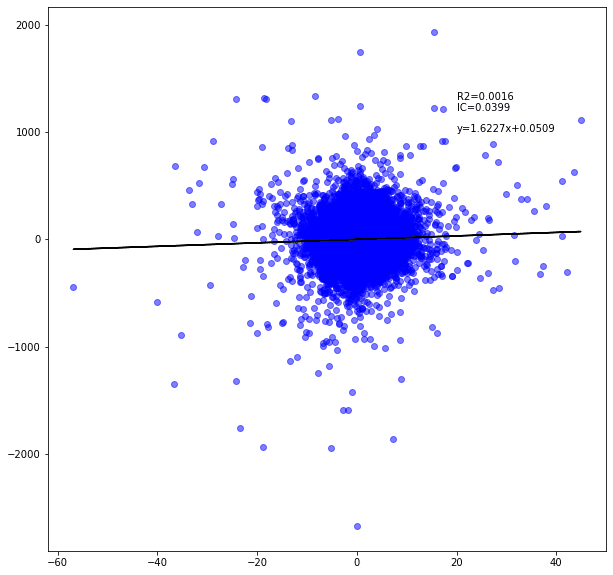
_x = scipy.stats.zscore(matrix["histgram"])MACD(2,3,2)の散布図を確認
# df作成
scatter = pd.DataFrame(df.next)

# MACD計算し、histgramをdfに追加
_,_,scatter["histgram"] = talib.MACD(close, fastperiod=2, slowperiod=3, signalperiod=2)

# dfからnanを削除
scatter = scatter.dropna()

# yに予測値を代入(next)
y = scatter["next"]

# xに標準化したhistgramの値を代入
x = (scatter["histgram"] - scatter["histgram"].mean())/scatter["histgram"].std()

# x,yをそれぞれ1番目からの配列にする(.shiftして行数がずれているため
y = y[1:]
x = x[1:]

# 回帰直線の係数と切片をnp.polyfitで計算
# np.polyfit(x, y, deg) degは係数の数
a,b = np.polyfit(x,y,1)

# 回帰直線を定義
y2 = a * x + b

# numpyで相関係数を計算
# correlation = np.corrcoef(x, y)[0,1]について:https://www.higashisalary.com/entry/numpy-corrcoef
correlation = np.corrcoef(x, y)[0,1]

# 決定係数determinationをcorrelationの2乗としている
determination = correlation**2

# pyplot scatter 参考:https://qiita.com/nkay/items/d1eb91e33b9d6469ef51#32-%E6%95%A3%E5%B8%83%E5%9B%B3axesscatter
fig=plt.figure(figsize=(10, 10))
ax=fig.add_subplot(111)
ax.scatter(x,y,alpha=0.5,color="Blue",linewidths=1)
ax.plot(x, y2,color='black')
ax.text(0.1,0, 'y='+ str(round(a,4)) +'x+'+str(round(b,4)),position=(20,1000))
ax.text(0.1,0, 'IC='+str(round(correlation,4)),position=(20,1200))
ax.text(0.1,0, 'R2='+str(round(determination,4)),position=(20,1300))
plt.show()