
Fonts Dance With Errors


日本語版の記事はこちら
In my work as a product designer, or industrial designer, I often deal with text that is placed on the surface of products.
As I worked with Adobe illustrator, I couldn't ignore the errors contained in the fonts, and when I looked for the cause, I found out that the paths generated are slightly different depending on the font size when outlining. It may have been common knowledge to someone other than myself....
For my own personal interest, I wanted to visualize this error and created a series of works called "Fonts Dance With Errors". I've also been interested in NFT, so I've published my work on Opensea.
https://opensea.io/collection/fonts-dance-with-errors
In this article, I will briefly summarize what "Fonts Dance With Errors" is and how I visualized it.
What is this?
Visualization of errors in font outlining

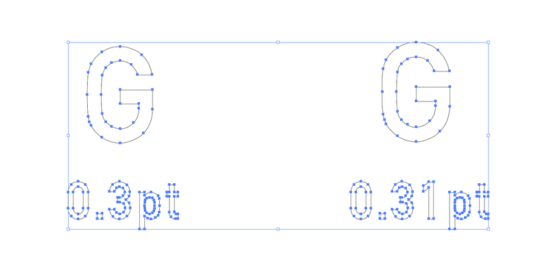
”Fonts Dance With Errors" is a project that summarizes the errors that occur when outlining text objects in Adobe illustrator in a form that is as easy to see as possible.

The error in outlining is so small that it is not a problem in general use, and can only be confirmed by enlarging the image to 64000% and displaying the outline with the same characters superimposed. If there is a problem in data handling, it is probably in the following situations at most.
When you import path data into CAD and perform geometric or dimensional constraints,
when the dimensions change from the intended numbers as a result of rounding errors when 2D drawings,
or when you are required to perfectly match outline data created in the past.
When I made a GIF animation of these errors, it looked like the fonts were dancing slightly, so I gave it the title "Fonts Dance With Errors".
Why did I create it?
When editing or conversion is involved, I want to make it known that even digital data contains degradation and errors.
It is often said that digital data does not deteriorate or have errors when copied, but many people have pointed out that it contains errors when it is not copied but edited or converted in some way. However, many people have pointed out that errors are included when editing or converting data. I believe that this is caused by the fact that "digital data does not degrade even if it is copied", which is mistakenly perceived as "data does not degrade even if it is edited or converted".
Therefore, I created this group of works in the hope that the fact that errors exist when editing or converting data will become more widely known, and that this will reduce the number of unpleasant problems caused by errors.
How did I make it?
Outline the text at 0.01pt each and align the size of the two adjacent objects so that only the non-overlapping parts remain.
In this production, I used a simple method as shown in the heading. The actual font size used was between 0.1pt and 1.1pt. The smaller the font size, the better the error, so I used only this range.
The amount of work required to do this by hand would have been enormous, so I used Extend Script to automatically control Illustrator.
Finally, I would like to end this article by introducing the basic flow of the creation process.

Use the outline view instead of the normal preview.


制作や開発の資金源にさせていただきます!