
[Flutter]charts_flutterでグラフ選択時にデータ値をツールチップで表示させる

※charts_flutterがサポート終了したようなので無料公開にしました。
こんにちは。暑い日が続きますね。
Flutterには、charts_flutterというグラフを描画するプラグインが公開されています。
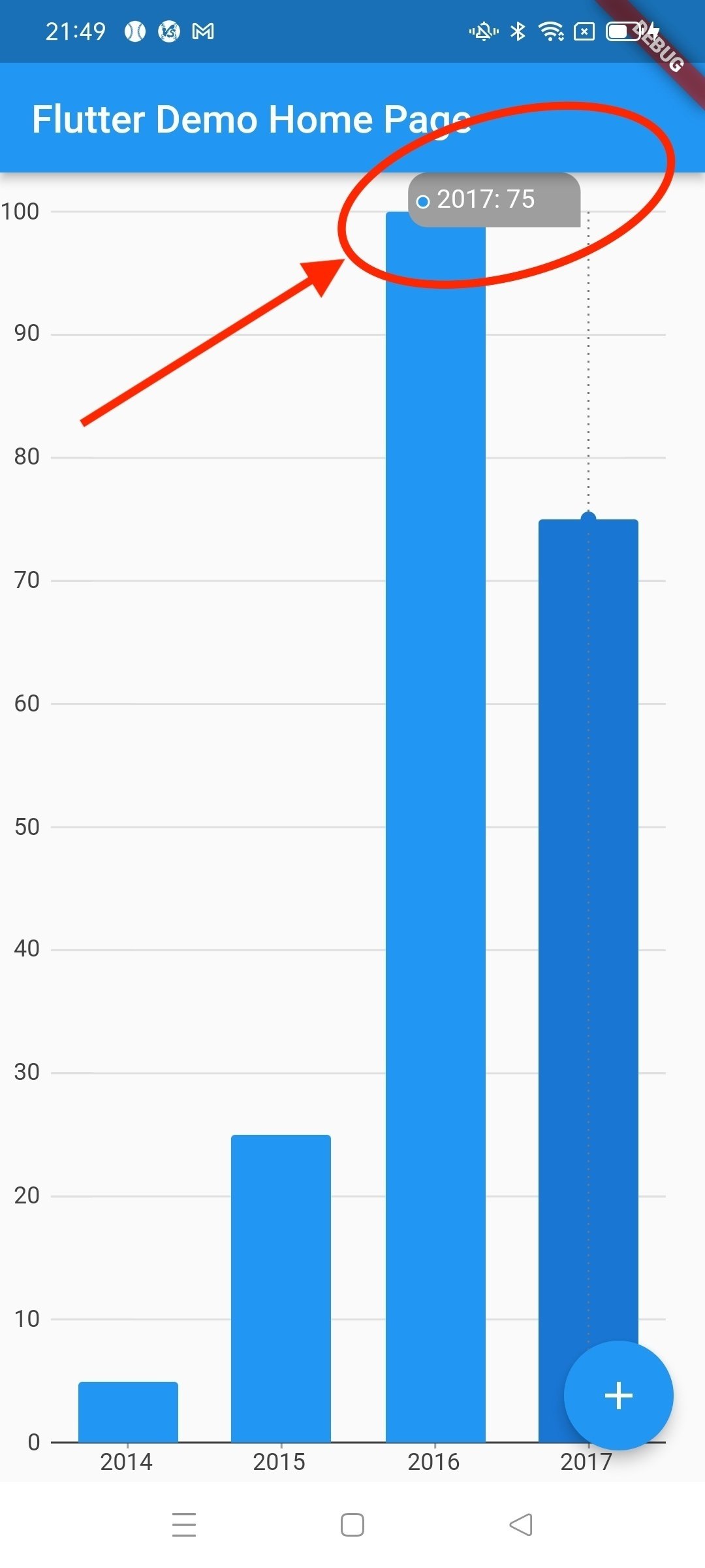
charts_flutterで棒グラフを作成し、棒グラフの棒をタップしたときにその棒が示しているデータ値をツールチップとして表示させたいと思っていました。ですが、charts_flutterの棒グラフには標準で簡単に実装する方法がありませんでした。
イメージとしてはこういうやつです。↓
簡単に実装する方法がなさそうなので、自分で作ることにしました。
使用環境
今回は以下の環境を使用しています。
Flutter 3.1.0
charts_flutter 0.12.0
charts_flutterのインストール
まずは、chars_flutterのプラグインを導入します。
2022年8月8日時点ではバージョンは0.12.0です。
pubspec.yamlに追記して pub getしてください。
dependencies:
  charts_flutter: ^0.12.0
棒グラフの作成
次に棒グラフの本体を作ります。後の処理で必要になってくるので、StatelessWidgetではなくStatefulWidgetで書きます。
今回はSimpleBarChartクラスで棒グラフのWidgetを作成しています。
棒グラフに必要なデータ群として、OrdinalSalesクラスを用意しています。
OrdinalSalesクラスのメンバ変数を見ていただければわかる通り、年と売り上げの組み合わせのデータを用意します。
BarChartクラス生成時に、List<charts.Series<OrdinalSales, String>>形式のListを作成してコンストラクタに引き渡すことでグラフを生成することになります。
/// Bar chart example
import 'package:charts_flutter/flutter.dart' as charts;
import 'package:flutter/material.dart';

class SimpleBarChart extends StatefulWidget {
  SimpleBarChart({Key? key}) : super(key: key);

  @override
  _SimpleBarChartState createState() => _SimpleBarChartState();
}

class _SimpleBarChartState extends State<SimpleBarChart> {


  @override
  Widget build(BuildContext context) {
    return  charts.BarChart(
      _createSampleData(),
      animate: true,
    );
  }

  /// Create one series with sample hard coded data.
  static List<charts.Series<OrdinalSales, String>> _createSampleData() {
    final data = [
       OrdinalSales('2014', 5),
       OrdinalSales('2015', 25),
       OrdinalSales('2016', 100),
       OrdinalSales('2017', 75),
    ];

    return [
      new charts.Series<OrdinalSales, String>(
        id: 'Sales',
        colorFn: (_, __) => charts.MaterialPalette.blue.shadeDefault,
        domainFn: (OrdinalSales sales, _) => sales.year,
        measureFn: (OrdinalSales sales, _) => sales.sales,
        data: data,
      )
    ];
  }
}

/// Sample ordinal data type.
class OrdinalSales {
  final String year;
  final int sales;

  OrdinalSales(this.year, this.sales);
}
そしてこのStatefulWidgetにstaticなList型のメンバ変数を一つ用意します。
この追加したstaticなList型である変数に、「どの棒グラフのデータが選択されたのか」を保存しておくことになります。
class SimpleBarChart extends StatefulWidget {
    static List selectedDatum = [];
棒グラフ選択時の処理(selectionModelsパラメータ)
次に、selectionModelsパラメータをcharts.BarChartに設定します。selectionModelsパラメータは、棒グラフの棒が選択されたときに呼ばれる処理を書くものです。選択した棒に対応するデータを、先ほど用意したstaticなメンバ変数であるselectedDatum配列に格納します。このデータを使って、後で記載する処理でツールチップをグラフ上に描画します。
      selectionModels: [
       charts.SelectionModelConfig(
           type: charts.SelectionModelType.info,
           changedListener: (charts.SelectionModel model) {
             if (model.hasDatumSelection) {
               SimpleBarChart.selectedDatum = [];
               model.selectedDatum.forEach((charts.SeriesDatum datumPair) {
                  SimpleBarChart.selectedDatum.add({
                    'color': datumPair.series.colorFn!(0),
                    'text': '${datumPair.datum.year}: ${datumPair.datum.sales} '
                 });
               });
             }
           })
     ],
棒グラフ選択時の処理(CircleSymbolRenderer)
次に、charts.CircleSymbolRendererクラスを継承したCustomCircleSymbolRendererというクラスを作成します。これが、実際にツールチップを描画するクラスです。
先ほど、selectedDatum変数をstaticで定義しましたが、charts.CircleSymbolRendererクラスは、描画させたい文字列を動的に変化させることができないようなクラス設計になっています。
paintメソッドでツールチップを描画するのですが、paintメソッドには描画したい文字を指定させることができません。つまり外部からデータを与えることができないので、paintメソッド内部からデータをとってくる必要があったので、selectedDatum変数をstaticで定義していました。わりと無理やりですが他に方法が見つかりませんでした。
class CustomCircleSymbolRenderer extends charts.CircleSymbolRenderer {
  final size;

  CustomCircleSymbolRenderer({this.size});

  @override
  void paint(ChartCanvas canvas, Rectangle<num> bounds,
      {List<int>? dashPattern,
      Color? fillColor,
      FillPatternType? fillPattern,
      Color? strokeColor,
      double? strokeWidthPx}) {
    super.paint(canvas, bounds,
        dashPattern: dashPattern,
        fillColor: fillColor,
        strokeColor: strokeColor,
        strokeWidthPx: strokeWidthPx);

    List tooltips = SimpleBarChart.selectedDatum;

    if (tooltips != null && tooltips.length > 0) {
      num tipTextLen = (tooltips[0]['text']).length;
      num rectWidth = bounds.width + tipTextLen * 8.9;
      num rectHeight = bounds.height + 20 + (tooltips.length - 1) * 18;
      num left = bounds.left > (size?.width ?? 300) / 2
          ? (bounds.left > size?.width / 4
              ? bounds.left - rectWidth
              : bounds.left - rectWidth / 2)
          : bounds.left - 40;

      canvas.drawRRect(Rectangle(left, 0, rectWidth, rectHeight),
          radius: 10,
          fill: charts.Color.fromHex(code: '#9e9e9e'),
          roundTopLeft: true,
          roundBottomLeft: true,
          roundTopRight: true);

      for (int i = 0; i < tooltips.length; i++) {
        canvas.drawPoint(
          point: Point(left.round() + 8, (i + 1) * 15),
          radius: 3,
          fill: tooltips[i]['color'],
          stroke: charts.Color.white,
          strokeWidthPx: 1,
        );
        style.TextStyle textStyle = style.TextStyle();
        textStyle.color = charts.Color.white;
        textStyle.fontSize = 13;
        canvas.drawText(
            chartsTextElement.TextElement(tooltips[i]['text'],
                style: textStyle),
            left.round() + 15,
            i * 15 + 8);
      }
    }
  }
}
そしてこのCustomCircleSymbolRendererクラスを、charts.BarChartの引数behaviorsに渡します。
      behaviors: [
        charts.LinePointHighlighter(
          symbolRenderer: CustomCircleSymbolRenderer(
            size: MediaQuery.of(context).size,
          ),
        )
      ],
全体コード
以上で、棒グラフをタップするとその棒のデータ値がツールチップとして表示できるようになります。
全体のソースコードを以下に貼っておきます。
import 'dart:math' show Rectangle, Point;

import 'package:charts_flutter/flutter.dart' as charts;
import 'package:charts_flutter/flutter.dart';
import 'package:charts_flutter/src/text_element.dart' as chartsTextElement;
import 'package:charts_flutter/src/text_style.dart' as style;
import 'package:flutter/material.dart';

void main() {
  runApp(const MyApp());
}

class MyApp extends StatelessWidget {
  const MyApp({super.key});

  @override
  Widget build(BuildContext context) {
    return MaterialApp(
      title: 'Flutter Demo',
      theme: ThemeData(
        primarySwatch: Colors.blue,
      ),
      home: const MyHomePage(title: 'Flutter Demo Home Page'),
    );
  }
}

class MyHomePage extends StatefulWidget {
  const MyHomePage({super.key, required this.title});
  final String title;

  @override
  State<MyHomePage> createState() => _MyHomePageState();
}

class _MyHomePageState extends State<MyHomePage> {
  @override
  Widget build(BuildContext context) {
    return Scaffold(
      appBar: AppBar(
        title: Text(widget.title),
      ),
      body: SimpleBarChart(),
    );
  }
}

class SimpleBarChart extends StatefulWidget {
  SimpleBarChart({Key? key}) : super(key: key);
  static List selectedDatum = [];

  @override
  _SimpleBarChartState createState() => _SimpleBarChartState();
}

class _SimpleBarChartState extends State<SimpleBarChart> {
  @override
  Widget build(BuildContext context) {
    return charts.BarChart(
      _createSampleData(),
      behaviors: [
        charts.LinePointHighlighter(
          symbolRenderer: CustomCircleSymbolRenderer(
            size: MediaQuery.of(context).size,
          ),
        )
      ],
      selectionModels: [
        charts.SelectionModelConfig(
            type: charts.SelectionModelType.info,
            changedListener: (charts.SelectionModel model) {
              if (model.hasDatumSelection) {
                SimpleBarChart.selectedDatum = [];
                model.selectedDatum.forEach((charts.SeriesDatum datumPair) {
                  SimpleBarChart.selectedDatum.add({
                    'color': datumPair.series.colorFn!(0),
                    'text': '${datumPair.datum.year}: ${datumPair.datum.sales} '
                  });
                });
              }
            })
      ],
      animate: true,
    );
  }

  /// Create one series with sample hard coded data.
  static List<charts.Series<OrdinalSales, String>> _createSampleData() {
    final data = [
      new OrdinalSales('2014', 5),
      new OrdinalSales('2015', 25),
      new OrdinalSales('2016', 100),
      new OrdinalSales('2017', 75),
    ];

    return [
      new charts.Series<OrdinalSales, String>(
        id: 'Sales',
        colorFn: (_, __) => charts.MaterialPalette.blue.shadeDefault,
        domainFn: (OrdinalSales sales, _) => sales.year,
        measureFn: (OrdinalSales sales, _) => sales.sales,
        data: data,
      )
    ];
  }
}

/// Sample ordinal data type.
class OrdinalSales {
  final String year;
  final int sales;

  OrdinalSales(this.year, this.sales);
}

class CustomCircleSymbolRenderer extends charts.CircleSymbolRenderer {
  final size;

  CustomCircleSymbolRenderer({this.size});

  @override
  void paint(ChartCanvas canvas, Rectangle<num> bounds,
      {List<int>? dashPattern,
      Color? fillColor,
      FillPatternType? fillPattern,
      Color? strokeColor,
      double? strokeWidthPx}) {
    super.paint(canvas, bounds,
        dashPattern: dashPattern,
        fillColor: fillColor,
        strokeColor: strokeColor,
        strokeWidthPx: strokeWidthPx);

    List tooltips = SimpleBarChart.selectedDatum;

    if (tooltips != null && tooltips.length > 0) {
      num tipTextLen = (tooltips[0]['text']).length;
      num rectWidth = bounds.width + tipTextLen * 8.9;
      num rectHeight = bounds.height + 20 + (tooltips.length - 1) * 18;
      num left = bounds.left > (size?.width ?? 300) / 2
          ? (bounds.left > size?.width / 4
              ? bounds.left - rectWidth
              : bounds.left - rectWidth / 2)
          : bounds.left - 40;

      canvas.drawRRect(Rectangle(left, 0, rectWidth, rectHeight),
          radius: 10,
          fill: charts.Color.fromHex(code: '#9e9e9e'),
          roundTopLeft: true,
          roundBottomLeft: true,
          roundTopRight: true);

      for (int i = 0; i < tooltips.length; i++) {
        canvas.drawPoint(
          point: Point(left.round() + 8, (i + 1) * 15),
          radius: 3,
          fill: tooltips[i]['color'],
          stroke: charts.Color.white,
          strokeWidthPx: 1,
        );
        style.TextStyle textStyle = style.TextStyle();
        textStyle.color = charts.Color.white;
        textStyle.fontSize = 13;
        canvas.drawText(
            chartsTextElement.TextElement(tooltips[i]['text'],
                style: textStyle),
            left.round() + 15,
            i * 15 + 8);
      }
    }
  }
}
この記事が気に入ったらサポートをしてみませんか?