
Tableau 見やすいランクチャートの作り方

今回は、Tableauでランクチャートを作成する方法について記載しようと思います!
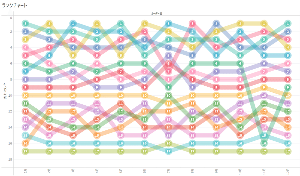
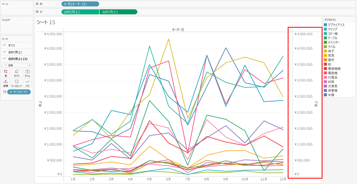
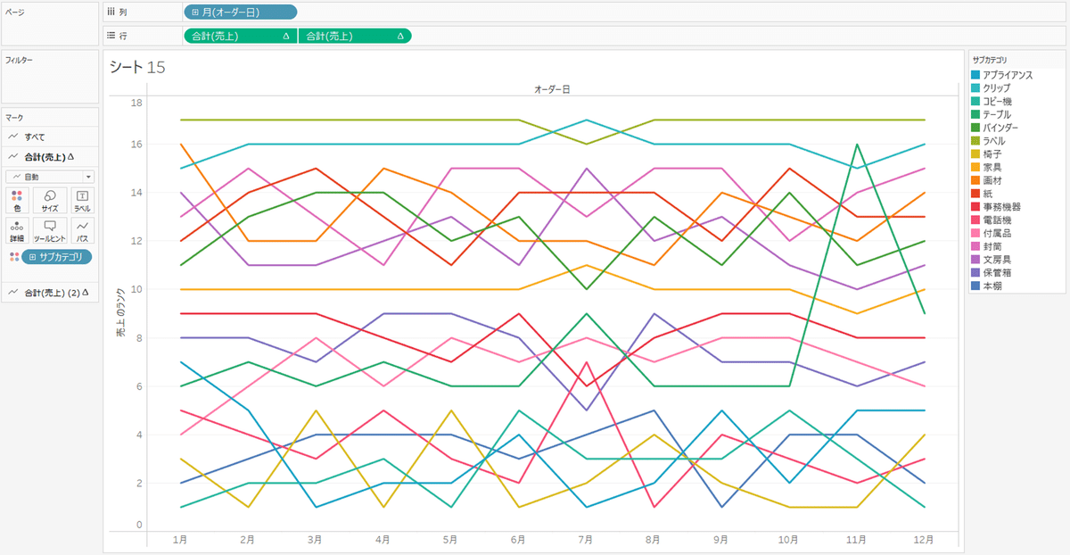
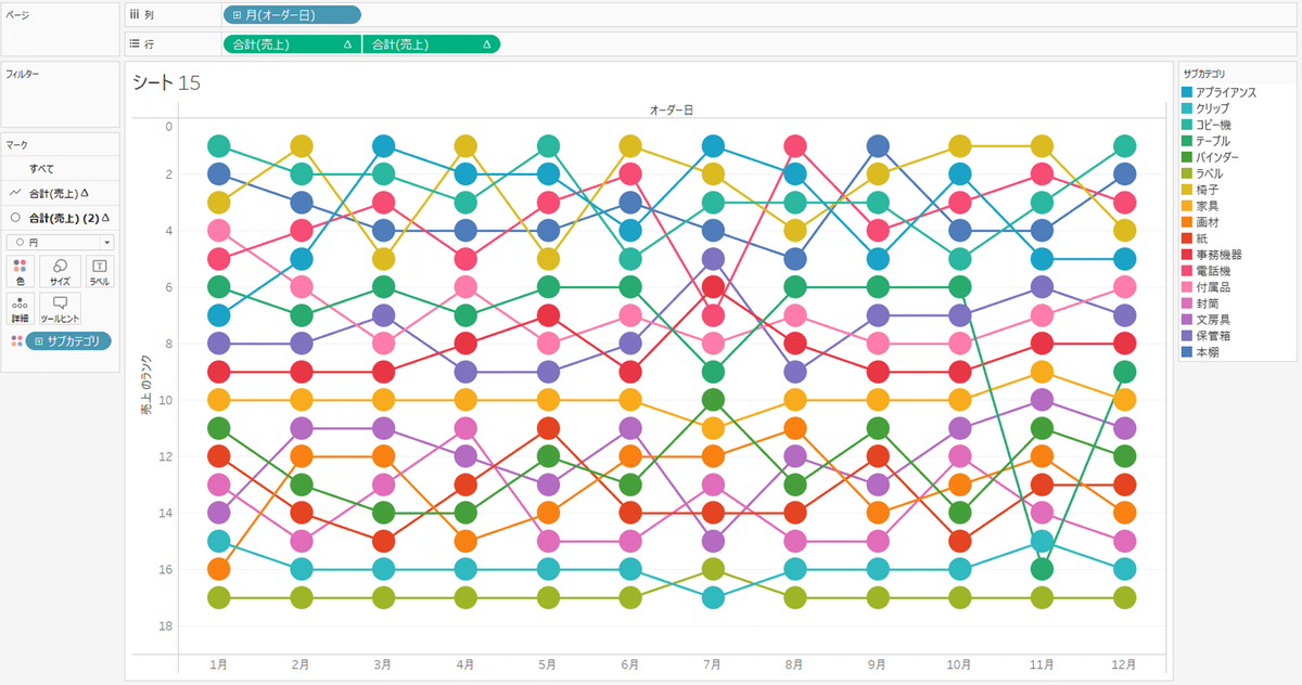
< ランクチャートの完成図 >
下記の完成図が、今回のゴールです。
作り方に入る前に、
そもそも「ランクチャートとは?」の観点から利用シーンについても少しだけ触れておきましょう~~
< ランクチャートの利便性 >
ランクチャートとは
ランクチャート … 主に相対的な順位を強調できるチャートで、データの比較とパターンの把握に寄与します。
その為、順位に意味がある場面で、異なる要素を視覚的にランク付けする必要がある時に利用される事が多いです。
ランクチャートの利用シーン
ランクチャートはデータセット内の要素をランキング順に表示するグラフで、特に次のような場面で利用可能です。
順位の比較:
異なる要素やカテゴリの順位を比較するために使用されます。例えば、製品やサービスの売上ランキングや評価のランキングを視覚的に理解するのに便利です。
トレンドの把握:
カテゴリカル変数を時系列データをランキングすることで、時間の経過に伴う変化やトレンドを把握できます。例えば、毎月の営業成績のランキングをランクチャートで表示することで、売上が上昇または下降しているかを追跡できます。
相対的な位置の理解:
ランクチャートは要素の相対的な位置を示すため、特定の要素が全体の中でどれだけの位置にあるかを理解するのに役立ちます。これにより、特定の要素の重要性や成績を把握しやすくなります。
競争分析:
競合他社や競合製品のランキングを比較することで、市場での競争状況を把握できます。企業のポジショニングやマーケットシェアの評価に利用されます。
< ランクチャートの作り方 >
※データは「サンプル - スーパーストア」を使用します。
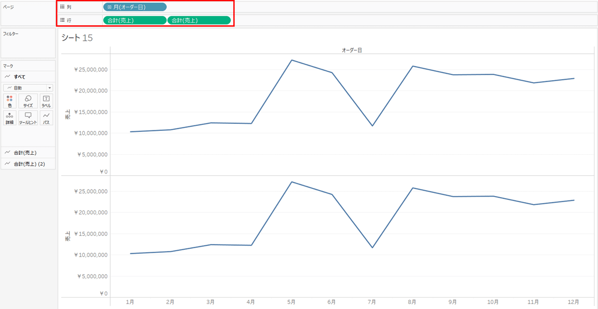
◆1:ペインを追加
列ペイン:「月(オーダー日)」
行ペイン:「合計(売上)」「合計(売上)」
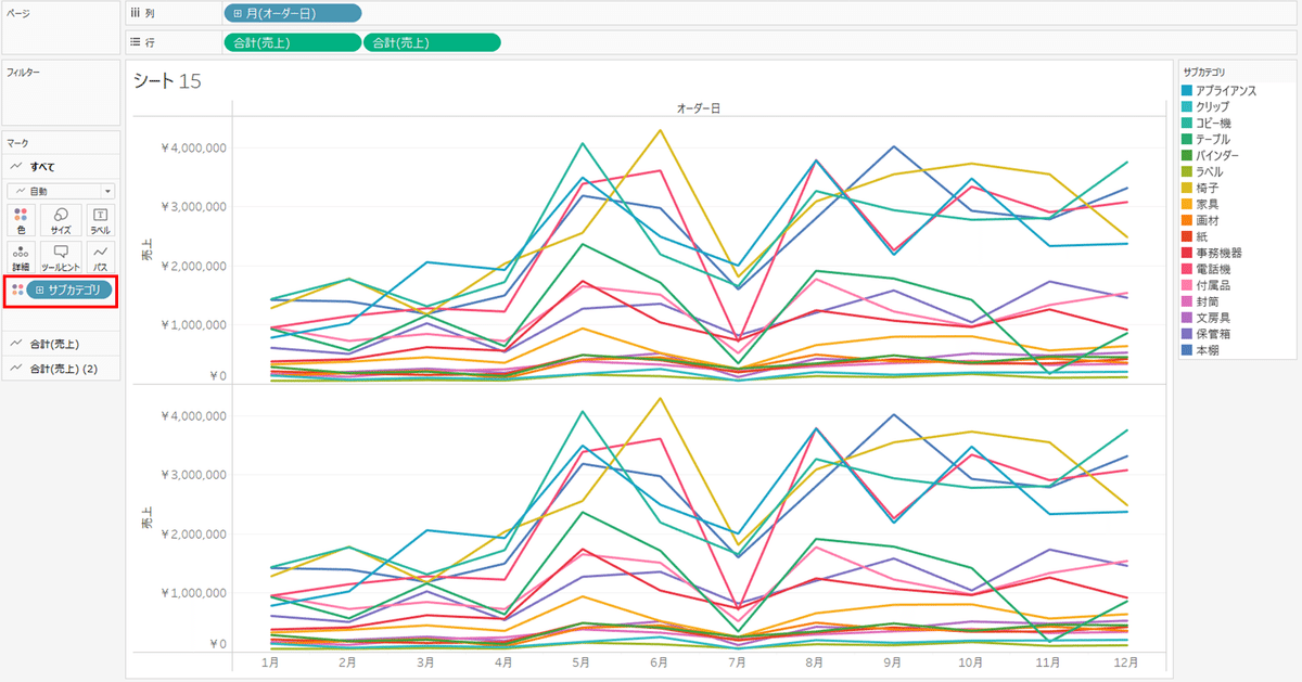
◆2:ランク付けしたいディメンションを追加
色に「サブカテゴリ」を追加
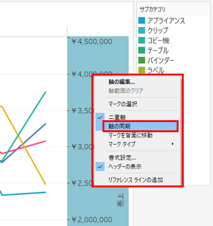
◆3:二重軸を作成
どちら一方の「合計(売上)」を"二重軸"設定にする
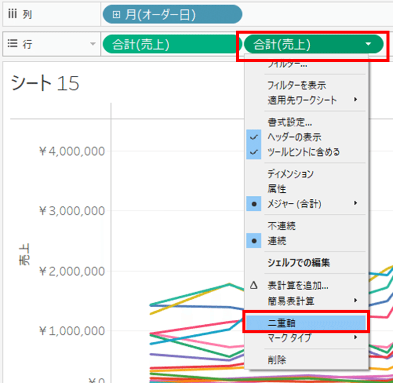
二重軸になっている事を確認
◆4:二重軸を同期
二重軸の上で右クリックし、「軸の同期」を選択
※メインの軸と同期し、同じグラフ尺度にする
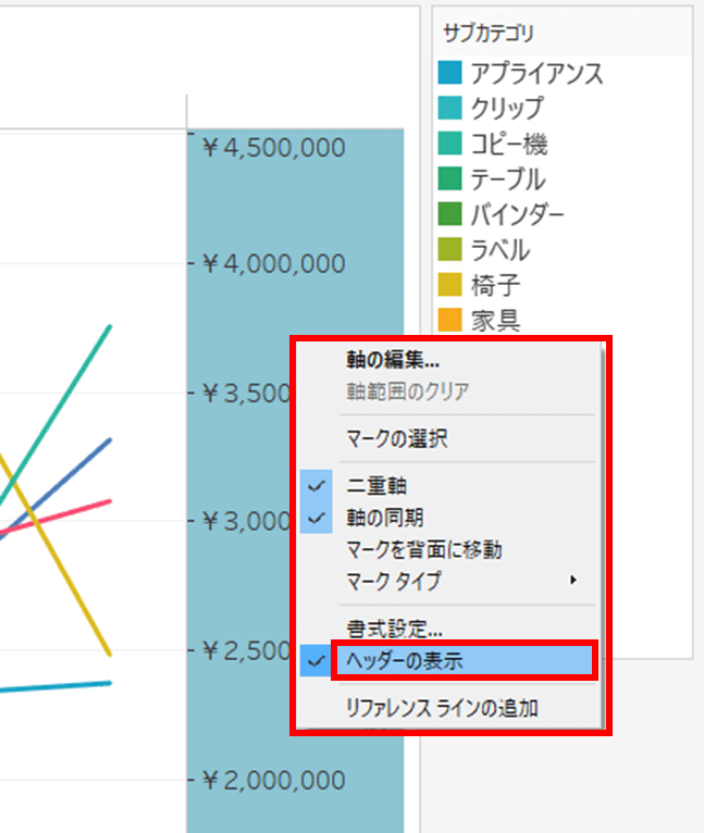
二重軸の上で右クリックし、「ヘッダーの表示」のチェックを外す
※メイン軸と同じ情報である為、二重軸のヘッダーを非表示にする
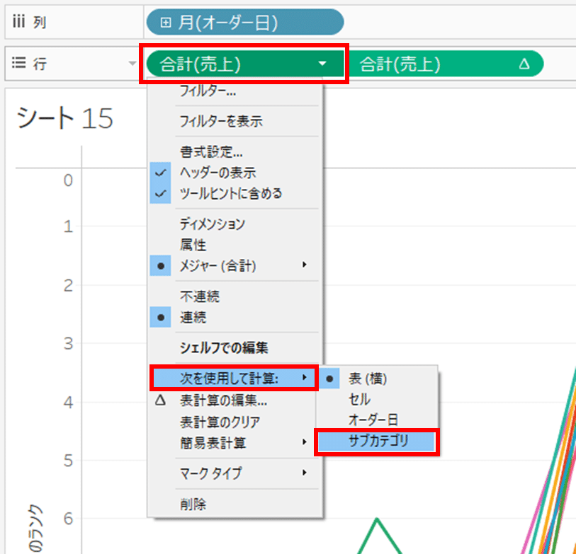
◆5:計算指標をランキングにする
行ペイン:「合計(売上)」の簡易表計算を「ランク」にする
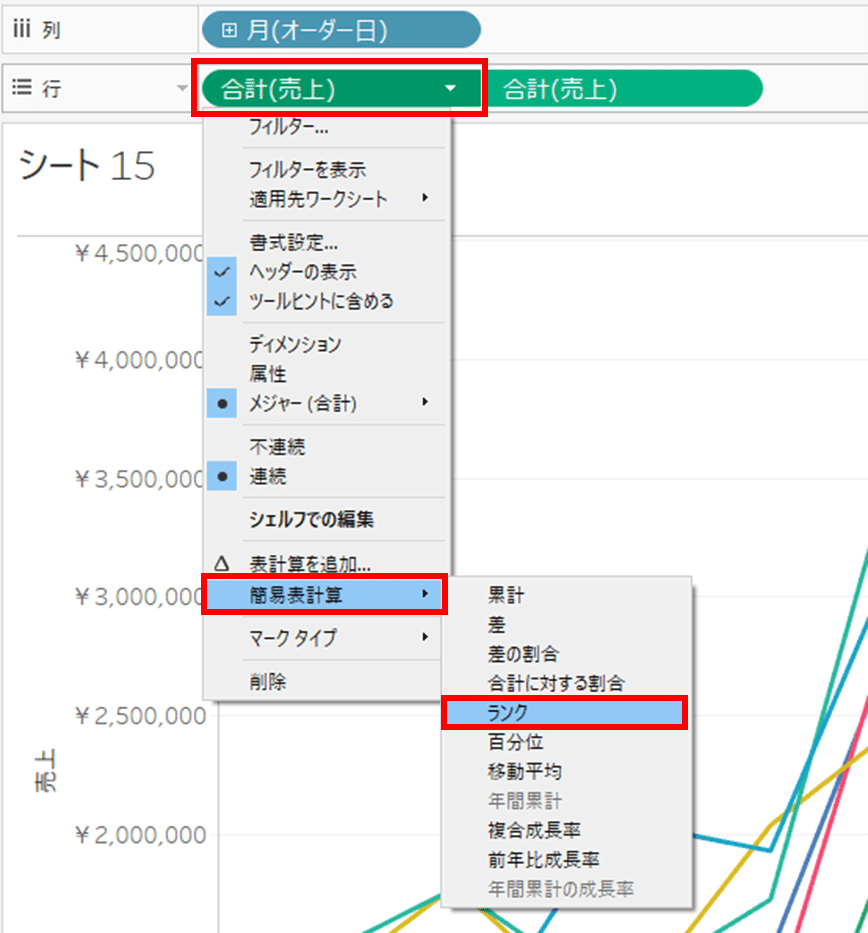
続けて、
行ペイン:「合計(売上)」の計算対象を「サブカテゴリ」にする
二重軸側の行ペイン:「合計(売上)」も同様に行う
・簡易表計算 ⇒ 「ランク」
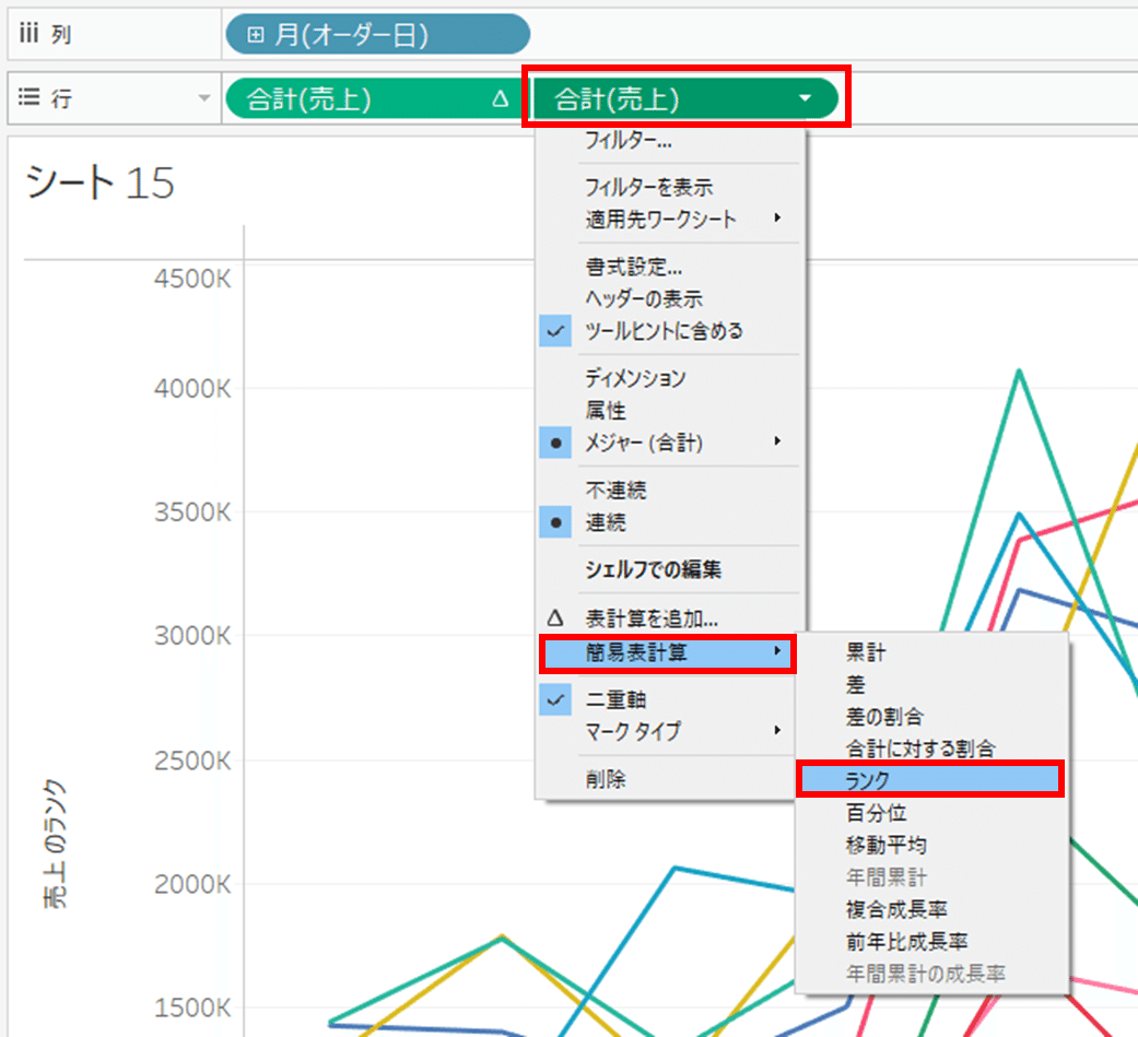
・計算対象 ⇒ 「サブカテゴリ」
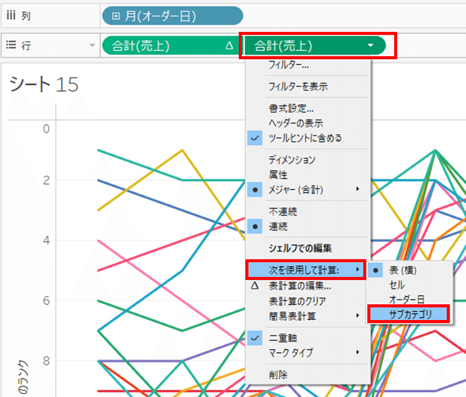
サブカテゴリがランク別になっている事を確認
◆6:軸を降順から昇順にする
軸上で右クリックし、「軸の編集」をクリックする
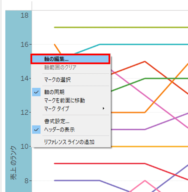
「軸の編集」のスケール「反転」を選択し、右上の「✕」をクリックする
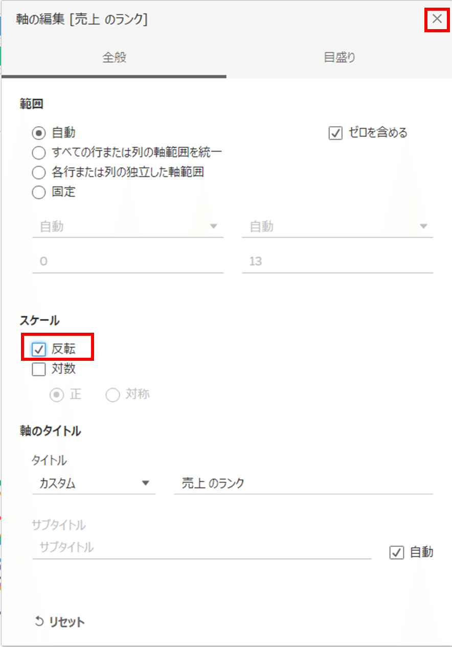
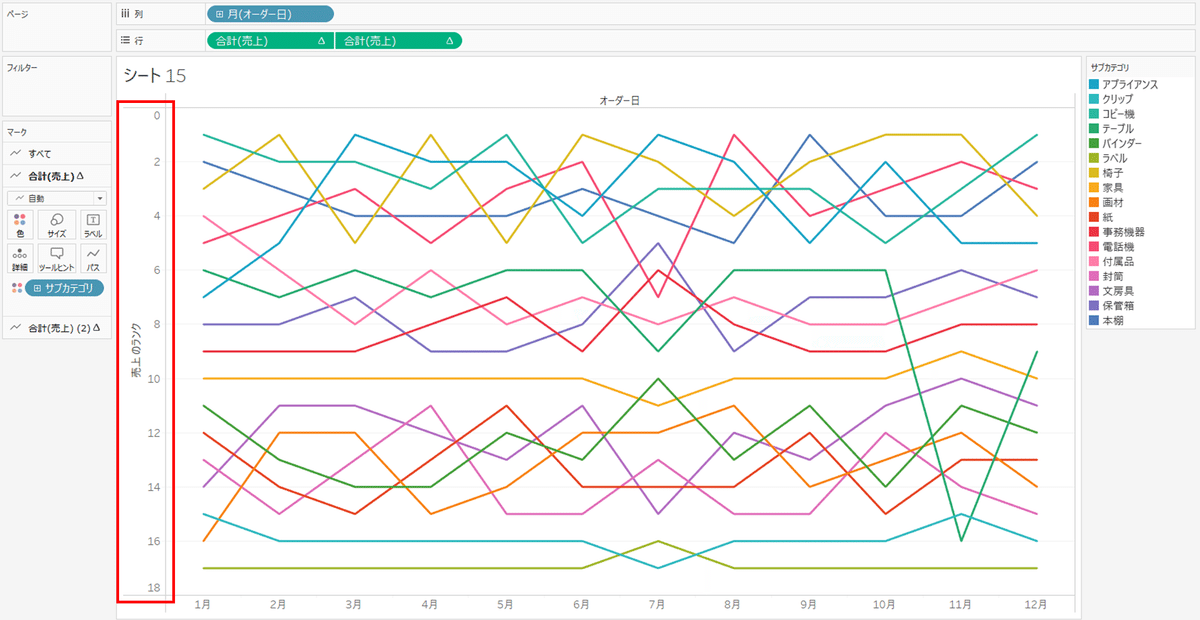
軸が昇順になっている事を確認
◆7:売上のグラフを円グラフに変更
マークの「合計(売上)(2)」のグラフを「円」に変更する
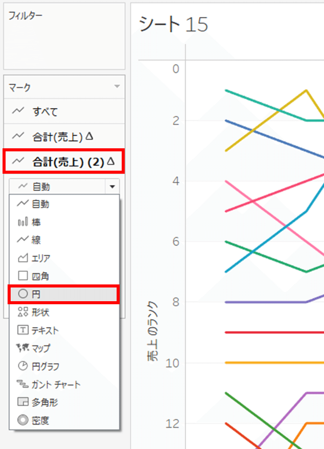
ランクチャートになる事を確認
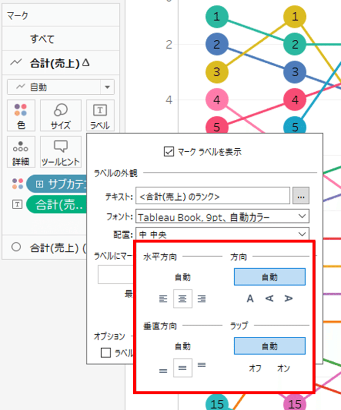
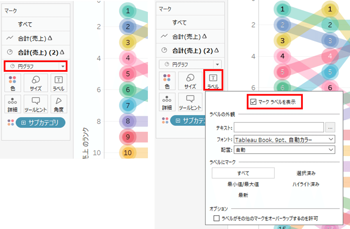
◆8:ランキングを表示させる
マークの「合計(売上)」のラベルに行ペインの「合計(売上)」をドラック&ドロップする
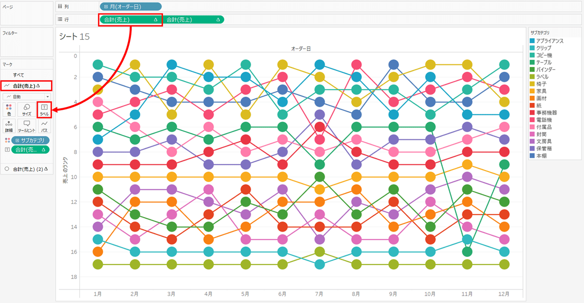
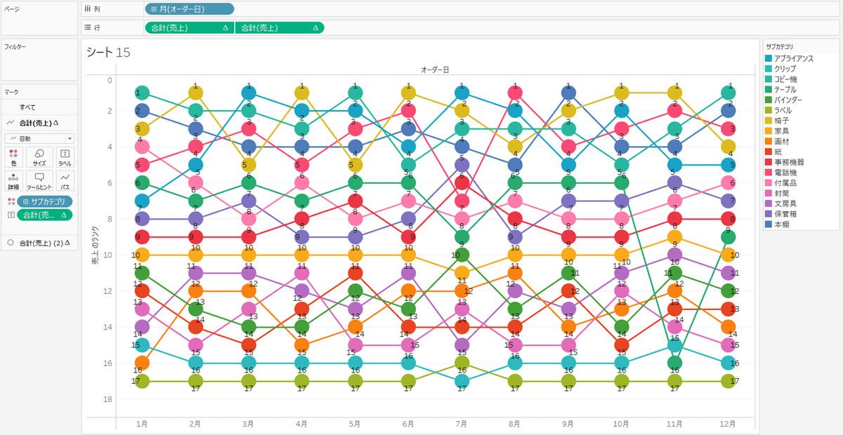
ランキング数が表示されている事を確認
また、
ラベルをクリックし、配置をクリック
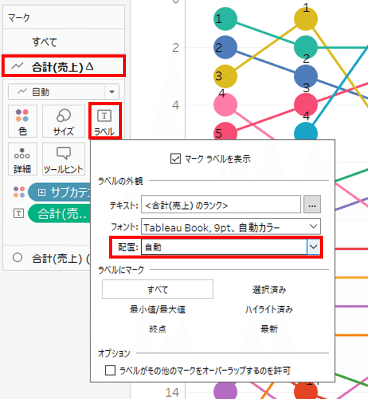
水平・垂直方向の配置を選択する
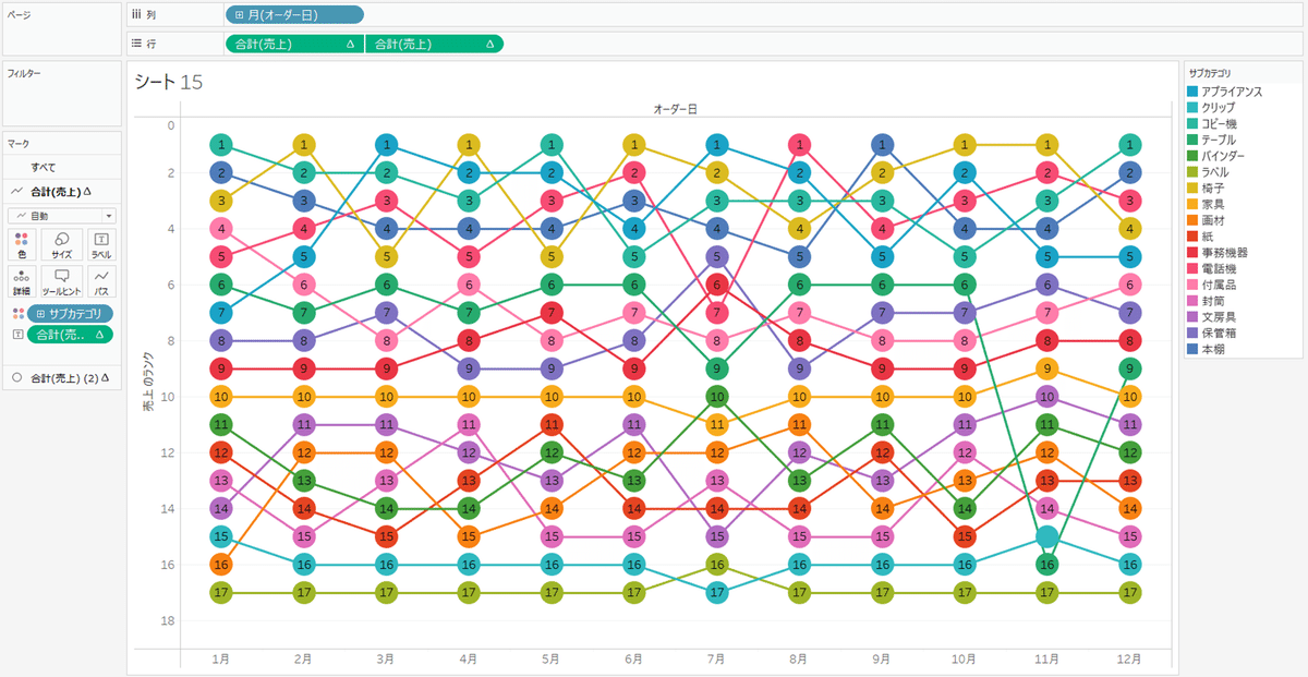
◆9:ランクチャートが完成!!
ひとまず、ランクチャートは完成です!
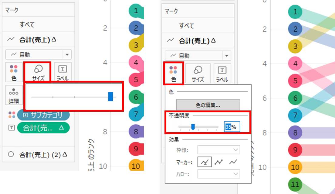
◆10:微調整してみましょう…
【マークの「合計(売上)」】
・サイズ:大きくする
・色:透明にする(例:35%)
【マークの「合計(売上)(2)」】
・サイズ:小さくする
・色:透明にする(例:35%)
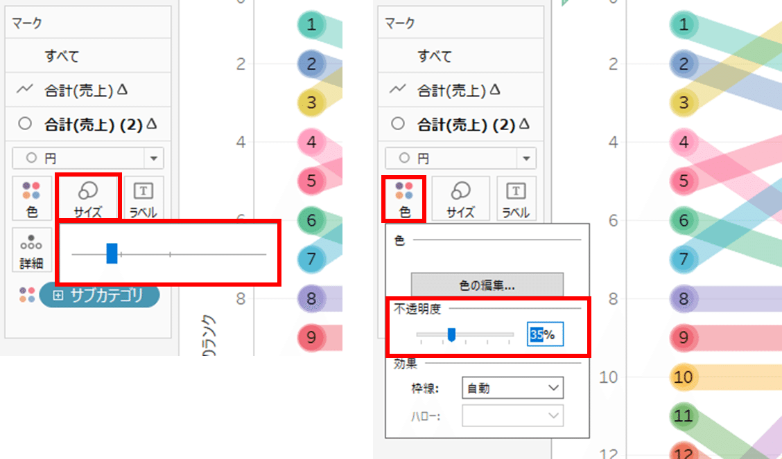
・グラフ:円グラフに変更する
・ラベル:マークラベルを表示を選択する
※文字のフォント、太字、カラーを選択する
完成です!
個人的には、◆9のランクチャートよりも見やすく出来たかなと思ってたりします…
お疲れ様でした!