
pythonのmatplotlibで角速度と倍角公式を可視化する

三角関数の角度を示す変数を2倍にしてみます。なんとなく、振幅がゆったりになるような気がしますが、実際にはその逆になります。
このことは、時間当たり波がどれくらい進むかを考えるとイメージしやすくなります。
例えば1秒間に1周期($${2\pi}$$)進む波は周波数 f = 1とします。すると1秒間にどれくらい進むかは角速度といい、ギリシア文字の$${\omega}$$で表します。そこで周波数1と周波数2のsinの角速度を次の通りとしてグラフを描いてみます。
$${\omega _1 = 2\pi\times 1 =2\pi}$$
$${\omega _2 = 2\pi\times 2 =4\pi}$$
import numpy as np
import matplotlib.pyplot as plt
N = 100
t = np.linspace(-1, 1, N)
omega_1 = 2 * np.pi * 1
omega_2 = 2 * np.pi * 2
sin_1 = np.sin(t * omega_1)
sin_2 = np.sin(t * omega_2)
fig ,ax = plt.subplots()
plt.rcParams["figure.figsize"] = (6, 4)
ax.set_title( r'$ f=1:\omega=2\pi$と$ f=2:\omega=4\pi$のグラフ', loc = 'center', pad=30, fontname="MS Gothic", fontsize = 24)
ax.plot(t, sin_1, color='g', label= r'$f=1:\omega=2\pi$')
ax.plot(t, sin_2, color='r', label= r'$f=2:\omega=4\pi$')

ax.set_xlabel('t', loc = 'right', labelpad=-30)
ax.set_yticks([-1, -1/2**0.5, -0.5, 0,0.5, 1/2**0.5,1])
ax.set_yticklabels( [ '-1', r'$-\frac{1}{\sqrt{2}}$',r'$-\frac{1}{2}$', '0',r'$\frac{1}{2}$',r'$\frac{1}{\sqrt{2}}$','1'])
ax.spines['left'].set_position('zero')
ax.spines['bottom'].set_position(('data', 0))
ax.spines["right"].set_color("none")
ax.spines["top"].set_color("none")
ax.legend( bbox_to_anchor=(1, 0.2))
ax.set_aspect(0.5, adjustable='box')
ax.grid(which = "major", axis = "x", color = "green", alpha = 0.8,
        linestyle = "--", linewidth = 0.5)
ax.grid(which = "major", axis = "y", color = "green", alpha = 0.8,
        linestyle = "--", linewidth = 0.5)
plt.show()
このように、$${\omega = 2\pi}$$より$${\omega = 4\pi}$$と2倍になると、波が細かく進むようになります。
ところで、$${\sin 2 \theta=2 \sin \theta\cos \theta}$$という倍角公式があるので当てはめてみます。
import numpy as np
import matplotlib.pyplot as plt
N = 100
theta = np.linspace(-2*np.pi, 2*np.pi, N)
sin_ = np.sin(theta)
sin_2 = np.sin(2*theta)
mul_ = 2 * sin_ * cos_
fig ,ax = plt.subplots()
plt.rcParams["figure.figsize"] = (6, 4)
ax.set_title( r'$\sin 2 \theta$と$2 \sin \theta \cos \theta$の関係', loc = 'center', pad=30, fontname="MS Gothic", fontsize = 24)
ax.plot(theta, sin_, color='g', linewidth=1, label= r'$\sin \theta$')
ax.plot(theta, sin_2, color='g', linewidth=8, alpha = 0.2, label= r'$\sin 2\theta$')
ax.plot(theta, mul_, color='r', linewidth=1,label= r'$2 \times  \sin\theta \times \cos \theta$')
ax.set_xticks([-2*np.pi,-1.5*np.pi, -np.pi,-0.5*np.pi,0,0.5*np.pi, np.pi,1.5*np.pi, 2*np.pi])
ax.set_xticklabels( [ '-2π',r'$-\frac{3}{2} \pi$' ,'-π', r'$-\frac{π}{2} \pi$','',
        r'$\frac{π}{2} \pi$','π', r'$\frac{3}{2} \pi$', '2π'])
ax.set_xlabel(r'$\theta$', loc = 'right', labelpad=-30)
ax.set_yticks([-1, -1/2**0.5, -0.5, 0,0.5, 1/2**0.5,1])
ax.set_yticklabels( [ '-1', r'$-\frac{1}{\sqrt{2}}$',r'$-\frac{1}{2}$', '0',r'$\frac{1}{2}$',r'$\frac{1}{\sqrt{2}}$','1'])
ax.spines['left'].set_position('zero')
ax.spines['bottom'].set_position(('data', 0))
ax.spines["right"].set_color("none")
ax.spines["top"].set_color("none")
ax.legend( bbox_to_anchor=(1, 0.2))
# ax.set_aspect(2, adjustable='box')
ax.grid(which = "major", axis = "x", color = "green", alpha = 0.8,
       linestyle = "--", linewidth = 0.5)
ax.grid(which = "major", axis = "y", color = "green", alpha = 0.8,
       linestyle = "--", linewidth = 0.5)
plt.show()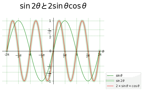
うまく重なりました。本当に興味が尽きません。
この記事が気に入ったらサポートをしてみませんか?