
PythonのMatplotlibでsinとconの関係を視覚的に捉える

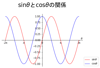
$${\cos \theta}$$のグラフを$${\sin \theta}$$のグラフを比較すると、$${\frac{\pi}{2}}$$だけ左に寄っています。
これを右にずらして$${\cos \theta}$$のグラフに重ねることを考えます。このために$${\cos \left(\theta-\frac{\pi}{2}\right)}$$ようにします。公式でいうと
$${\sin \theta=\cos \left(\theta-\frac{\pi}{2}\right)}$$となります。早速グラフにしてみます。
import numpy as np
import matplotlib.pyplot as plt
N = 100
theta = np.linspace(-2*np.pi, 2*np.pi, N)
sin_ = np.sin(theta)
cos_ = np.cos(theta - np.pi/2)
fig ,ax = plt.subplots()
plt.rcParams["figure.figsize"] = (6, 4)
ax.set_title(r'$\sin \theta$と$\cos \left(\theta- \frac{\pi}{2}\right)$の関係', loc = 'center', pad=30, fontname="MS Gothic", fontsize = 24)
ax.plot(theta, sin_, color='r', linewidth=8, alpha = 0.2, label= r'$\sin \theta$')
ax.plot(theta, cos_, color='g', linewidth=1,label= r'$\cos \left(\theta- \frac{\pi}{2}\right)$')
ax.set_xticks([-2*np.pi,-1.5*np.pi, -np.pi,-0.5*np.pi,0,0.5*np.pi, np.pi,1.5*np.pi, 2*np.pi])
ax.set_xticklabels( [ '-2π',r'$-\frac{3}{2} \pi$' ,'-π', r'$-\frac{π}{2} \pi$','',
         r'$\frac{π}{2} \pi$','π', r'$\frac{3}{2} \pi$', '2π'])
ax.set_xlabel(r'$\theta$', loc = 'right', labelpad=-30)
ax.set_yticks([-1, -1/2**0.5, -0.5, 0,0.5, 1/2**0.5,1])
ax.set_yticklabels( [ '-1', r'$-\frac{1}{\sqrt{2}}$',r'$-\frac{1}{2}$', '0',r'$\frac{1}{2}$',r'$\frac{1}{\sqrt{2}}$','1'])
ax.spines['left'].set_position('zero')
ax.spines['bottom'].set_position(('data', 0))
ax.spines["right"].set_color("none")
ax.spines["top"].set_color("none")
ax.legend( bbox_to_anchor=(1, 0.2))
ax.set_aspect(4, adjustable='box')
ax.grid(which = "major", axis = "x", color = "green", alpha = 0.8,
        linestyle = "--", linewidth = 0.5)
ax.grid(which = "major", axis = "y", color = "green", alpha = 0.8,
        linestyle = "--", linewidth = 0.5)
plt.show()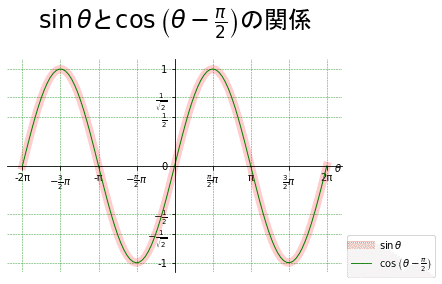
上手くグラフを作ることができると、重なってしまい両者の関係がわからなくなってしまいます。そこで、10行目で線の太さを8、また透明度(alpha)を0.2とします。alphaは0~1の間で指定し、数値が大きいほど透明度は低くなります。このことにより、図のように$${\cos \left(\theta-\frac{\pi}{2}\right)}$$とnp.sin(theta)が等しいことがはっきりします。グラフにするとイメージしやすくなります。
この記事が気に入ったらサポートをしてみませんか?