
Python matplotlibのグラフの種類

Pythonではmatplotlibを使い、簡単にグラフを描くことができます。この中でスタイルを上手く設定することで、グラフの印象を変えることができます。そこで、このグラフのスタイルの一覧をるプログラムを作成しました。
import numpy as np
import matplotlib.pyplot as plt
import matplotlib.style
x = np.arange(0.0, 15.0, 0.1)
y1 = np.sin(x)
y2 = np.cos(x)
mystyle=matplotlib.style.available
for i , v in enumerate(mystyle):
print(i,v)
matplotlib.style.use(mystyle[i])
fig, ax = plt.subplots(figsize=(6, 4))
ax.plot(x, y1, label='sin')
ax.plot(x, y2, label='cos')
ax.legend()
fig.suptitle(mystyle[i])
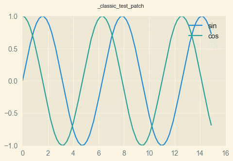
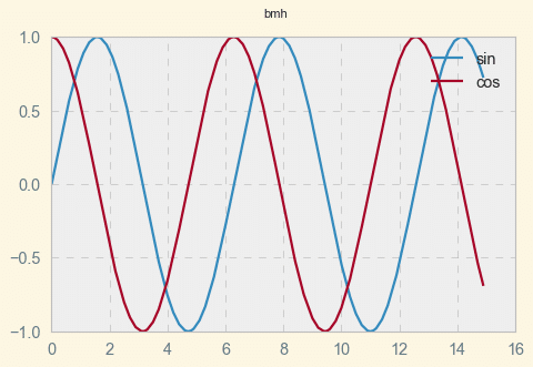
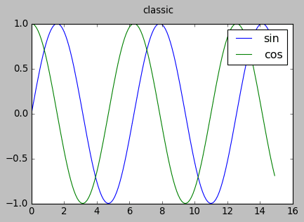
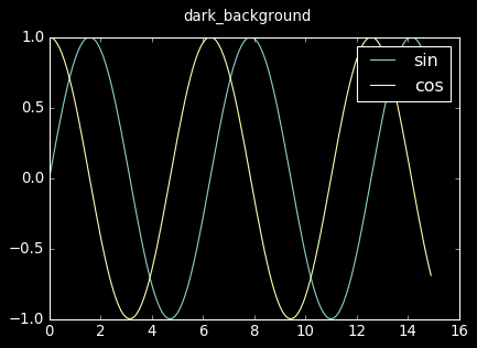
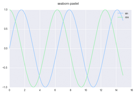
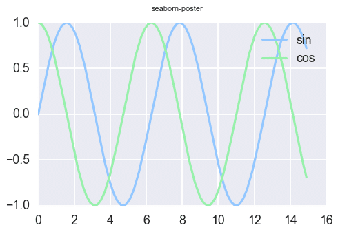
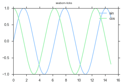
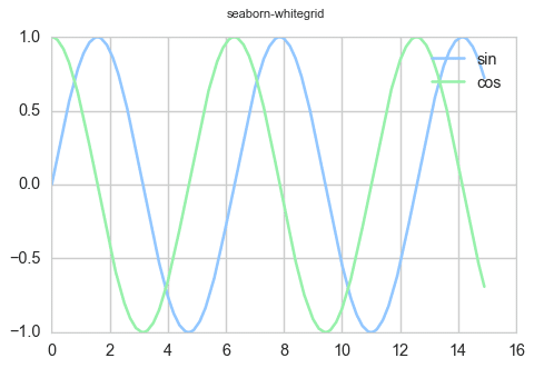
plt.show()次の通り、種類のスタイルがあることがわかりました。
0 Solarize_Light2

1 _classic_test_patch
2 bmh
3 classic
4 dark_background
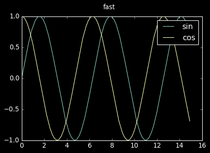
5 fast
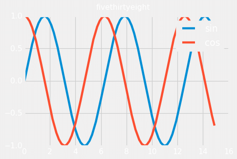
6 fivethirtyeight
7 ggplot

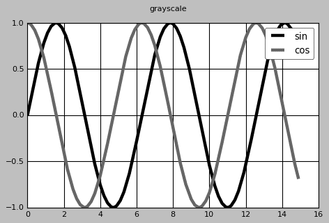
8 grayscale
9 seaborn

10 seaborn-bright

11 seaborn-colorblind

12 seaborn-dark

13 seaborn-dark-palette

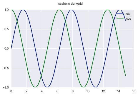
14 seaborn-darkgrid
15 seaborn-deep

16 seaborn-muted

17 seaborn-notebook

18 seaborn-paper

19 seaborn-pastel
20 seaborn-poster
21 seaborn-talk

22 seaborn-ticks
23 seaborn-white

24 seaborn-whitegrid
25 tableau-colorblind10

全部で26種類もあります。個人的には最後の25 tableau-colorblind10がしゃれているように感じます。
この記事が気に入ったらサポートをしてみませんか?