
LangChainによるCode Interpreterオープンソース実装を試す

先日OpenAIからChatGPTのCode Interpreter が公開されて、その能力の高さと応用範囲の広さから界隈で大騒ぎになっていますね。そのコードインタープリター機能をFunction Callingを利用して、LangChainでオープンソース実装を行う試みも始まったようです。
というわけで、さっそく簡単に試食してみます。なお、技術的な詳細などはLangChainの公式ブログやGitHubリポジトリなどをご参照ください。
概要
LangChainエージェント用のPythonコード実行環境として、専用のJupyterカーネルであるCodeBoxを準備し、その中でPythonインタープリターを実行することで機能を実現しているとのことです。
入力ファイルとして、ローカルのファイルも指定できますが、URLを指定するとネット情報も取得できる。
Google Colabで試してみる
簡単にGoogle Colab環境で試食してみます。
環境準備
!pip install codeinterpreterapi > /dev/nullimport os
os.environ["OPENAI_API_KEY"] = "YOUR OPENAI API KEY"日本語でも動作しますが若干不安定な印象なので、今のところ英語のプロンプトで指示するのがよさそうです。
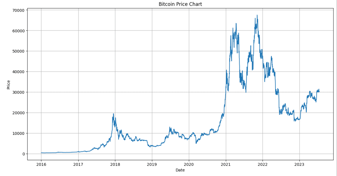
実行例① Bitcoinの価格変化
公式Code Interpreterと違って、普通にネット情報を漁ってくれる。
from codeinterpreterapi import CodeInterpreterSession

async with CodeInterpreterSession() as session:
    response = await session.generate_response(
        "2023現在までのbitcoinのチャートをプロットして"
    )

    print("AI: ", response.content)
    for file in response.files:
        file.show_image()
AI: Here is the Bitcoin price chart from 2016 to mid-July 2023. The chart shows the closing price of Bitcoin on each day. Please note that the data is only available up to July 18, 2023.
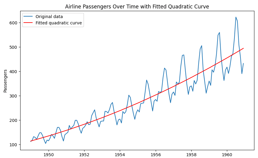
実行例② 航空旅客サンプルデータに近似曲線を追加
ローカルファイルを入力に指定もできますが、URL指定してネット情報も使える。
from codeinterpreterapi import CodeInterpreterSession

async with CodeInterpreterSession() as session:
    response = await session.generate_response(
        """
        Plot https://github.com/jbrownlee/Datasets/blob/master/airline-passengers.csv.
        Calculate the approximate curve with a quadratic function and plot it in red.

        """
    )

    print("AI: ", response.content)
    for file in response.files:
        file.show_image()
AI: Here is the plot of the original data along with the fitted quadratic curve. The original data is in blue, and the fitted quadratic curve is in red.
As you can see, the quadratic curve does a reasonable job of capturing the overall trend in the data. However, it doesn't capture the seasonal fluctuations in the number of passengers. For that, a more complex model might be needed.
Please note that this is a simple approximation and might not be the best model for this data. For a more accurate model, you might want to consider other factors and use more complex models.
====
AI:元のデータとフィットした2次曲線のプロットです。元のデータは青で、フィットした2次曲線は赤です。
ご覧のように、2次曲線はデータの全体的な傾向を捉えるのに適切なものです。しかし、乗客数の季節変動を捉えることはできない。そのためには、もっと複雑なモデルが必要かもしれません。
これは単純な近似であり、このデータに最適なモデルではないことにご注意ください。より正確なモデルのためには、他の要因を考慮し、より複雑なモデルを使用した方がよいでしょう。
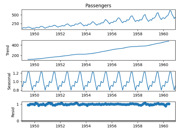
実行例③ ②の課題を詳しく分析してもらう
# 以下の時系列データについて適切なモデルを検討し、結果を可視化してください。
"""
Please consider the appropriate model for the following time series data and
visualize the results.
https://github.com/jbrownlee/Datasets/blob/master/airline-passengers.csv
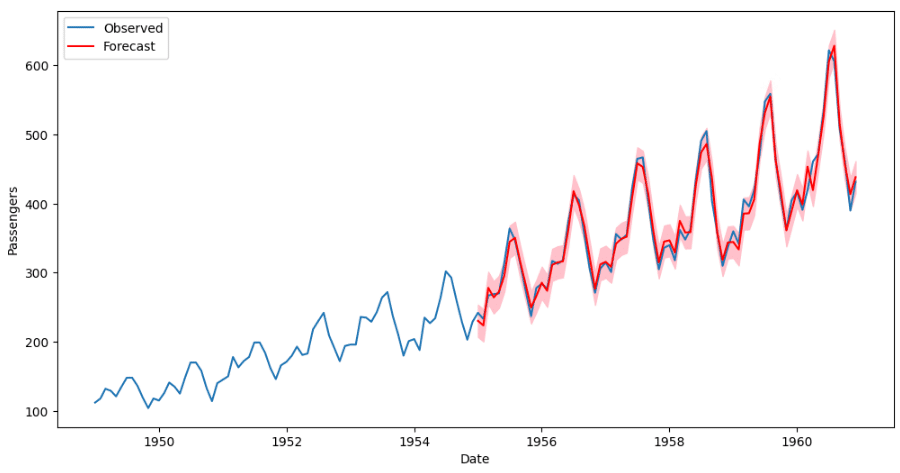
"""AI:プロットの赤線は、1955年から始まるSARIMAモデルによる乗客数の予測値を表す。ピンクの網掛け部分は予測値の信頼区間を表す。
見てわかるように、このモデルはデータの全体的な傾向と季節性をうまく捉えているようです。予測値は観測値とよく一致しており、SARIMAモデルがこのデータによく適合していることを示唆しています。
モデルはデータによくフィットしているように見えますが、適切な指標(平均絶対誤差、二乗平均平方根誤差など)を使ってモデルのパフォーマンスを評価し、可能であればホールドアウトテストセットで検証するのが常に良いアイデアであることに注意してください。
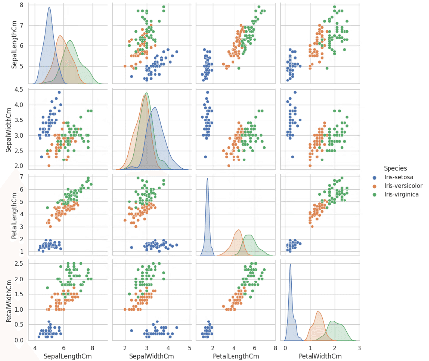
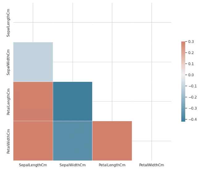
実行例④ アイリスデータのEDA
from codeinterpreterapi import CodeInterpreterSession

async with CodeInterpreterSession() as session:
    response = await session.generate_response(
        """
        Analyze this dataset and plot something interesting about it.
        https://github.com/shroominic/codeinterpreter-api/blob/main/examples/assets/iris.csv
        """
    )

    print("AI: ", response.content)
    for file in response.files:
        file.show_image()
AI: The heatmap above shows the correlation between the numerical variables in the dataset. The color in each cell represents the strength and direction of the correlation: dark blue for strong negative correlation, white for no correlation, and dark red for strong positive correlation.
From the heatmap, we can observe that:
1. PetalLengthCm and PetalWidthCm have a strong positive correlation. This means that as the petal length increases, the petal width also tends to increase, and vice versa.
2. SepalLengthCm also has a positive correlation with PetalLengthCm and PetalWidthCm, but not as strong as the correlation between PetalLengthCm and PetalWidthCm.
3. SepalWidthCm, on the other hand, has a negative correlation with the other three variables. This means that as the sepal width increases, the other measurements tend to decrease, and vice versa.
These observations can be useful for predicting the species of a flower based on these measurements. For example, a flower with a long petal length and a wide petal width is likely to be a different species than a flower with a short petal length and a narrow petal width.
====
AI: 上のヒートマップは、データセット中の数値変数の間の相関を示す。各セルの色は、相関の強さと方向を表す:濃い青は強い負の相関、白は相関なし、濃い赤は強い正の相関である。
ヒートマップから、次のことが観察できる:
1. PetalLengthCmとPetalWidthCmは強い正の相関がある。
2. SepalLengthCmもPetalLengthCmとPetalWidthCmと正の相関があるが、PetalLengthCmとPetalWidthCmの相関ほど強くない。
3. 一方、SepalWidthCmは他の3つの変数と負の相関がある。これは、がく片の幅が大きくなると、他の測定値が小さくなる傾向があり、逆もまた同様であることを意味する。
これらの観察は、これらの測定値に基づいて花の品種を予測するのに有用である。例えば、花弁の長さが長く、花弁の幅が広い花は、花弁の長さが短く、花弁の幅が狭い花とは異なる種である可能性が高い。
感想
まだまだ粗削りな印象もありますが、もともとのGPT自体の性能、素性が良いためでしょうか、今の段階でも実行結果の品質はとても良いと思いました。今後、LangChainのAgent機能や各種ツールと連携されるようになり、自由にLLMが計算機資源やデータベース、ネット情報にアクセスできるようになると、さらに一歩世界が大きく変わりそうです。楽しみですね。
おしまい
この記事が気に入ったらサポートをしてみませんか?