
[第2回] matplotlibを使ってグラフを作ってみる

jupyter notebookとpythonを利用した分析講座となっております。
データフレーム
・jupyter notebookに下記コードを読み込ませてデータフレームを作成する
# グラフ化に必要なものの準備
import matplotlib as mpl
import matplotlib.pyplot as plt
import japanize_matplotlib

# データの扱いに必要なライブラリ
import pandas as pd
import numpy as np
import datetime as dt

# グラフのスタイル設定
plt.style.use('ggplot')
font = {'family' : 'TakaoPGothic'}

# CSV読込
url = 'https://vincentarelbundock.github.io/Rdatasets/csv/robustbase/ambientNOxCH.csv'
df_sample = pd.read_csv(url, parse_dates=True, index_col=1)

# dfの準備
df = df_sample.iloc[:, 1:]

# df_monthlyの準備
df_monthly = df.copy()
df_monthly.index = df_monthly.index.map(lambda x: x.month)
df_monthly = df_monthly.groupby(level=0).sum()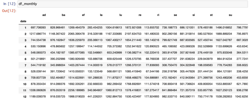
グラフの作成
jupyter notebookにそれぞれ下記のコマンドを入力してグラフを作成する
bar chart
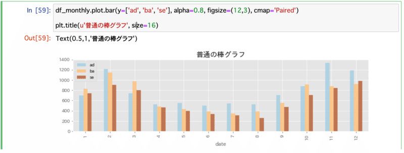
df_monthly.plot.bar(y=['ad','ba','se'], alpha=0.8, figsize=(12,3), cmap='Paired')bar chart 積上
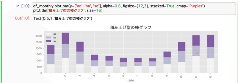
df_monthly.plot.bar(y=['ad','ba','se'], alpha=0.8, figsize=(12,3), stacked=True, cmap='Purples')Line Chart
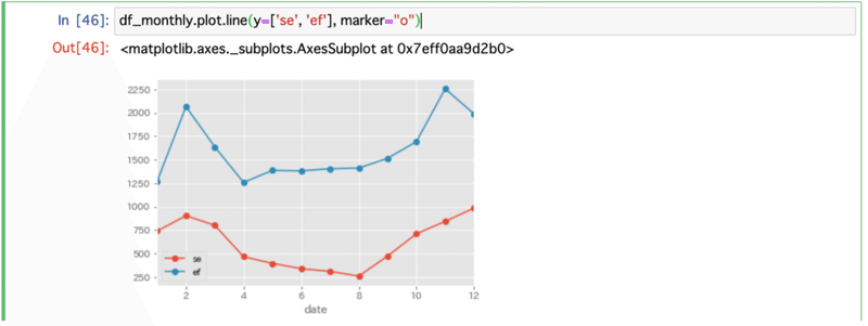
df_monthly.plot.line(y=['se','ef'], marker='o')pie chart
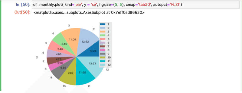
df_monthly.plot(kind='pie', y='se', figsize=(5,5), cmap='tab20', autopct='%.2f')ヒストグラム
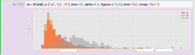
ax= df.plot(y=['ad','ba','ef'], bins=50, alpha=0.5, figsize=(16,4), kind='hist' cmap='Set1')散布図
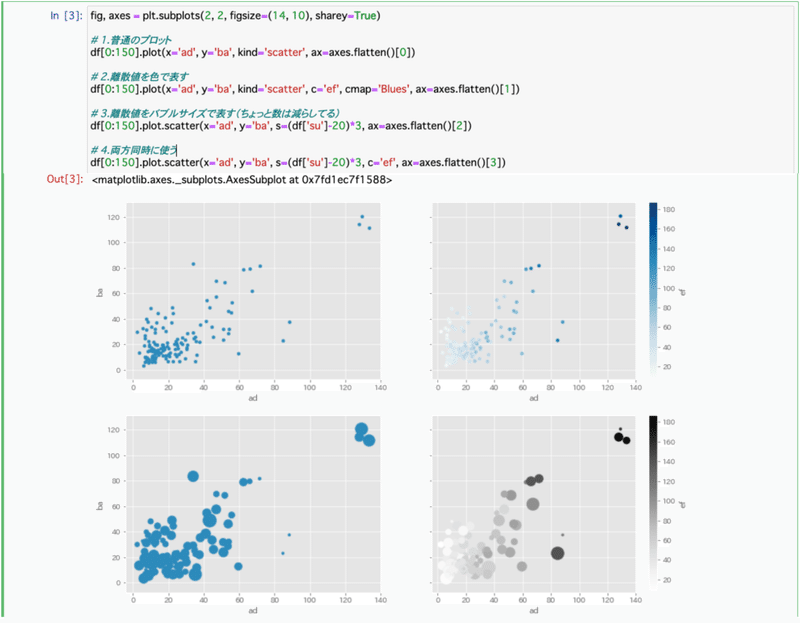
エリアチャート
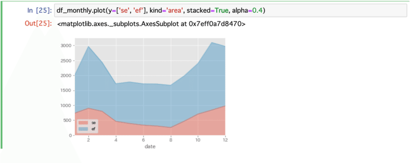
df_monthly.plot(kind='area', y=['se','ef'], stacked=True, alpha=0.4)はこひげ
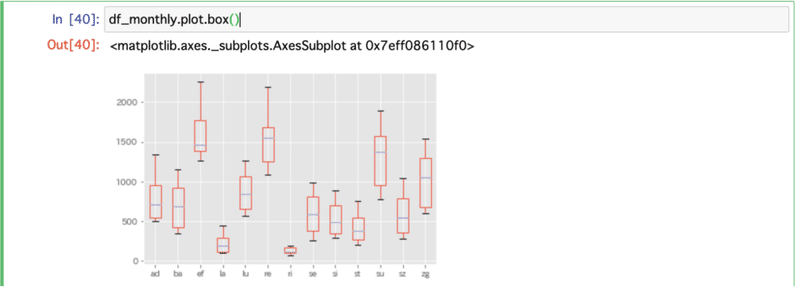
df_monthly.plot.box()次回講座
この記事が気に入ったらサポートをしてみませんか?