「エレオノール」3 major differences between Western and Japanese websites

This is Eléonore from Apparel Web, Global Team member. Today, I am in charge of writing our weekly note.
In my current work, I noticed that expanding a business to an international scale is a true challenge, especially when it comes from Japan : let's focus on the web part of this process.
A website is the front store of an e-commerce shop, so it has to be eye-catching, understandable, and obey to UX basic rules.
In terms of webdesign and marketing content, Japan has its own standards, differing from the rest of the world ; which makes Japanese companies more difficult to localize abroad, if no experience or knowledge about foreign business.
At this level, localization is not just about content, but also website architecture and design which are quite divergent from the West.
DISCLAIMER : there is no good or bad webdesign, just two versions of how a website can be built and perceived by visitors. Any judgement, nor opinion will be pronounced in this article.
From now on, let's summarize some of the non-exhaustive differences between Japanese and Western websites.
1. DESIGN
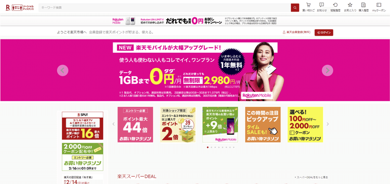
Japanese webdesign is known for its colorful-flashy touch and crowded structure, with small information and advertisements everywhere on the page.
However, Western websites tend to be sober, with maximum 2 or 3 variations of color. These websites below are famous e-commerce platforms in France (Fnac.com) and in the US (Walmart.com).
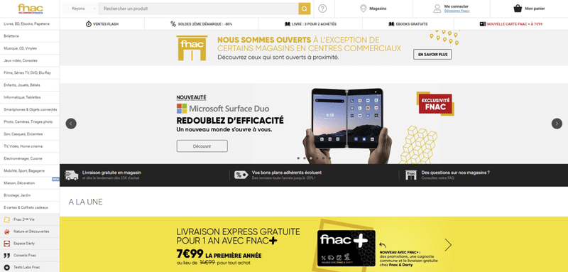
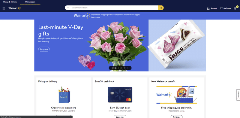
Both websites are very sober, a minimalist design and share the same architecture : menu on the left, search bar on the top, and a few basic and important promotions and information displaying.
Because these e-commerce websites have many categories and can be easily fuzzy, a simple and effective architecture matters, with harmonized tones.
Also, flashy colors are absolutely not trendy in Europe or North America, and will make it look like a non-serious website with 20 years late. It is important to consider this aspect while localizing.
2. CONTENT STRUCTURE
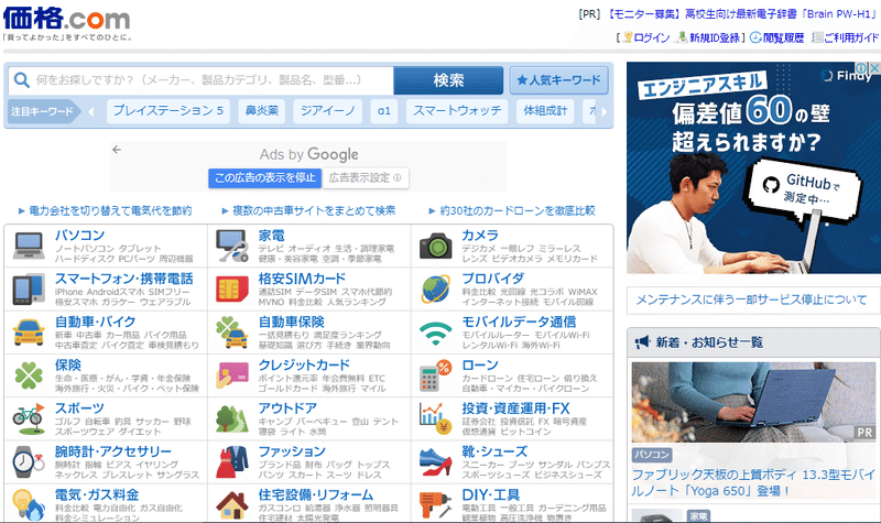
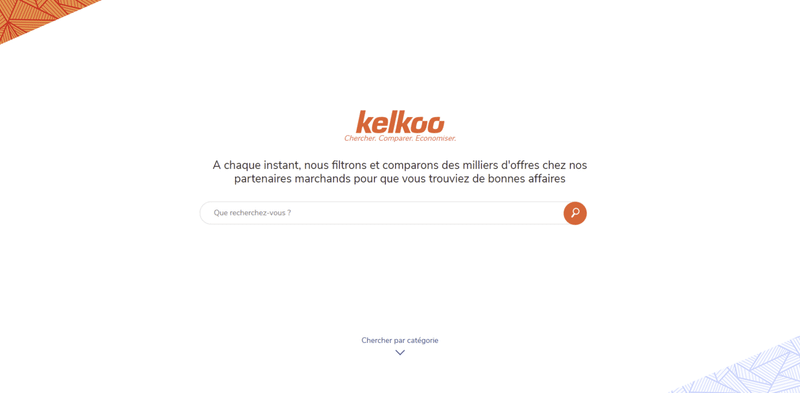
In this second part, let's take a look at the top page of two comparison shopping websites.
Here is the Japanese one :
then, the French one below :
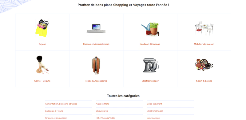
The amount of text on the French website is reduced on maximum, to allow the visitor to discover and experience the website and avoid confusion with too much information.
If Japanese users like to have many information on the top page to get aknowledge of the service, Western websites tend to priorize less information and more space to explore different categories of information through the navigation. Experience towards information.
Too much information with no hierarchy = visitors leaving the website right away.
3. BLOG USAGE
When it comes to content creation, I discovered two visions.
In Japan, a blog category is usually made for updates or self-promotions, like the example below.
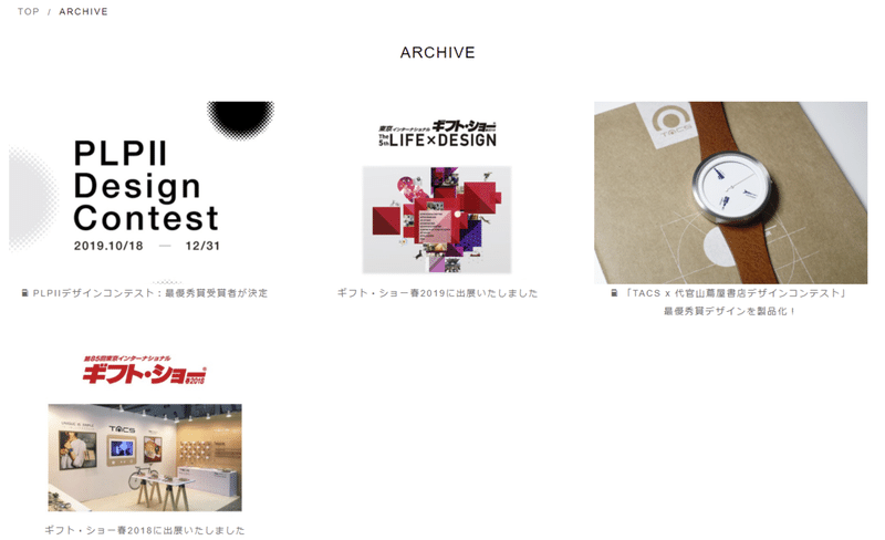
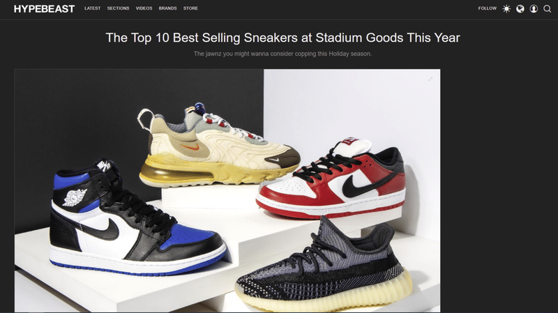
I noticed that on many websites, in order to share biggest events and information to people. In Europe and mostly in the rest of the world, blogs are dedicated to the creation of hot topics, related to the website's business.
Especially, small and medium competitive e-commerce websites are using it, in order to rank better on Google by writing clickbait topic titles and adding trendy keywords to optimize SEO and then getting more traffic.
Content creation on blog is an opportunity to feed its website, attract visitors and having a loyal audience sharing your articles.
I think these small differences are not easy to understand for Japanese people who never experienced a business expansion abroad ; and vice-versa. These cultural divergences are usually a source of confusion for a company, and need to be taken seriously.
この記事が気に入ったらサポートをしてみませんか?