ggplot2: y = x の補助線を引く

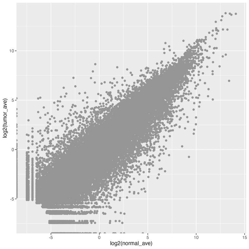
下記のような散布図があったとします。このうち、変動していない遺伝子は、normal (x軸)と tumor (y軸) の値が同じ、つまり、 y = x になっている点ということです。これを判断しやすいように、 y = x の補助線を引く例を紹介します。
geom_abline() で直線を追加
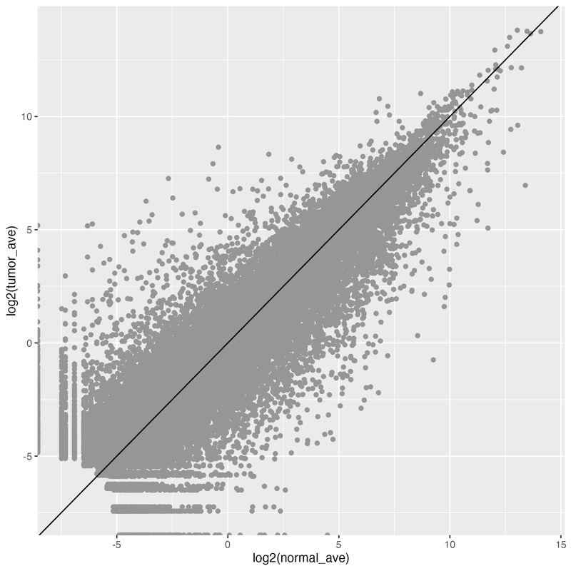
y = x の直線を追加するには、 geom_point() にプラスで続けて、 geom_abline() を追加します。
g + geom_point(color = "#969696") +
  geom_abline(slope = 1, intercept = 0)
引数として、傾き (slope) = 1 を、切片 (intercept) = 1 を指定しています。これで、y = x の直線が追加されます。
続けて指定すれば、複数の線を追加可能です。 y = x + 1, y = x, y = x - 1 の3本を追加しています。
g + geom_point(color = "#969696") +
  geom_abline(intercept =  1, linetype = "dotted", color = "red") +
  geom_abline(intercept =  0, linetype = "dotted") +
  geom_abline(intercept = -1, linetype = "dotted", color = "blue")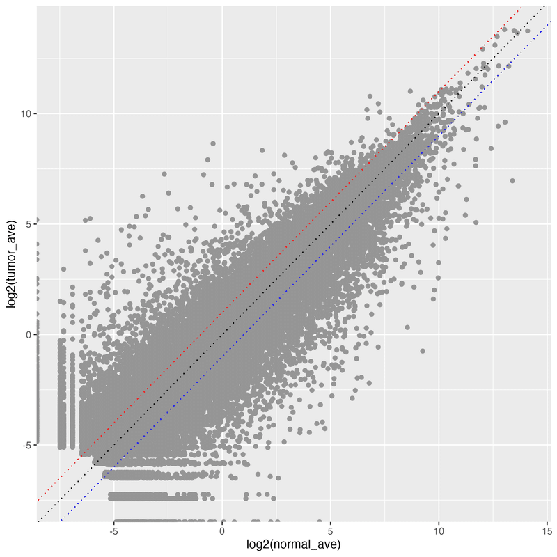
この記事が気に入ったらサポートをしてみませんか?