Chapter 2 - Web Design[Stukent]
Hi Guys It's Yoshinosuke, Nice to see you again! Today, I will learn about Web Design, which is one of the crucial parts of Digital marketing toward to successful. Web design might sound technical for people who are not familiar with that. But no worries, I'm not the person having that special skills and background. This chapter is helpful when you analyze, optimize, and work on web design with web engineer or web designer!
Previous Chapter
Learning Objectives of Web Design
Utilize multiple design philosophies to design and revise web pages to maximize conversion rate
Identify a variety of web page element that should be reviewed and decided upon when designing web pages
List the dimensions on which an ad and landing page should match to encourage conversion
Describe the various types of landing pages
What is a Good Web Design?
1. Design for usability
Every webpage should be designed that average users can find what they are looking for, and accomplish what they want without numerous effort.
Check lists to manage useful website as follow;
Follow website conversion
Create effective visual hierarchies
Break pages up into clearly defined areas
Make it obvious what is clickable
Eliminate distractions
Format content to support scanning
2. Conversion-centered design
Can the web design lead to create conversion? If not, the website should be optimized, because generating conversions is the one of the goal of digital marketing. These below elements are the point for it.
Attention - Our actions or call-to-action is proper for potential customers?
Context - Where do visitors come from? Does it match the expectations of customers?
Clarity - Is it clear from quick scan?
Congruence - Do all words encourage the conversion?
Credibility - Is there ample reasons to believe?
Closing - Does the website have positive messages to close to the desired click region?
Continuance - Can the website induce to next conversion?
3. Three questions design framework
To assess your website, if your website can provide clear answer for three questions, It will generate effective conversions
What are you offering?
Why should I pick you?
What do you want me to do next?
4. Customer Segments
Focusing on one segment is not effective, because customer needs are vary and changing sharply at any moments, so that each webpage should address multiple segments using another dimension or additional information.
5. Mobile First
Any design should primary mobile first. because mobile traffic has overtaken desktop traffic in volume.
To optimize it mobile-friendly, you should mainly pay attention to;
Text - especially clickable text, the text size is readable and clickable on mobile screen?
Image - If the image you use is too heavy or too large, it is not eligible
Navigation - is it working properly? Jumping to wrong page or area may sometimes happen.
6. Conversion Rate Optimization(CRO)
Gaining the highest possible conversion rate only comes through Conversion Rate Optimization(CRO). "A/B test" is the one way to optimize your webpage.
A/B Test
Comparison between two types of webpage.
You take the exist webpage(It is "A" version of webpage) and you make a change to some element of the page that you believe could improve conversion(It is "B" version of webpage).
And following guidelines are helpful to optimize your webpage with A/B Test
Make change based on data
Employ user experience tests when web analytics data is insufficient
Make changes based on web design principles
Avoid redesigns
Page Elements
1. Navigation
Navigation is helpful for any viewer to look for what they want to see. However, overusing the navigation will be distraction.
2. Trust Symbols
This is the primary purpose of branding. Trust symbols can show the trustworthiness to customers
Example of trust symbols
Accessible Return Policy and Guarantees

Brand Recognition and Awards

Positive Publicity

Social Media Presence
Video Demonstration and Testimonials

18 Web design techniques that instill trust in site visitors
Professional Photography
High-Quality Design
Guarantees
Accessible Return Policies
Accessible Privacy Policies
Secure Payment Gateway
Brand Recognitions and Awards
Testimonials
Client logos
Pictures of customers using the product or service
Video demonstration
Logos & links to organizations with which the company is affiliated
Readily available contact information proving the company is real
Accessible, detailed product information
Positive publicity
Social media presence
Third party credentials or certifications
Company contact information
3. Color Scheme
Choosing color is not much important. The more important thing is contrast. Using contrasting color to give direct attention is more crucial than choosing color.
4. Buttons
In your mind, creating a goal for you is important. Typically, the key button is "Call-to-Action(CTA)", such as "Add to cart", "Buy now" and so forth. You should highlight this button using gradients, borders, and shadows.
5. Image
Web pages are scanned, not read. Image can give huge impression for viewers. If the photographs don't look professional in any way, the webpage containing them will be untrustworthy.
6. Video
A lot of webpages are increasingly employing video contents which is funny, valuable, or informative, because of many advantages as follows;
Videos combine images and speech
If the video is professional, it lends credibility to the site
Watching videos is less effortful than reading
Videos are as useful to mobile users as they are to desktop users
7. Forms
Whether the website is generating leads or taking site visitor through the purchase process, the visitor will have to fill out a form.
10 Best practice for Form Optimization
Remove unnecessary form fields
Set the cursor so that it is already flashing in the first field
Frame the form so that it stands out on the page
Use a call to action that incentivizes the user to complete the form
Include a note that the form won't take long to fill out
Add an image or message reminding visitors what they get as soon as they complete the form
Make submission button that stands out
Test different layouts of form fields
When a form is complete, be sure a thank you/confirmation message or paper appears
Use browser cookies to auto fill appropriate fields for repeat visitors
Landing Pages
A landing page is the first website that a visitor to a site sees, and is a page that people see when they click on an ad. Landing pages don't need to back to the main website, so they don't have to follow the same structure or color scheme as the main website.
Landing Page Design
It never start a marketing campaign without a dedicated landing page
Three dimensions of landing page design that should match landing pages
Products/services
Message
Visual Component
Landing Page types
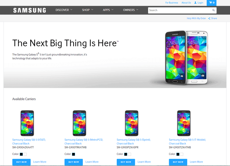
Single-Product Landing pages
If a company advertises a specific product, the landing page should be all about that same product. Visitors should see all of the following:
Product Image
Unique Value Proposition(UVP)
Call to Action
How to Proceed
Familiar color scheme & logo
Multi-products landing pages
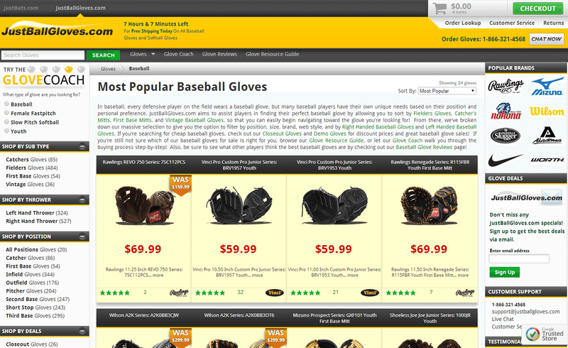
If a company advertises a product category instead of one specific product, anyone who clicks this ad should arrive at a landing page featuring multiple products from this product category.
The challenge compared to single product landing page is finding the best way to display multiple products without giving the visitor information overload. Prioritizing the best sellers and the products with the best margins show first.
Lead Generation Landing Pages
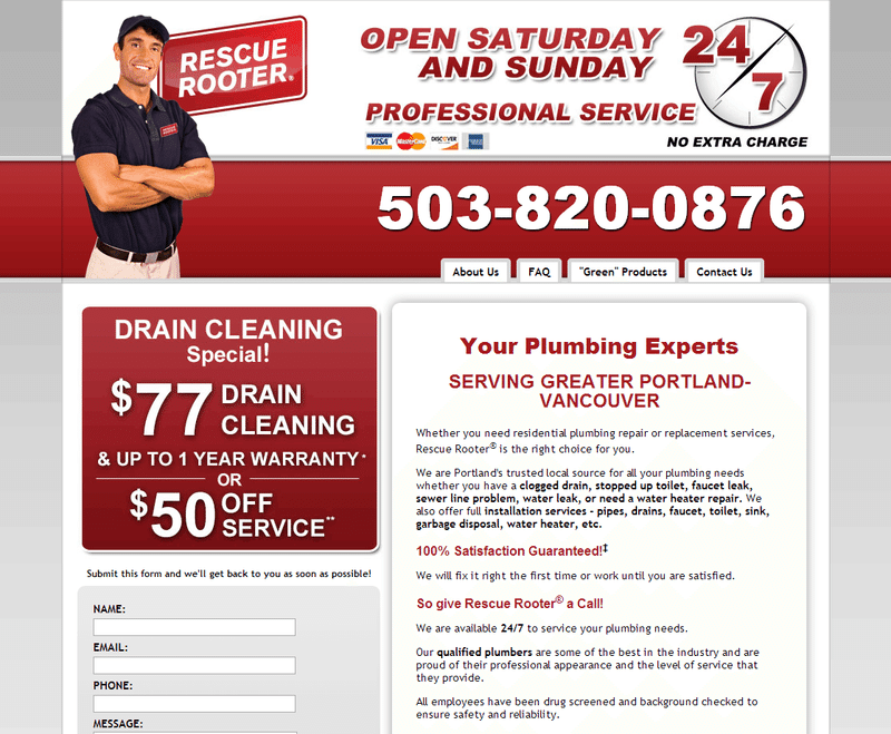
Most lead-generation sites want visitors to either call in or fill out a form. Thus a landing page should show a phone number prominently in the upper fold, typically with a call to action, and it may also provide a contact form with an additional call to action.
Subscription Landing Pages
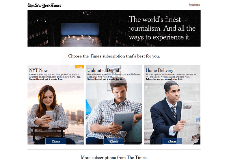
A media website makes more money as traffic increases, and one way to increase traffic is to sign visitors up for subscriptions. To do so, media sites will often use site overlays(also known as pop-up window) asking the visitor to subscribe.
In other case, they will run an ad to drive traffic to content with a prevalent call to action to earn subscribers when sites expect a new piece of content to be popular among potential subscribers.
Single-purpose Landing pages
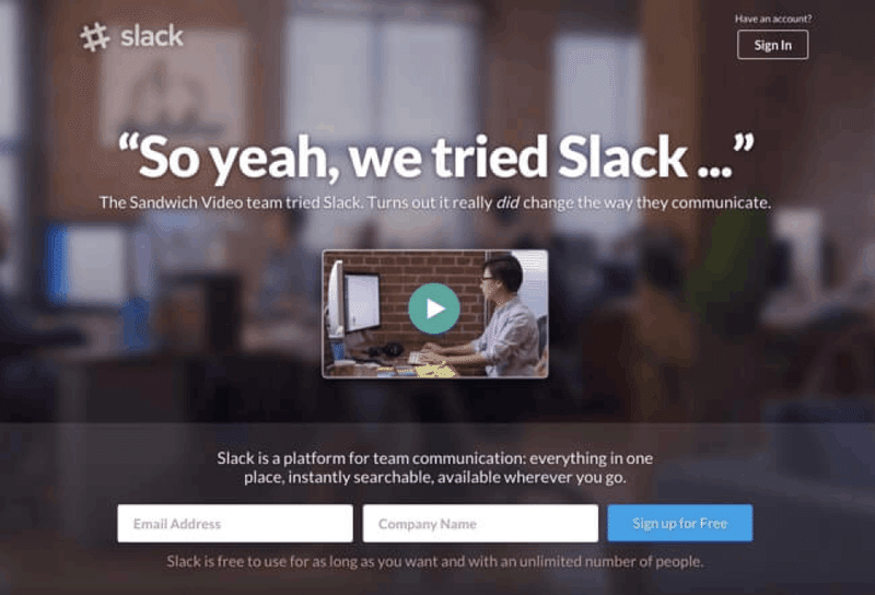
The page provides very little information aside from a short video promotion, and it provides only a few option for new customers - for example, enter your email or leave.
Chapter2 - Web Design is now done! Each webpage differs depending on the purpose and products/services. If you have the opportunity to build, assess, or audit websites, these information will help you!
Next Chapter will be "Analytics". To know how the website work well, This knowledge and skill is important.
Let's be marketer, See you soon!
この記事が気に入ったらサポートをしてみませんか?
