
箱ひげ図に多重比較検定の結果を描画

(1)はじめに
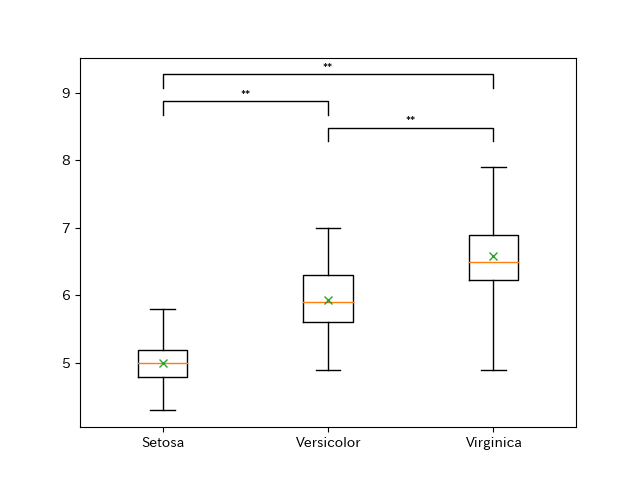
多重比較検定の結果を箱ひげ図に描画します。これを自動化できるとどれだけ楽か・・・
参考にしたのは以下のサイト。最高です。がこのサイトでは、3群のデータから2群ずつ取り出し、マン-ホイットニー検定を実施しているので、多重比較検定バージョンにしました。
https://rowannicholls.github.io/python/graphs/ax_based/boxplots_significance.html
(2)全体コード
import pandas as pd
import matplotlib.pyplot as plt
import itertools
import scikit_posthocs as sp

df = pd.read_csv("iris.csv")

data_sp = df.loc[:, ["variety", "sepal.length"]]

#多重比較検定(Steel-Dwass)
dscf = sp.posthoc_dscf(data_sp, val_col='sepal.length', group_col='variety')

#カテゴリを抽出
val = data_sp["variety"].unique()
val_sp = []
# カテゴリの2つの組み合わせを抽出し、リスト化
comb = itertools.combinations(val, 2)
for combination in comb:
    val_sp.append(combination)

#組み合わせを数字に置換。グラフに打ち込むのに必要なため、1からスタート。
significant_combinations = []
ls = list(range(1, len(val_sp)+1))
combs = [(ls[x], ls[x + y]) for y in reversed(ls) for x in range((len(ls) - y))]

#Steel-Dwass法の結果から抽出する組み合わせを準備。自動化できると思うけど面倒くさかったです。
ran = [(0, 1), (0, 2), (1, 2)]

#dscfの結果はデータフレーム形式になるので、.ilocで抽出。
#組み合わせとdscfの結果をリスト化。
for i in range(0, 3):
    p = dscf.iloc[ran[i][0],ran[i][1]]
    significant_combinations.append([combs[i], p])


#箱ひげ図を描画するために、データを加工。
#dfのvariety列から'Setosa','Versicolor','Virginica'のsepal.lengthのみを抽出
data = [
    df[df['variety'] == 'Setosa']['sepal.length'],
    df[df['variety'] == 'Versicolor']['sepal.length'],
    df[df['variety'] == 'Virginica']['sepal.length']
    ]


#箱ひげ図の描画
fig, ax = plt.subplots()

ax.boxplot(data, labels=['Setosa','Versicolor','Virginica'], whis=[0, 100],
           showmeans=True, meanprops={"marker":"x"})

#y軸の上限値・下限値を抽出
bottom, top = ax.get_ylim()

#y軸の範囲を抽出
y_range = top - bottom

#ここのfor文で多重比較検定の結果を打ち込む。
for i, significant_combination in enumerate(significant_combinations):
    #対象となる列を選択
    x1 = significant_combination[0][0]
    x2 = significant_combination[0][1]

    #どこにプロットするか。
    level = len(significant_combinations) - i

    #バーの高さを決める。
    bar_height = (y_range * 0.1 * level) + top
    bar_tips = bar_height - (y_range * 0.05)

    #バーをプロットする。
    plt.plot(
        [x1, x1, x2, x2],
        [bar_tips, bar_height, bar_height, bar_tips], lw=1, c='k'
        )

    #アスタリスク等の基準を決める。
    p = significant_combination[1]
    if p < 0.01:
        sig_symbol = "**"
    elif p < 0.05:
        sig_symbol = "*"
    elif p >= 0.05:
        sig_symbol = "n.s."

    #バーの上のテキストの高さを決める。高さは自分で調整してください。
    text_height = bar_height - y_range * 0.005

    #バーの上にテキストを打ち込む。
    plt.text((x1 + x2)*0.5, text_height, sig_symbol, ha='center', va='bottom', c='k')

plt.show()
(3-1)プチ解説
コメントを読んでもらうと理解できるかと思います。多重比較検定を行なって、箱ひげ図を書いて、そこに多重比較検定の結果を描画します。
なお、論文化する際には、別途グラフのデザインを調整するので、今回は細かい調整はしていません。縦軸くらいは調整した方が便利かもしれませんね。
(4)参考
https://rowannicholls.github.io/python/graphs/ax_based/boxplots_significance.html