
Creating a custom React UI library and Hosting it on NPM

クリエイター : Bishal Bhattarai , 株式会社readytowork ネパール支店長
React Libraries are widely used for building User interfaces and there are possibly large UI libraries in react that can be used and integrated into React web projects. It helps us to save time and increase productivity however these libraries may not always meet specific needs, and style preferences, and want to customize our own and imports between projects. So in this article, we are focused to build our own custom react UI library and publishing it to NPM registry.

In this article, we are will be using typescript for the UI library. Let's get hands-on with it.
Step 1: Setup project with UI component
Lets us set up a new create react app project with typescript
yarn create react-app cra-ui --template typescript
Let's add a storybook to the project. It is useful for developing UI components in isolation.
npx storybook init
Here when we initialize the storybook, It creates stories folder with built-in dummies stories. To run the storybook please add in following, by default the story script is added to package.json which will help fire the browser to see the components in isolation.
yarn storybook
Now It will expose the components in a port, we don’t need bear stories, will create them when we do the component, for now, we will delete the stories folder.
We will remove the public and all the files from the src folder. Note that, scr folder will be the entry point to add components of our needs.
Let us add and component as a build in ui library
yarn add antd
Add styledComponents for styling and types/styled-components
yarn add styled-components && yarn add -d @types/styled-components
Let's add a theme to the UI Library, it's a color code for branding UI in theme.ts
export const theme = {
    gray7: "#8C8C8C",
    gray8: "#595959",
    gray9: "#262626",
    primary: "#121212",
    borderColorBase: "#d9d9d9",
    placeholder: "#9f9f9f",
    link: "#1890ff",
    signupLink: "#19389C",
    secondaryLight: "#C2C2C2",
    secondaryDark: "#8E8E8E",
    yellow1: "#F7CD48",
    yellow2: "#EAB82D",
    blue1: "#19389C",
    blue2: "#1751D5",
    blue4: "#2B478B",
    accentMid: "#F5FAFF",
    base: "#FFFFFF",
    darkGrey: "#E7E9ED",
    primaryLine: "#DCDCDC",
    face1: "#FFB27D",
    face2: "#E2915A",
    gray: "#F8F8F8",
    alert: "#EB5757",
    lightBlue: "#B9CBF2",
    bgColor: "#f3f4f6",
  }
Now let's create UI components, so inside the component folder we create the atoms folder, and inside the atom, we are going to create the Button component. This is because it is following the atomic design principle.
In the Button folder, we need to create two file index.ts the actual components and index.stories.tsx for components to view in the storybook.
import { ReactNode } from "react"
import styled from "styled-components"
import { theme } from "../../../theme"
import { Button } from "antd"
type ButtonType = "primary" | "link"
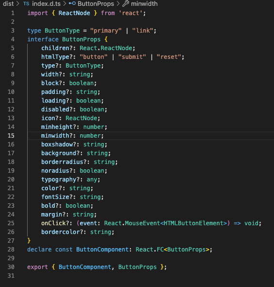
export interface ButtonProps {
children?: React.ReactNode
htmlType?: "button" | "submit" | "reset"
type?: ButtonType
width?: string
block?: boolean
padding?: string
loading?: boolean
disabled?: boolean
icon?: ReactNode
minheight?: number
minwidth?: number
boxshadow?: string
background?: string
borderradius?: string
noradius?: boolean
typography?: any
color?: string
fontSize?: string
bold?: boolean
margin?: string
// eslint-disable-next-line no-unused-vars
onClick?: (event: React.MouseEvent<HTMLButtonElement>) => void
bordercolor?: string
}
const Wrapper = styled.div`
display: contents;
& .ant-btn-primary {
background: ${theme.blue2};
box-shadow: 0px 0px 12px rgba(28, 86, 225, 0.51);
font-size: 16px;
line-height: 30px;
font-weight: 700;
}
& .ant-btn-link {
box-shadow: none;
background: transparent;
color: ${theme.blue2};
}
`
const StyledButton = styled(Button)`
${({ typography }: ButtonProps) => {
if (typography) {
return typography
}
}}
&[disabled] {
background-color: ${theme.secondaryLight};
border: none;
box-shadow: none !important;
color: ${theme.base};
}
border-color: ${theme.blue2};
border-radius: ${({ borderradius, noradius }: ButtonProps) => {
return noradius ? "none" : borderradius ? borderradius : "100px"
}};
margin: ${({ margin }: ButtonProps) => {
return margin && margin
}};
padding: ${({ type, padding }: ButtonProps) => {
if (padding) {
return `${padding} !important`
}
switch (type) {
case "primary":
return "0px 36px 0px 37px"
default:
return "0px 36px 0px 37px"
}
}};
background: ${({ background }: ButtonProps) => {
return background ? background : theme.blue2
}};
color: ${({ color }: ButtonProps) => {
return color ? `${color} !important` : theme.base
}};
font-size: ${({ fontSize }: ButtonProps) => {
return fontSize && fontSize
}};
font-weight: ${({ bold }: ButtonProps) => {
return bold && "bold"
}};
min-width: ${({ minwidth }: ButtonProps) => {
return minwidth && `${minwidth}px`
}};
width: ${({ width }: ButtonProps) => {
return width && `${width}`
}};
min-height: ${({ minheight }: ButtonProps) => {
return minheight && `${minheight}px`
}};
`
export const ButtonComponent: React.FC<ButtonProps> = ({
children,
htmlType,
loading,
onClick,
...rest
}) => {
return (
<Wrapper {...rest}>
<StyledButton
onClick={onClick as any}
htmlType={htmlType}
loading={loading}
{...rest}
>
{children}
</StyledButton>
</Wrapper>
)
}Let's create a story component so that we see how it looks on the browser. We create a file called index.stories.tsx inside the button folder.
import React from "react"
import { action } from "@storybook/addon-actions"
import { ButtonComponent } from "."
export default {
title: "Components/Atoms",
component: ButtonComponent,
parameters: {
docs: {
description: {
component: "A simple button component",
},
},
},
args: {
type: "primary",
},
argTypes: {
color: {
description: "Color of the text",
control: "color",
},
},
}
const Template = (args: any) => (
<ButtonComponent onClick={action("onClickAction")} {...args}>
{"Button"}
</ButtonComponent>
)
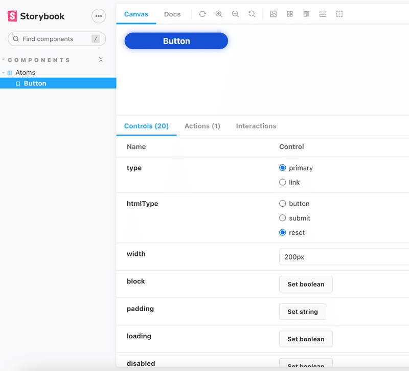
export const Button = Template.bind({})We can see how the component looks like on http://localhost:6006 as we have been running the storybook in the background.
We will create index.ts a folder in src to able to export the Ui components from the main entry file.
export * from "./components"Now we have set up a component that is ready to reuse all over again.
Step 2: Rollup configuration for exportable library
Rollup is a module bundler that can be used to create a production-ready build of a React UI library.
Install rollup
yarn add -d rollup
Let's add the necessary plugins for bundling Library
yarn add @rollup/plugin-commonjs @rollup/plugin-json @rollup/plugin-node-resolve @rollup/plugin-typescript @rollup/plugin-babel rollup-plugin-dts rollup-plugin-peer-deps-external rollup-plugin-postcss rollup-plugin-terser --dev
Add the following line in package.json, Don’t worry we don’t have this file for now, it will be created when we build from rollup however we are specifying the modules, sources, and types so it can be used in rollup config.
"main": "dist/cjs/index.js",
"module": "dist/esm/index.js",
"source": "src/index.ts",
"types": "dist/index.d.ts",
"files": [
  "dist"
]
Create a rollup configuration file in the root of the project it is to configure the entry point, output format and bundle preprocesses. Copy and paste the following code snippet into the file rollup.config.ts.
import babel from "rollup-plugin-babel"
import resolve from "@rollup/plugin-node-resolve"
import external from "rollup-plugin-peer-deps-external"
import typescript from "@rollup/plugin-typescript"
import postcss from "rollup-plugin-postcss"
import commonjs from "@rollup/plugin-commonjs"
import json from "@rollup/plugin-json"
import { terser } from "rollup-plugin-terser"
import dts from "rollup-plugin-dts"
const packageJson = require("./package.json")

export default [
  {
    input: packageJson.source,
    output: [
      {
        file: packageJson.main,
        format: "cjs",
        sourcemap: true,
      },
      {
        file: packageJson.module,
        format: "esm",
        sourcemap: true,
      },
    ],
    plugins: [
      typescript({ tsconfig: "./tsconfig.json" }),
      postcss({
        plugins: [],
        minimize: true,
      }),
      commonjs(),
      json(),
      babel({
        exclude: "node_modules/**",
        presets: ["@babel/preset-react"],
      }),
      external(),
      resolve(),
      terser(),
    ],
  },
  {
    input: "dist/esm/index.d.ts",
    output: [{ file: "dist/index.d.ts", format: "esm" }],
    plugins: [dts()],
  },
]
Here we want to compile the input source i.e src/index.ts to output the dist folder with cjs and es module files.
we add plugins to compile typescript, postcss, commonjs, json, we also want to exclude compile for node modules.
The rollup-plugin-peer-deps-external the library is a Rollup plugin that helps with this by automatically marking peer dependencies as external, so they are not included in the library bundle.
In package.json we add the following code.
  "peerDependencies": {
    "react": ">=18.2.0",
    "react-dom": ">=18.2.0"
  }
@rollup/plugin-node-resolve the plugin will attempt to locate the package in your node_modules directory and resolve its dependencies. It can also handle packages that have been installed with a non-default package manager, such as Yarn.
rollup-plugin-terser is a plugin that uses the Terser JavaScript compressor to minify and optimize the output bundle and reduce the size of the code by removing unnecessary characters such as white spaces, comments, and semicolons.
Now, we need to run the rollup command to build a library, which will generate a production-ready bundle of libraries to be published to npm or can be used for another project. please add rimraf module to the project. The following code will remove the dist folder and will build the package.
"build-lib": "rimraf dist && rollup -c"
Now lets build the library
yarn build-lib
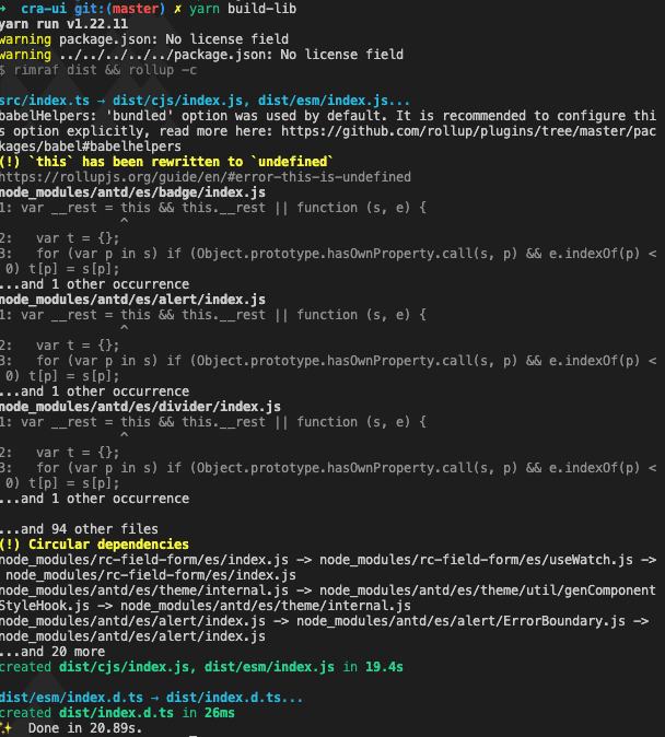
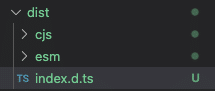
This will remove the dist folder and build with output files CJS and ESM.
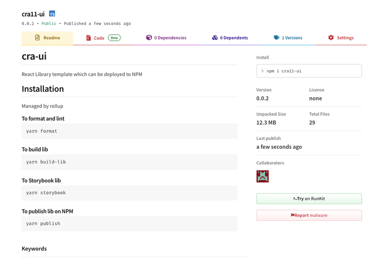
Step 3: Publish the bundled folder to the NPM registry using NPM
To publish the module to npm we need to first log in to npm.
npm login
To publish the module to npm
npm publish
yarn info cra11-ui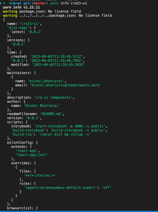
We have successfully created a UI library and published to NPM. Now we can add the library to any project that we want using the following command.
Thank you. happy coding 🎉
Reference: https://github.com/bhattaraibishal50/cra-ui