美しいグラフとそのコード

import pandas as pd
import matplotlib.pyplot as plt
import numpy as np
import json


twh = '110'
flex_rate = '0.5'
# Load and parse the JSON data from a file
file_path = f'../計算結果_JSON/{twh}.json'
with open(file_path, 'r') as file:
    data = json.load(file)
import json
import matplotlib.pyplot as plt
from matplotlib import rcParams
# Set the font globally to Times New Roman
rcParams['font.family'] = 'serif'
rcParams['font.serif'] = 'Times New Roman'
font_size = 16
# Reordering the data according to the human-readable case names
costs_per_case = {case_names[key]: data[key]['Cost'] for key in case_names if key in data}

# Extracting costs for each technology
labels = list(costs_per_case.keys())
solar = [costs['Solar']/1000 for costs in costs_per_case.values()]
onshore_wind = [costs['Onshore Wind']/1000 for costs in costs_per_case.values()]
offshore_wind = [costs['Offshore Wind']/1000 for costs in costs_per_case.values()]
geothermal = [costs['Geothermal']/1000 for costs in costs_per_case.values()]
battery = [costs['Battery']/1000 for costs in costs_per_case.values()]

# Plotting with specific colors
fig, ax = plt.subplots(figsize=(10, 6))
width = 0.35
ax.bar(labels, solar, width, label='Solar', color='#FCB615')  # Gold color for solar
ax.bar(labels, onshore_wind, width, bottom=solar, label='Onshore Wind', color='#007CBB')  # Green for onshore wind
ax.bar(labels, offshore_wind, width, bottom=[i+j for i, j in zip(solar, onshore_wind)], label='Offshore Wind', color='#00ADD9')  # Blue for offshore wind
ax.bar(labels, geothermal, width, bottom=[i+j+k for i, j, k in zip(solar, onshore_wind, offshore_wind)], label='Geothermal', color='#911726')  # Brown for geothermal
ax.bar(labels, battery, width, bottom=[i+j+k+l for i, j, k, l in zip(solar, onshore_wind, offshore_wind, geothermal)], label='Battery', color='#B8EA04')  # Purple for battery


ax.set_xlabel('Case Scenario', fontsize=font_size)
ax.set_ylabel('Costs [Billon EUR]', fontsize=font_size)
ax.set_title('Costs by Technology and Renamed Case Scenario', fontsize=font_size)
ax.set_xticks(range(len(labels)))
ax.set_xticklabels(labels,  fontsize=font_size)
ax.set_yticklabels([f'{i:.0f}' for i in ax.get_yticks()], fontsize=font_size)
ax.legend(fontsize=font_size*0.8)

# Y軸の表示幅を1.5倍にする
ax.set_ylim(0, ax.get_ylim()[1]*1)

# legendを行にする
plt.legend(loc='upper left', bbox_to_anchor=(1, 1), fontsize=font_size*0.8)


# Labeling
# ax.set_ylabel('Costs [Billon EUR]')
# ax.set_title('Costs by Technology and Renamed Case Scenario')
# ax.set_xticks(range(len(labels)))
# ax.set_xticklabels(labels, rotation=45)
# ax.legend()

plt.show()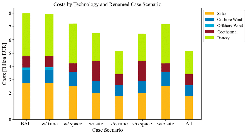
import json
import pandas as pd
import matplotlib.pyplot as plt
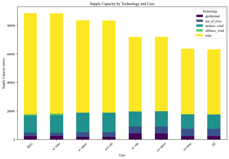
# Prepare to aggregate the supply data by case and technology across all regions
supply_data = {}
# Extracting and summing up supply capacity across all regions for each case
for key, value in data.items():
case_description = key # Including case parameters in the description
supply_data[case_description] = {}
if 'Datacenter' in value and 'supply_capacity' in value['Datacenter']:
regions = value['Datacenter']['supply_capacity']
for region, technologies in regions.items():
for tech, amount in technologies.items():
if tech in supply_data[case_description]:
supply_data[case_description][tech] += amount
else:
supply_data[case_description][tech] = amount
# Creating a DataFrame for easy plotting
df = pd.DataFrame.from_dict(supply_data, orient='index').fillna(0)
# Renaming the indices of the DataFrame according to the new case names
df_renamed = df.rename(index=case_names)
# Specifying the order of cases as a categorical variable for sorting
case_order = ["BAU", "w/ time", "w/ space", "w/ site", "s/o time", "s/o space", "w/o site", "All"]
# df_renamed['Case'] = pd.Categorical(df_renamed['Case'], categories=case_order, ordered=True)
# Re-plotting with updated case names
ax = df_renamed.plot(kind='bar', stacked=True, figsize=(10, 7), colormap='viridis')
ax.set_title('Supply Capacity by Technology and Case')
ax.set_xlabel('Case')
ax.set_ylabel('Supply Capacity (units)')
ax.legend(title='Technology')
plt.xticks(rotation=45)
plt.tight_layout()
plt.show()
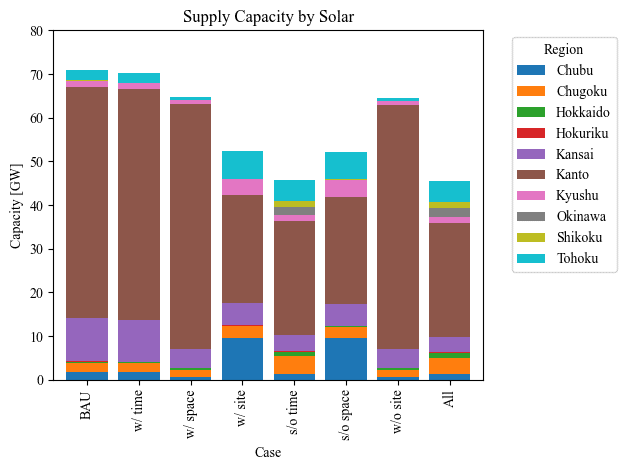
# Importing necessary libraries for data handling and visualization
import json
import matplotlib.pyplot as plt
import pandas as pd
import seaborn as sns
# Lists of energy sources and regions in Japan for analysis
energy_sources = ['geothermal', 'onshore_wind', 'offshore_wind', 'solar', 'battery']
regions = ['Hokkaido', 'Tohoku', 'Kanto', 'Chubu', 'Kansai', 'Hokuriku', 'Chugoku', 'Shikoku', 'Kyushu', 'Okinawa']
# Extracting 'Supply Capacity' data and converting it to a DataFrame format
supply_capacity_data = []
for case, details in data.items():
for region in regions:
entry = {
'Case': case_names[case],
'Region': region
}
capacities = details['Datacenter']['supply_capacity'].get(region, {})
for source in energy_sources:
if source != "battery":
entry[source] = capacities.get(source, 0)/1000 # Convert capacity to gigawatts
else:
entry[source] = details['Datacenter']['Battery_capactiy'].get(region, {})/1000
supply_capacity_data.append(entry)
df_capacity = pd.DataFrame(supply_capacity_data)
# Specifying the order of cases as a categorical variable for sorting
case_order = ["BAU", "w/ time", "w/ space", "w/ site", "s/o time", "s/o space", "w/o site", "All"]
df_capacity['Case'] = pd.Categorical(df_capacity['Case'], categories=case_order, ordered=True)
df_capacity.sort_values('Case', inplace=True)
# Generating individual bar graphs for each energy source
for source in energy_sources:
if source != "battery":
plt.figure(figsize=(10, 1))
source_data = df_capacity.pivot_table(values=source, index='Case', columns='Region', aggfunc='sum')
source_data.plot(kind='bar', stacked=True, width=0.8)
plt.title(f'Supply Capacity by {source.capitalize()}') # Title with the name of the energy source
plt.ylabel('Capacity [GW]') # Y-axis label
plt.xlabel('Case') # X-axis label
# 表示範囲を1.5倍にする
plt.ylim(0, 80)
plt.legend(title='Region', bbox_to_anchor=(1.05, 1), loc='upper left')
plt.tight_layout() # Adjust layout to make room for the legend
plt.show()
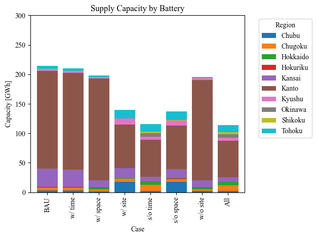
else:
plt.figure(figsize=(10, 1))
source_data = df_capacity.pivot_table(values=source, index='Case', columns='Region', aggfunc='sum')
source_data.plot(kind='bar', stacked=True, width=0.8)
plt.title(f'Supply Capacity by {source.capitalize()}')
plt.ylabel('Capacity [GWh]')
plt.xlabel('Case')
plt.ylim(0, 300)
plt.legend(title='Region', bbox_to_anchor=(1.05, 1), loc='upper left')
plt.tight_layout()
plt.show()
# Importing necessary libraries for data handling and visualization
import json
import matplotlib.pyplot as plt
import pandas as pd
import seaborn as sns

# Lists of energy sources and regions in Japan for analysis
energy_sources = ['geothermal', 'onshore_wind', 'offshore_wind', 'solar', 'battery']
regions = ['Hokkaido', 'Tohoku', 'Kanto', 'Chubu', 'Kansai', 'Hokuriku', 'Chugoku', 'Shikoku', 'Kyushu', 'Okinawa']

# Extracting 'Supply Capacity' data and converting it to a DataFrame format
supply_capacity_data = []
for case, details in data.items():
    for region in regions:
        entry = {
            'Case': case_names[case],
            'Region': region
        }
        capacities = details['Datacenter']['supply_capacity'].get(region, {})
        for source in energy_sources:
            if source != "battery":
                entry[source] = capacities.get(source, 0)/1000  # Convert capacity to gigawatts
            else:
                entry[source] = details['Datacenter']['Battery_capactiy'].get(region, {})/1000
        supply_capacity_data.append(entry)

df_capacity = pd.DataFrame(supply_capacity_data)

# Specifying the order of cases as a categorical variable for sorting
case_order = ["BAU", "w/ time", "w/ space", "w/ site", "s/o time", "s/o space", "w/o site", "All"]
df_capacity['Case'] = pd.Categorical(df_capacity['Case'], categories=case_order, ordered=True)
df_capacity.sort_values('Case', inplace=True)

# Generating individual bar graphs for each energy source
for source in energy_sources:
    if source != "battery":
        plt.figure(figsize=(10, 1))
        source_data = df_capacity.pivot_table(values=source, index='Case', columns='Region', aggfunc='sum')
        source_data.plot(kind='bar', stacked=True, width=0.8)
        plt.title(f'Supply Capacity by {source.capitalize()}')  # Title with the name of the energy source
        plt.ylabel('Capacity [GW]')  # Y-axis label
        plt.xlabel('Case')  # X-axis label
        # 表示範囲を1.5倍にする
        plt.ylim(0, 80)
        plt.legend(title='Region', bbox_to_anchor=(1.05, 1), loc='upper left')
        plt.tight_layout()  # Adjust layout to make room for the legend
        plt.show()
    else:
        plt.figure(figsize=(10, 1))
        source_data = df_capacity.pivot_table(values=source, index='Case', columns='Region', aggfunc='sum')
        source_data.plot(kind='bar', stacked=True, width=0.8)
        plt.title(f'Supply Capacity by {source.capitalize()}')
        plt.ylabel('Capacity [GWh]')
        plt.xlabel('Case')
        plt.ylim(0, 300)
        plt.legend(title='Region', bbox_to_anchor=(1.05, 1), loc='upper left')
        plt.tight_layout()
        plt.show()
この記事が気に入ったらサポートをしてみませんか?