
Rをつかう単純な計算のための備忘録

Rを使い始めた頃に参照していたものの1つは『データ解析環境「R」』(工学社発行)という本であった。著者は、舟尾暢男・高浪洋平の2氏。本に書き込みをしながら読んだ。有意義な本であった。
まず、その本に書き込んだメモを見ながら、Rの使い方を復習してみようと思う。そうすることで、しばらく使わないでいたあとにまごつかないようにすることができるだろう。
別の本(注)も、昔真剣に取り組んだことがある。その本の巻末に「補遺 RとS-PLUSの備忘録」というものがあり、これも復習してみようと思っている。Rを自由に使えるならば、わざわざPythonなどのプログラミング言語を新たに学ぶ必要は私にとってはない。(表計算ソフトも無用である。)
[注]
B.エベリット『RとS-PLUSによる多変量解析』(シュプリンガー・ジャパン)
1. 表計算ソフトのような計算
まず、1から12までの数からマトリックス(行列)を作り、その行や列を操作してみる。
a <- matrix(1:12,3)
a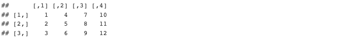
b <- a[2,] + a[3,]
b
c <- rbind(a,b)
c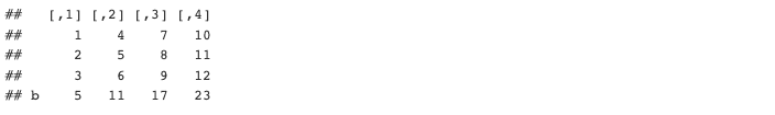
d <- c[c(1,4),]
d
上の例で、「c(1,4)」の部分は、「c(-2,-3)」や「-c(2,3)」と同じ。マイナス記号は、排除を意味する。
rownames(d)[1] <- "a(r1)"
d
mydata <- matrix(c(70,30,45,5),2,byrow = T)
mydata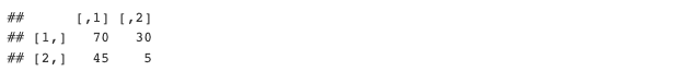
addmargins(mydata, margin = 1:2)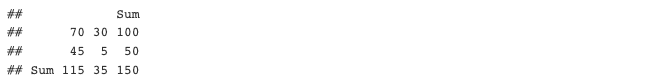
グラフ化してみる。図で日本語を使うためにはMacの場合、par(family="HiraKakuProN-W3")などとフォントを指定する。棒グラフはbarplot()関数を使う。
par(family="HiraKakuProN-W3")
barplot(mydata,xlab="性別",names=c("男","女"),col=c("blue","red"))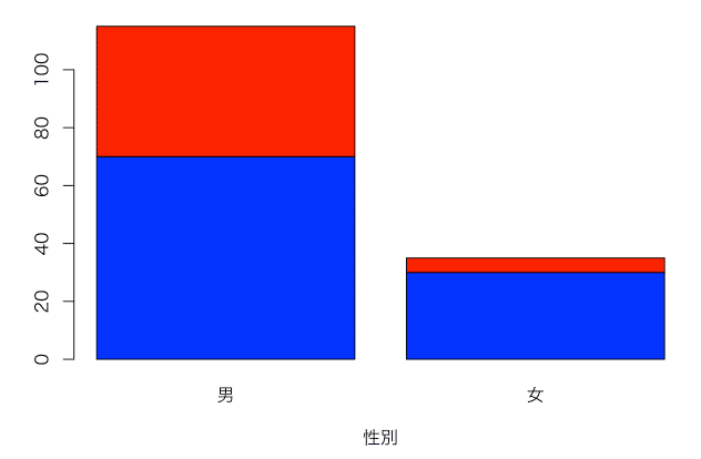
棒を横に並べる場合には、beside = TRUEとする。
par(family="HiraKakuProN-W3")

barplot(mydata,names=c("男","女"),col=c("blue","red"), beside=T)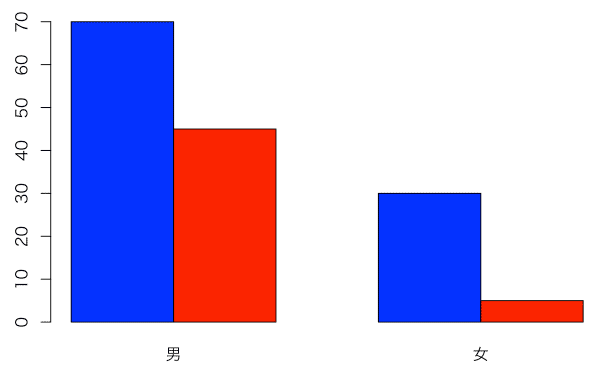
パーセントの計算
prop.table()関数で、行方向、あるいは、列方向の比率を計算する。
# 行パーセントの計算
m1 <- prop.table(mydata,1)
rownames(m1) <- c("male","female")
colnames(m1) <- c("yes","no")
m1
行と列を入れ替えて100をかける。性別が表頭に来るようにする。
m2 <- t(m1)*100
m2
棒グラフ
barplot(m2,xlab="sex",col=c("blue","red"),
legend=T,args.legend = list(x = "bottomright"))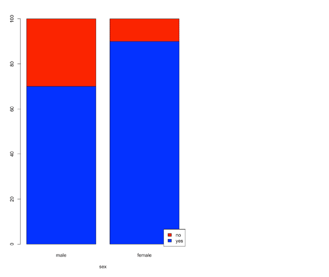
帯グラフ
barplot(m2,horiz=T,xlab="respose",col=c("blue","red"),
legend=T,args.legend = list(x = "bottomright"))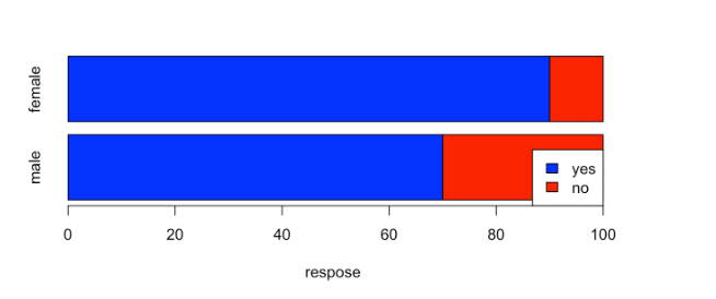
列の入れ替え。2列目が1列目に、1列目が2列目に。
m3 <- m2[,c(2,1)]
m3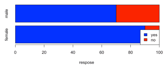
モザイク図
mosaicplot(m2,color = T,main = "")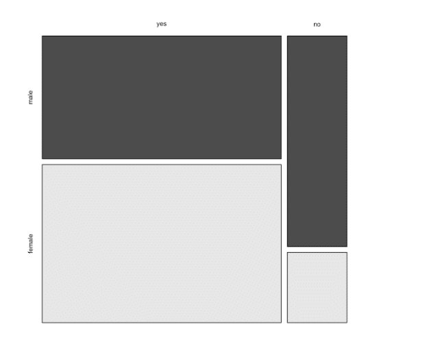
mosaicplot(t(m2),color = T,main = "")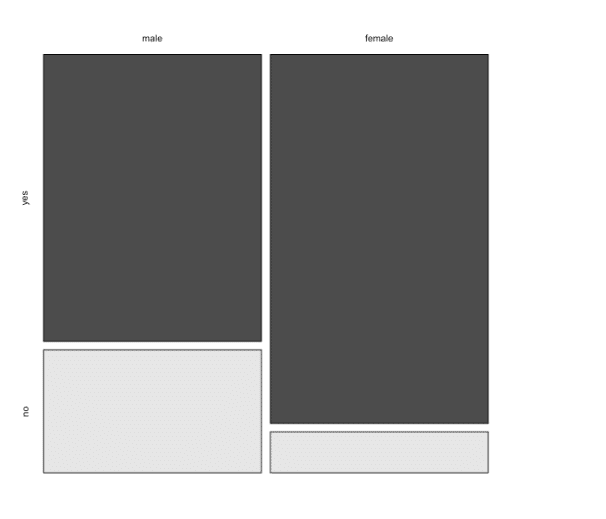
カイ2乗検定
m2
chisq.test(m2)

chisq.test(m2, simulate.p.value=TRUE)

fisher.test(m2)
male female
yes 70 90
no 30 10
Pearson's Chi-squared test with Yates' continuity correction
data: m2
X-squared = 11.281, df = 1, p-value = 0.0007829
Pearson's Chi-squared test with simulated p-value (based on
2000 replicates)
data: m2
X-squared = 12.5, df = NA, p-value = 0.0009995
Fisher's Exact Test for Count Data
data: m2
p-value = 0.0006504
alternative hypothesis: true odds ratio is not equal to 1
95 percent confidence interval:
0.1063153 0.5936350
sample estimates:
odds ratio
0.2609721
二つの比率の差の検定
# サンプルaとサンプルbの比率を設定
p1 <- 0.468
p2 <- 0.363

# サンプルaとサンプルbのサイズを設定
n1 <- 188
n2 <- 457

# 両サンプルを結合した場合の比率を計算(母比率の推定値として)
p_hat <- (p1 * n1 + p2 * n2) / (n1 + n2)

# 検定統計量zを計算
z <- (p1 - p2) / sqrt(p_hat * (1 - p_hat) * (1/n1 + 1/n2))

# p値を計算
p_value <- 2 * (1 - pnorm(abs(z)))

# 結果を表示
cat("検定統計量 z =", z, "\n")
cat("p値 =", p_value, "\n")

# 有意水準0.05での検定
if (p_value < 0.05) {
  cat("2つの比率に有意な差があります。\n")
} else {
  cat("2つの比率に有意な差はありません。\n")
}
```
行列の行名と列名をまとめて定義する(dimnames)
rownames()やcolnames()を使って行名や列名を定義することができるが、一度にそれらをおこなうには、dimnames()関数を使う。
x <- matrix(seq(12),nrow=4)
dimnames(x) <- list(c("R1","R2","R3","R4"), c("C1","C2","C3"))
x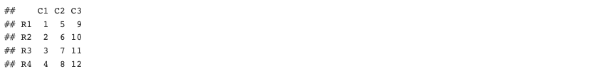
x <- matrix(seq(12),nrow=4)
dimnames(x) <- list(paste("row", seq(4)), paste("col", seq(3)))
x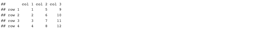
2. データフレーム
データフレームの作成は、data.frame(vector1, vector2, …)。
height <- c(50,70,45,80,100)
weight <- c(120,140,100,200,190)
age <- c(20,40,41,31,33)
names <- c("Bob","Ted","Alice","Mary","Sue")
sex <- c("Male","Male","Female","Female","Female")
data <- data.frame(names,sex,height,weight,age)
data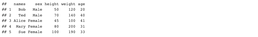
年齢のデータを取り出すためには、data$ageでもいいし、data[,"age"]でもいい。data[,5]も同じ結果。
data[3:5,5]とすると、3行目から5行目まで(3:5)のageの数値(5列目)が表示される。これは、data[-c(1:2),5]、あるいは、data[c(-1,-2),5]としてもよい。
列の平均
数値が入っている列で平均を計算する。apply()関数を利用。meanの前の2は、列方向を意味する。
apply(data[,c(3,4,5)],2,mean) # 平均
集計(tabulation)
単純集計やクロス集計をおこなう。
table(data$sex)
table(data$height, data$sex)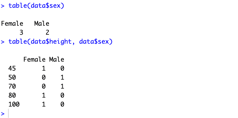
度数分布やヒストグラムを作成する場合には、データをどのように分割するかが問題になる。以下はcut()関数の説明。
Convert Numeric to Factor
Description
cut divides the range of x into intervals and codes the values in x according to which interval they fall. The leftmost interval corresponds to level one, the next leftmost to level two and so on.
breaks <- seq(40,100,by=20)
table(cut(data$height,breaks))
各範囲は、左の境界がopenで、右の境界がclosed。つまり、「超える」と「以下」。普通の「a以上、b未満」という区切り方と違う。
pie(result, labels = c("A","B","C"), col = rainbow(3))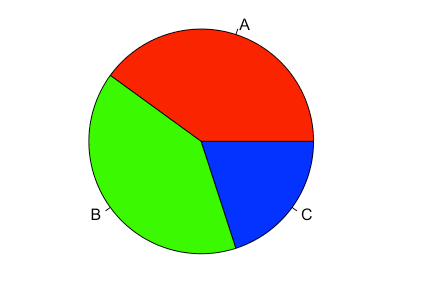
ヒストグラム
hist(data$height,breaks)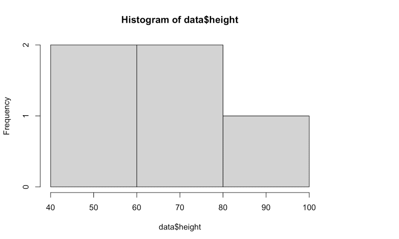
各範囲がa以上b未満(右端を除き)とするためには、right = FALSE, include.lowest = TRUEと設定する。[a,b)という設定。
hist(data$height, breaks = breaks,right = F,include.lowest = T)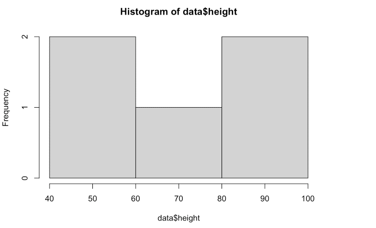
freq <- cut(data$height, breaks=breaks, right=F, include.lowest=TRUE)
table(freq)
散布図
plot(x=data$height, y=data$weight)
result <- lm(weight ~ height, data = data)
abline(result)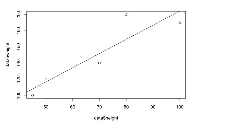
3. ベクトルに用いる関数
合計、要約、標準偏差、丸め、ヒストグラム、箱ひげ図
x <- 1:100
sum(x)
## [1] 5050
summary(x)
## Min. 1st Qu. Median Mean 3rd Qu. Max.
## 1.00 25.75 50.50 50.50 75.25 100.00
sd(x)
## [1] 29.01149
round(29.01149,digits=2)
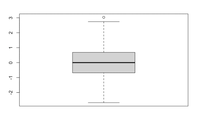
## [1] 29.01x <- rnorm(1000, mean=0, sd=1)
hist(x)
boxplot(x)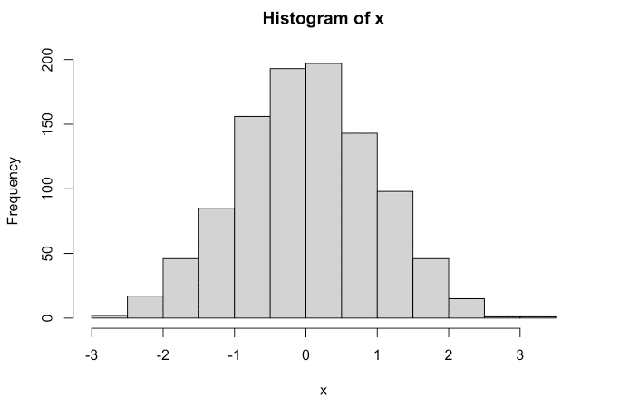
この記事が気に入ったらサポートをしてみませんか?