
#TW-10 会社行きたくないダッシュボード改造:予測との差の理由 (Dash board improvement: of gap vs Forecasting)

(English follows)
以前から自分の勉強用に会社行きたくないINDEXというダッシュボードを公開していました(こちら)。一旦出来上がってしまうと、あとは日々更新されているだけなのであまり、記事にするようなことはなかったのですが今回少しじかんができたので、若干の改造を行ったのでそれについて少しだけ話してみようかと。相変わらず趣味と冗談の延長でやっているようなものなので「だいたい」のものとしてご笑覧ください。
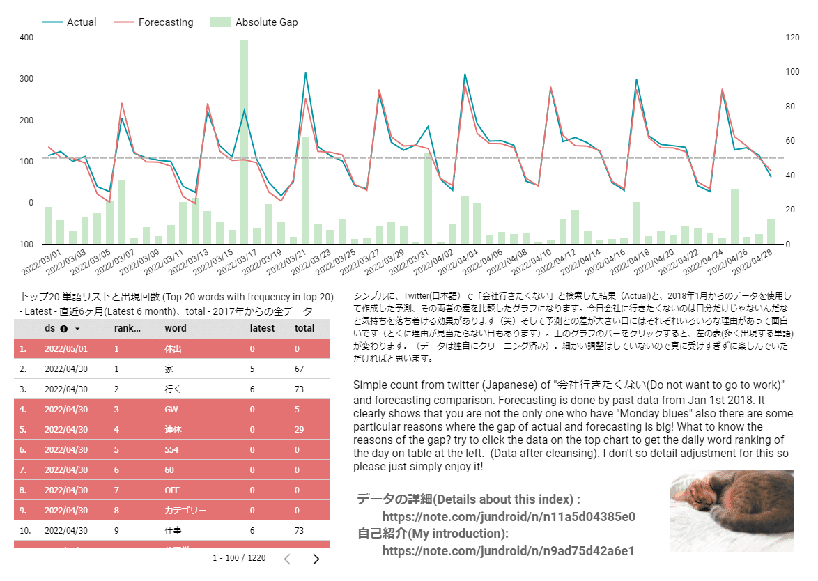
今回改造したのは左下の表みたいな部分。もともと上のグラフで、例年ならこれくらい、という天気予報のような数字と実際のツイート件数を折れ線グラフで表示してその差を緑の棒グラフで表示して、「ここでなんかあったらしい」というざっくりしたものを示していました。例えば上の図だと3月16日に何かがあって会社に行きたくない人が増えたらしい、、、くらいが表示されていました。そういう日があると僕はツイートのデータに戻って理由を探してみるという作業をしてツイートしたりしていました(ちなみにアカウントはこちら)。
よく考えてみると、公開しているのはこのダッシュボードだけなので、これを見ていただいても、そもそも一番「楽しい」差があった理由がわからないなぁというのは課題だったので、そのヒントだけでもというのが今回の改造。
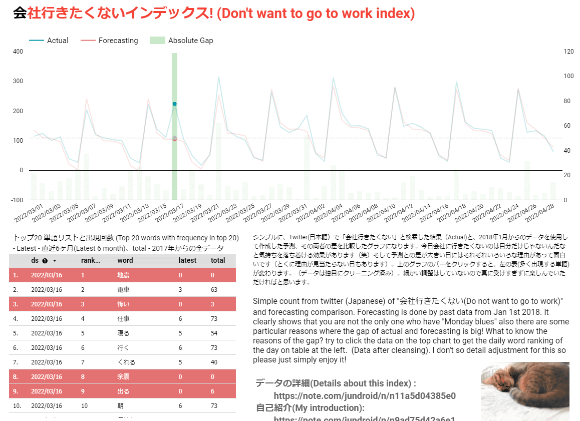
今回上の棒グラフをクリックすると、左の表にその日の特徴的な単語のランキングが表示されて、なんとなく特徴的なものを赤くハイライトするようにしました。例えば件の3月16日だと地震関連の単語が出ていて、あなるほど地震の翌日で会社行きたくない人が増えたんだなと何となくわかるような、わからないような。
中身としてはその日の出現した単語のランキングを過去の月別の20位のランキングと比較して、直近の6ヶ月に一度も出現していない単語をハイライトするというシンプルな分析になります。なので、大雪とかが続いたりするとハイライトは消えてしまうかもしれませんが、それでもヒントにはなるかなと。なるといいな。。。
という訳で、皆さんの方でも差のあった日の「理由」を楽しめるようになったので、気がついたらクリックしてみたくださいな。というお知らせでした。次は何をしてみようかな。
I have published a dashboard for quite a while called "Don't want to work Index" which is the tweet data analysis for my personal study purpose (Here). Once the development is done, it is updated everyday and I had nothing much to talk about it. However I recently got time to improve the tool and I completed it. So let me talk about it in this article. Well as always, this tool is not the very serious tool to reflect something, so please take it as "roughly" showing something Lol.

What I have changed is the chart on the left side bottom to show the clue of the reasons why there is a gap between actual and forecasting. Originally, it only shows figures. Blue line is to show the actual and the red line is for forecasting and the gap in green bar. You could tell, there was something so that it seem people didn't go to work in Japan. For example, there is the big gap on 16th Mar but you didn't know what is the reasons of it which I think is the most fun part of this analysis. I just tweeted sometimes after looking into raw tweet data (My twitter account).
I thought it would be interesting if I could roughly show the reasons of the gap for you to enjoy this analysis more.

Now, when you click the "gap" bar of the particular date, it shows the word ranking of the day and highlight the words which is unique to the day (roughly). Above is when you tap 16th Mar where you see the huge gap on the trend chart. The left table shows word ranking of the day and highlighted words are related to "Earth quake". It was the day before I left back from Japan to Singapore and I remember the earthquake was huge enough to scare people…
The analysis itself is simple. I compare the day's word ranking with monthly word ranking till 20th and highlight words which is not shown in past 6 months. So possibly, it will miss the highlights when you for example have "big snow" every month. But I assume it is enough to get the clue of the gap! (Hopefully)
So now, I believe you can enjoy the dash board more than before. When you find the gap, try to click the day and enjoy assuming what happened in Japan. Some are quite unique in Japanese culture! Well, I'm wondering what I'm going to do next :)
この記事が気に入ったらサポートをしてみませんか?