都市廃棄物管理コストの予測

プログラミング初心者がKaggleのデータセット(Municipal Waste Management Cost Prediction)を使い、Notebook(Municipal Cost Prediction using EDA)を参考に、都市廃棄物管理コストの予測をしてみました。
なお、実行環境は以下のとおりです。
Google Colaboratory
Python ver.3.8.16
統計量の確認とデータの可視化
まずは必要なライブラリをインポートします。
import numpy as np
import pandas as pd
import seaborn as sns
import matplotlib.pyplot as plt
データを読み込んでデータのサイズ(行数、列数、全要素数)を取得します。
dataset = pd.read_csv("/content/drive/MyDrive/Colab Notebooks/public_data_waste_fee.csv")
print(dataset.shape)
print(f"total number of elements in the dataset are {dataset.shape[0] * dataset.shape[1]}")
>>出力結果
(4341, 39)
total number of elements in the dataset are 169299
欠損値の確認
欠損値があるカラム名、カラム数、欠損値の割合を見てみます。
features_with_nan = [features for features in dataset.columns if dataset[features].isnull().sum() >= 1]
print(features_with_nan)
print(len(features_with_nan))

for features in features_with_nan:
    print(features , np.round(dataset[features].isnull().mean(),4) ,"%missing values")
>>出力結果
['name', 'cres', 'csor', 'area', 'alt', 'isle', 'sea', 'pden', 'wden', 'urb', 'organic', 'paper', 'glass', 'wood', 'metal', 'plastic', 'raee', 'texile', 'other', 'geo', 'roads', 's_wteregio', 's_landfill', 'gdp', 'proads', 'wage', 'finance']
27
name 0.0014 %missing values
cres 0.012 %missing values
csor 0.0154 %missing values
area 0.0014 %missing values
alt 0.0014 %missing values
isle 0.0014 %missing values
sea 0.0014 %missing values
pden 0.0014 %missing values
wden 0.0014 %missing values
urb 0.0014 %missing values
organic 0.1179 %missing values
paper 0.0058 %missing values
glass 0.0076 %missing values
wood 0.2522 %missing values
metal 0.0567 %missing values
plastic 0.009 %missing values
raee 0.0723 %missing values
texile 0.2334 %missing values
other 0.0313 %missing values
geo 0.0657 %missing values
roads 0.1021 %missing values
s_wteregio 0.0657 %missing values
s_landfill 0.0657 %missing values
gdp 0.0889 %missing values
proads 0.1021 %missing values
wage 0.0657 %missing values
finance 0.0889 %missing values
数値データの確認
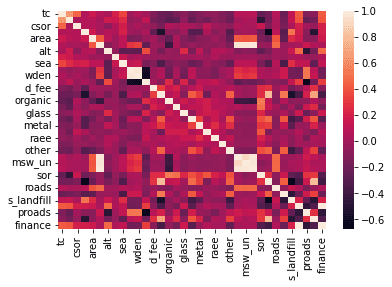
数値データのカラム名、カラム数を確認し、カラム同士の相関係数をヒートマップで表してみます。
#数値データのカラムを見る。
numerical_features = [features for features in dataset.columns if dataset[features].dtype!='O']
print(numerical_features)
print(len(numerical_features))
dataset[numerical_features].head()
#数値データのカラム同士の相関係数をそれぞれ計算してヒートマップで表す。
sns.heatmap(dataset[numerical_features].corr())
>>出力結果
['tc', 'cres', 'csor', 'istat', 'area', 'pop', 'alt', 'isle', 'sea', 'pden', 'wden', 'urb', 'd_fee', 'sample', 'organic', 'paper', 'glass', 'wood', 'metal', 'plastic', 'raee', 'texile', 'other', 'msw_so', 'msw_un', 'msw', 'sor', 'geo', 'roads', 's_wteregio', 's_landfill', 'gdp', 'proads', 'wage', 'finance']
35
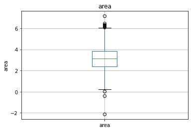
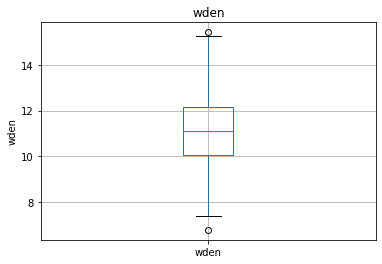
続いて、箱ひげ図を使って外れ値を見てみます。
for features in continous_features:
    data = dataset.copy()

    if 0 in data[features].unique():
        data[features] = np.log1p(data[features])
    else:
        data[features] = np.log(data[features])
        data.boxplot(column=features)
        plt.ylabel(features)
        plt.title(features)
        plt.show()
>>出力結果の一例
カテゴリカルデータの確認
数値データと同様にカテゴリカルデータのカラム名とカラム数を見てみます。
categorical_features = [features for features in dataset.columns if dataset[features].dtype=='O' ]
print(categorical_features)
print(len(categorical_features))
>>出力結果
['region', 'province', 'name', 'fee']
4
ベースラインモデル
特徴量選択
特徴量選択とは、機械学習のモデルを使用する際に有効な特徴量の組み合わせを探索するプロセスのことです。
ヒートマップで相関係数が高い組み合わせがいくつかあることがわかりましたので、相関係数が高いカラムの組み合わせを出力してみます。
#相関係数行列
corr_df=dataset[numerical_features].corr()
#相関係数が0.5より大きく,1ではないもののインデックスを抽出
trim_idx=np.where((abs(corr_df)>0.5) & (abs(corr_df)!=1))
#重複を取り除き,(行,列)で整理
trim_list=[]

for (line,row) in zip(trim_idx[0],trim_idx[1]):
  if line<row:
    trim_list.append([line,row])

trim_idx_np=np.array(trim_list)
>>出力結果
array([[ 0,  1],
       [ 3, 13],
       [ 3, 27],
       [ 3, 30],
       [ 5, 23],
       [ 5, 24],
       [ 5, 25],
       [ 9, 10],
       [ 9, 11],
       [ 9, 32],
       [10, 11],
       [10, 32],
       [11, 32],
       [13, 27],
       [13, 29],
       [13, 30],
       [13, 33],
       [14, 26],
       [23, 24],
       [23, 25],
       [24, 25],
       [27, 30],
       [27, 33],
       [31, 34]])
上記のカラムの組み合わせのどちらを排除するか判断するため、各カラムの出現回数を取得します。
uni_idx_list,uni_count=np.unique(trim_idx_np,return_counts=True)

uni_idx_list_reshape=uni_idx_list.reshape([-1,1])
uni_count_reshape=uni_count.reshape([-1,1])

test_np=np.concatenate([uni_idx_list_reshape, uni_count_reshape],axis=1)

test_df = pd.DataFrame(data=test_np, columns=['idx' , 'count'])
>>出力結果
idx	count
0	0	1
1	1	1
2	3	3
3	5	3
4	9	3
5	10	3
6	11	3
7	13	5
8	14	1
9	23	3
10	24	3
11	25	3
12	26	1
13	27	4
14	29	1
15	30	3
16	31	1
17	32	3
18	33	2
19	34	1
出現回数は1~5回で、3回のカラムが最も多いことがわかりました。出現回数4回以上のカラムを排除することとします。
特徴量作成
まず欠損値の処理を行います。
カテゴリカルデータの"name"に欠損値がありますが、分析においてあまり有用ではないので"name"カラムはドロップします。
数値データの欠損値は中央値で補完します。
n_features_na = [features for features in dataset.columns if dataset[features].isnull().sum()>=1 and dataset[features].dtype!='O']

print(n_features_na)

for features in n_features_na:
    median_values = dataset[features].median()
    dataset[features] = dataset[features].fillna(median_values)

print(dataset[n_features_na].isnull().sum())
続いて、対数変換による歪み除去を行います。
import math


for features in numerical_features:
   if 0 in dataset[features].unique():
      dataset[features] = np.log1p(dataset[features])
   else:
      dataset[features] = np.log(abs(dataset[features]))
次に、外れ値を処理します。"area"は外れ値が多いので、減らす処理をします。
upper_limit = dataset['area'].quantile(0.99)
lower_limit = dataset['area'].quantile(0.01)

dataset = dataset[(dataset.area < upper_limit) & (dataset.area > lower_limit)]
次は、カテゴリカルデータの数値化です。
固有の値ごとに"finance"の平均値を出し、その順位(昇順)を数値化に使用しています。
categorical_features = [features for features in dataset.columns if dataset[features].dtype=='O' and features not in ['name'] ]
print(len(categorical_features))

for feature in categorical_features:
    labels_ordered=dataset.groupby([feature])['finance'].mean().sort_values().index
    labels_ordered={k:i for i,k in enumerate(labels_ordered,0)}
    dataset[feature]=dataset[feature].map(labels_ordered)

dataset[categorical_features].head()
特徴量スケーリング
MinMaxScalerでスケールを合わせます。
from sklearn.preprocessing import MinMaxScaler

feature_scale = [features for features in dataset.columns if features not in ['name']]
print(feature_scale)
scaler = MinMaxScaler()
scaler.fit_transform(dataset[feature_scale])

dataset.head()
ランダムフォレストによる回帰分析
機械学習アルゴリズムの1つであるランダムフォレストを使って回帰モデルを構築します。ランダムフォレストとは、決定木のモデルを複数作り、回帰の場合は予測結果の平均、分類の場合は多数決をとって、最終予測を行う手法です。
まず訓練データとテストデータを作成します。上述のとおり、分析に必要ではない"name"と、相関係数が高いカラム同士のうち、出現回数が4回以上のカラム"sample"と"geo"をドロップします。
from sklearn.ensemble import RandomForestRegressor
from sklearn.linear_model import Ridge,Lasso
from sklearn.feature_selection import SelectFromModel
from sklearn.model_selection import RandomizedSearchCV
from sklearn.model_selection import train_test_split
x = data.drop(['name' , 'finance', 'sample', 'geo'], axis=1)
y = data['finance']
train_x, test_x, train_y, test_y = train_test_split(x, y, random_state=42)学習に使うデータを準備できたので、予測モデルを構築していきます。
ハイパーパラメーターはランダムサーチで最適なセットを探します。
model = RandomForestRegressor()

param_distribution = {

                      'max_depth': [10, 20, 30, 40, 50, 60, 70, 80, 90, 100, None],
                      'min_samples_leaf': [1, 2, 4],
                      'min_samples_split': [2, 5, 10],
                      'n_estimators': [200, 400, 600, 800, 1000, 1200, 1400, 1600, 1800, 2000]

                      }
search_cv = RandomizedSearchCV(
estimator=model , param_distributions=param_distribution,
n_iter=10 , scoring="neg_mean_absolute_error" , cv=3
)
search_cv.fit(train_x , train_y)>>出力結果
RandomizedSearchCV(cv=3, estimator=RandomForestRegressor(),
param_distributions={'max_depth': [10, 20, 30, 40, 50, 60,
70, 80, 90, 100, None],
'min_samples_leaf': [1, 2, 4],
'min_samples_split': [2, 5, 10],
'n_estimators': [200, 400, 600, 800,
1000, 1200, 1400, 1600,
1800, 2000]},
scoring='neg_mean_absolute_error')スコアリングは平均絶対誤差で行っています。
ベストスコアを出します。
search_cv.best_score>>出力結果
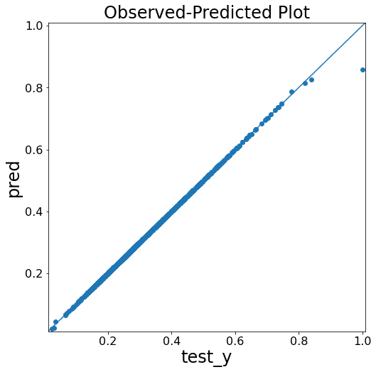
-0.00046507281774973676テストデータを用いて予測し、さらに結果を図化します。
pred = search_cv.predict(test_x)import numpy as np
from matplotlib import pyplot as plt
# yyplot 作成関数
def yyplot(test_y, pred):
yvalues = np.concatenate([test_y.flatten(), pred.flatten()])
ymin, ymax, yrange = np.amin(yvalues), np.amax(yvalues), np.ptp(yvalues)
fig = plt.figure(figsize=(8, 8))
plt.scatter(test_y, pred)
plt.plot([ymin - yrange * 0.01, ymax + yrange * 0.01], [ymin - yrange * 0.01, ymax + yrange * 0.01])
plt.xlim(ymin - yrange * 0.01, ymax + yrange * 0.01)
plt.ylim(ymin - yrange * 0.01, ymax + yrange * 0.01)
plt.xlabel('test_y', fontsize=24)
plt.ylabel('pred', fontsize=24)
plt.title('Observed-Predicted Plot', fontsize=24)
plt.tick_params(labelsize=16)
plt.show()
return fig
# yyplot の実行
np.random.seed(0)
fig = yyplot(np.array(test_y), np.array(pred))>>出力結果

予測モデルの改善
ラッソ特徴量選択
上図のとおり、すでに予測精度はかなり高いのですが、ラッソを用いた特徴量選択を行うとベースラインモデルを改善することができるのか見ていきます。
ラッソによる特徴量選択では、正則化項を用いてアルゴリズムが自動で特徴量選択をしてくれます。こちらのブログ(Data Science Life)を参照させていただきましたので、詳しくはそちらをご覧ください。
feature_selection = SelectFromModel(Lasso(alpha=0.001))
feature_selection.fit(train_x,train_y)
feature_selection.get_support()>>出力結果
array([False, True, False, False, False, False, False, False, False,
False, False, False, False, False, False, False, False, False,
False, False, False, False, False, False, False, False, False,
False, False, False, False, False, True, False, False])特徴量は35→2に絞られました。
ベースラインモデルの流れと同様に分析を進めます。
selected_features = train_x.columns[(feature_selection.get_support())]
train_x = train_x[selected_features]
model = RandomForestRegressor()
param_distribution = {
'max_depth': [10, 20, 30, 40, 50, 60, 70, 80, 90, 100, None],
'min_samples_leaf': [1, 2, 4],
'min_samples_split': [2, 5, 10],
'n_estimators': [200, 400, 600, 800, 1000, 1200, 1400, 1600, 1800, 2000]
}
search_cv = RandomizedSearchCV(
    estimator=model , param_distributions=param_distribution,
    n_iter=10 , scoring="neg_mean_absolute_error" , cv=3
)

search_cv.fit(train_x , train_y)
ベストスコアを出します。
>>出力結果
-0.0002911195425323859ベースラインモデルでのベストスコアは-0.00046507281774973676でした。0に近づくほどいいので、改善していることがわかります。
テストデータを用いて予測し、さらに結果を図化します。
test_x = test_x[selected_features]
pred = search_cv.predict(test_x)
import numpy as np
from matplotlib import pyplot as plt
# yyplot 作成関数
def yyplot(test_y, pred):
yvalues = np.concatenate([test_y.flatten(), pred.flatten()])
ymin, ymax, yrange = np.amin(yvalues), np.amax(yvalues), np.ptp(yvalues)
fig = plt.figure(figsize=(8, 8))
plt.scatter(test_y, pred)
plt.plot([ymin - yrange * 0.01, ymax + yrange * 0.01], [ymin - yrange * 0.01, ymax + yrange * 0.01])
plt.xlim(ymin - yrange * 0.01, ymax + yrange * 0.01)
plt.ylim(ymin - yrange * 0.01, ymax + yrange * 0.01)
plt.xlabel('test_y', fontsize=24)
plt.ylabel('pred', fontsize=24)
plt.title('Observed-Predicted Plot', fontsize=24)
plt.tick_params(labelsize=16)
plt.show()
return fig
# yyplot の実行例
np.random.seed(0)
fig = yyplot(np.array(test_y), np.array(pred))>>出力結果
図ではあまり違いがわかりませんが、ベストスコアの比較からモデルが改善されたことがわかります。
また、改善前のベースラインモデルではランタイムが10分以上かかりましたが、特徴量選択をした後では1分程度に短縮されました。
まとめ
ラッソ特徴量選択によって、モデルの予測性能が若干改善するとともに、学習時間が短縮されたことがわかりました。
今回はここまでとなりますが、複数のモデルの比較を行う、モデルのアンサンブルを行うなどができるといいかと思いました。