rKIN package の使い方

はじめに
安定同位体比分析は、食物網の構造や動物の餌源などを推定する方法として広く用いられます。
また、2種類の安定同位体比によって表される同位体ニッチは、生態ニッチを反映すると考えることができます。
ここでは、同位体ニッチを描画するツールの一つ、"rKIN"の使い方について紹介します。
参考文献
Eckrich, CA, Albeke, SE, Flaherty, EA, Bowyer, RT, Ben-David, M. rKIN: Kernel-based method for estimating isotopic niche size and overlap. J Anim Ecol. 2020; 89: 757– 771. https://doi.org/10.1111/1365-2656.13159
やってみよう
データセットの準備
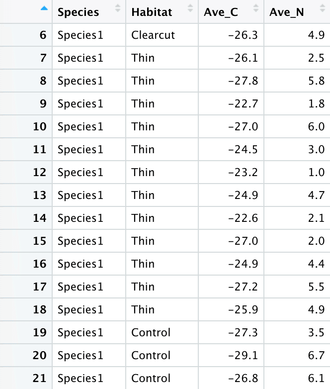
rKINで使用するデータセットの構成は以下の通りです
列1:Species #種名 、グループ名など、カテゴリカルな情報
列2:Habitat #調査地 、グループ名など、カテゴリカルな情報
列3:Ave_C #安定同位体比1 。今回は炭素安定同位体比を用いる。
列4:Ave_N #安定同位体比2 。今回は窒素安定同位体比を用いる。
基本コード
データセットの準備ができたら、さっそくrKINを使ってみましょう。
今回はサンプルデータセット"rodents"を使います。
library(rKIN)
data("rodents")
test.kin<- estKIN(data=rodents, x="Ave_C", y="Ave_N", group="Species",
levels=c(50, 75, 95), scaler=2)まずはlibrary(rKIN)を実行します。パッケージのインストールが済んでいない場合は、install.packages("rKIN")を実行してください。
次に、estKIN()関数を用いて、カーネル密度推定で同位体ニッチを算出します。
group=""で指定したグループごとにニッチを推定します。
自身で用意したデータセットを使う場合は、以下のコードを実行してください(念のため紹介)
library(rKIN)
dt <- read.csv("mydata.csv")
test.kin<- estKIN(data=dt, x="Ave_C", y="Ave_N", group="Species",
                  levels=c(50, 75, 95), scaler=2)
ニッチの描画
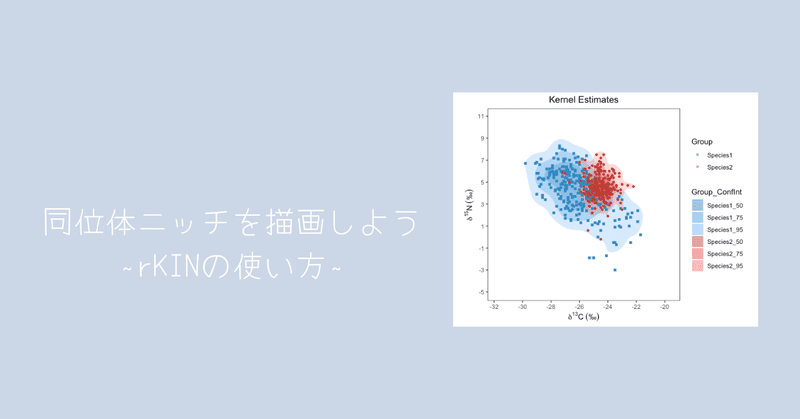
estKIN()の計算が完了したら、ニッチを描画してみましょう。
plotKIN(test.kin, scaler = 2, title = "Kernel Estimates",
        xlab = expression({delta}^13*C~ ('\u2030')),
        ylab = expression({delta}^15*N~ ('\u2030')))
各ニッチの重複率を調べたい場合はcalcOverlap(test.kin)を実行してください。

基本操作は以上です!
応用編
描画設定を変える (配色、形などの変更)
rKIN package の描画は、ggplot2が使われます。
カラーパレットはデフォルトで"Colorbrewer2"が指定されているそうです。
※ おそらくRColorBrewer package の "Set2"
また、プロットの形状はどうも数値データで指定されているようでした。
公式からカラーパレットやプロットの形を変更する方法は発表されていませんが、こっそりここで伝授します。
まずは、plotKIN()関数の中身を覗いてみます
plotKIN<- function(estObj, scaler = 1, alpha = 0.3, title = "", xlab = "x", ylab = "y", xmin = NULL, xmax = NULL, ymin = NULL, ymax = NULL){
  requireNamespace("maptools")
  #requireNamespace ("rgeos")
  #library (maptools)
  #//////////////////////////
  # NEED TO CHECK FOR PROPER OBJECT TYPES
  if(!inherits(estObj$estObj, "estObj"))
    stop("estObj must be of class estObj created from estEllipse, estKIN, or estMCP functions!")
  if(!inherits(scaler, "numeric"))
    stop("scaler must be numeric!")
  if(!inherits(alpha, "numeric"))
    stop("alpha must be numeric!")
  if(alpha > 1 | alpha < 0)
    stop("alpha must be a numeric value between 0 and 1!")
  if(!inherits(title, "character"))
    stop("title must be a character!")
  if( !inherits(xlab, "character"))
    if(!inherits(xlab, "expression"))
      stop("xlab must be a character or an expression!")
  if(!inherits(ylab, "character"))
    if(!inherits(ylab, "expression"))
      stop("ylab must be a character or an expression!")
  if(!inherits(xmin, "numeric"))
    if(!is.null(xmin))
      stop("xmin must be numeric or NULL!")
  if(!inherits(xmax, "numeric"))
    if(!is.null(xmax))
      stop("xmax must be numeric or NULL!")
  if(!inherits(ymin, "numeric"))
    if(!is.null(ymin))
      stop("ymin must be numeric or NULL!")
  if(!inherits(ymax, "numeric"))
    if(!is.null(ymax))
      stop("ymax must be numeric or NULL!")


  # Get the ConfInt to be sorted descending for ggplot stuff
  ord<- unique(estObj$estObj[[1]]@data$ConfInt)[order(unique(estObj$estObj[[1]]@data$ConfInt), decreasing = TRUE)]
  #get  the min/max extent of all SPDF
  xs<- numeric()
  ys<- numeric()
  df<- list()

  #Loop  through the polygons
  for(i in 1:length(estObj$estObj)){
    xs<- c(xs, sp::bbox(estObj$estObj[[i]])[1, ])
    ys<- c(ys, sp::bbox(estObj$estObj[[i]])[2, ])
    # Create new column to set the drawing order in ggplot, largest CI first
    for(j in 1:length(ord)){
      estObj$estObj[[i]]@data$PlotOrder[estObj$estObj[[i]]@data$ConfInt==ord[j]]<- j
    }# close j loop
    gdf<- ggplot2::fortify(estObj$estObj[[i]], region = "PlotOrder")
    gdf<- merge(gdf, estObj$estObj[[i]]@data, by.x = "id", by.y = "PlotOrder")
    gdf$Group_ConfInt<- paste(gdf$Group, gdf$ConfInt, sep = "_")
    df<- c(df, list(gdf))
  }# close i loop

  if(length(df) > 6)
    stop("You have more than 6 Groups, this is quite a few and plotKIN will currently fail with that many due
         to the number of discernable color pallettes. Perhaps try reducing your data to fewer groups?")

  #loop  through the input points
  pts<- list()
  for(i in 1:length(estObj$estInput)){
    #place  all points into data.frame list for plotting
    #pf <- ggplot2::fortify(estObj$estInput[[i]], region = "Group")

    pts<- c(pts, list(estObj$estInput[[i]]@data))
    #store  all coordinates for later use
    xs<- c(xs, estObj$estInput[[i]]@data[ , 3])
    ys<- c(ys, estObj$estInput[[i]]@data[ , 4])
  }# close i loop

  # Set the x and y axes limits
  ifelse(is.null(xmin) & !is.numeric(xmin), xmin <- (min(xs) - scaler), xmin)
  ifelse(is.null(xmax) & !is.numeric(xmax), xmax <- (max(xs) + scaler), xmax)
  ifelse(is.null(ymin) & !is.numeric(ymin), ymin <- (min(ys) - scaler), ymin)
  ifelse(is.null(ymax) & !is.numeric(ymax), ymax <- (max(ys) + scaler), ymax)


  # make a plot using ggplot2
  kin.plot<- ggplot2::ggplot() +
    lapply(df, function(x) ggplot2::geom_polygon(data = x, alpha = alpha, ggplot2::aes_string(x = "long", y = "lat", fill = "Group_ConfInt", group = "group"))) +
    ggplot2::scale_fill_manual(values = getColors(length(df), length(ord))) +
    #ggplot2 ::geom_point(data = pts, aes_string(x = names(pts)[3], y = names(pts)[4], colour = "Group", shape = "Group")) +
    lapply(pts, function(x) ggplot2::geom_point(data = x, ggplot2::aes_string(x = names(x)[3], y = names(x)[4], colour = "Group", shape = "Group"))) +
    ggplot2::scale_color_manual(values = getColors(length(df), 1)) +
    ggplot2::coord_fixed(ratio = (xmax - xmin)/(ymax - ymin), xlim = c(xmin, xmax), ylim = c(ymin, ymax)) +
    ggplot2::scale_x_continuous(breaks = seq(from = round(xmin), to = round(xmax), by = scaler)) +
    ggplot2::scale_y_continuous(breaks = seq(from = round(ymin), to = round(ymax), by = scaler)) +
    ggplot2::labs(title = title, x = xlab, y = ylab) +
    ggplot2::guides(colour = ggplot2::guide_legend(override.aes = list(alpha = alpha))) +
    ggplot2::theme_bw() +
    ggplot2::theme(panel.background = ggplot2::element_blank(),
          panel.grid.major = ggplot2::element_blank(),
          panel.grid.minor = ggplot2::element_blank(),
          panel.border = ggplot2::element_rect(fill = NA, color = "black"),
          plot.title = element_text(hjust = 0.5))
  # return the plot
  return(kin.plot)

}# close function
後半 # make a plot using ggplot2 で描画設定のコードを見つけました。
ニッチエリアの色は、ggplot2::scale_fill_manual(values = getColors(length(df), length(ord)))
プロットの色は、ggplot2::scale_color_manual(values = getColors(length(df), 1))
で指定されているようです。
また、プロットの形を指定するコードは見当たりませんでした。
ということで、このコードを少し改造すれば、好みの色や形でプロットを作成できそうです。
カラーパレットの作成
まずは、カラーパレットを作成します。
ニッチエリア用のカラーパレットは、グループ数 X 3 (50%, 75%, 95% エリア用) 色の指定が必要です。
プロット用のカラーパレットは、グループ数だけ色を指定すればOKです。
以下に例を示します。
# For niche areas
cols <- c("#3389c1","#3ca1e4","#70b9f4",
          "#c13c33","#e9483e","#f4726c")

# For plots
cols1 <- c("#3389c1",
           "#c13c33")
形の指定
次に形を指定するためのデータセットを作成します
sha <- c(15,16)数字と形の対応表はこちらのサイトが参考になります
関数の作成
次に、plotKIN()関数に修正を加えます。
まずは # make a plot using ggplot2 パートのみを切り取って説明します。
# make a plot using ggplot2
  kin.plot <- ggplot2::ggplot() +
    lapply(df, function(x) ggplot2::geom_polygon(data = x, alpha = alpha, ggplot2::aes_string(x = "long", y = "lat", fill = "Group_ConfInt", group = "group"))) +

    ggplot2::scale_fill_manual(values = cols) +  ### 変更点1 ###

    #ggplot2 ::geom_point(data = pts, aes_string(x = names(pts)[3], y = names(pts)[4], colour = "Group", shape = "Group")) +
    lapply(pts, function(x) ggplot2::geom_point(data = x, ggplot2::aes_string(x = names(x)[3], y = names(x)[4], colour = "Group", shape = "Group"))) +
    ggplot2::scale_color_manual(values = cols1) +  ### 変更点2 ###
    ggplot2::scale_shape_manual(values = sha) + ### 変更点3 ###
    ggplot2::coord_fixed(ratio = (xmax - xmin)/(ymax - ymin), xlim = c(xmin, xmax), ylim = c(ymin, ymax)) +
    ggplot2::scale_x_continuous(breaks = seq(from = round(xmin), to = round(xmax), by = scaler)) +
    ggplot2::scale_y_continuous(breaks = seq(from = round(ymin), to = round(ymax), by = scaler)) +
    ggplot2::labs(title = title, x = xlab, y = ylab) +
    ggplot2::guides(colour = ggplot2::guide_legend(override.aes = list(alpha = alpha))) +
    ggplot2::theme_bw() +
    ggplot2::theme(panel.background = ggplot2::element_blank(),
                   panel.grid.major = ggplot2::element_blank(),
                   panel.grid.minor = ggplot2::element_blank(),
                   panel.border = ggplot2::element_rect(fill = NA, color = "black"),
                   plot.title = element_text(hjust = 0.5))
### 変更点1###
ggplot2::scale_fill_manual() で塗りつぶしの色を指定できます。
ggplot2::scale_fill_manual(values = cols) とすることで、先ほど作成したニッチエリア用カラーパレットが指定されます。
### 変更点2 ###
ggplot2::scale_color_manual() でプロットの色を指定できます。
ggplot2::scale_color_manual(values = cols1) とすることで、先ほど作成したプロット用カラーパレットが指定されます。
### 変更点3 ###
(新しくコードを追加)
ggplot2::scale_shape_manual() でプロットの形を指定できます。
ggplot2::scale_shape_manual(values = sha) とすることで、先ほど作成したリストが指定されます。
実際に実行してほしいコードはこちらです。
# For niche areas
cols <- c("#3389c1","#3ca1e4","#70b9f4",
          "#c13c33","#e9483e","#f4726c")

# For plots
cols1 <- c("#3389c1",
           "#c13c33")

# For shape
sha <- c(15,16)

# plotKIN function

plotKIN <- function(estObj, scaler = 1, alpha = 0.3, title = "", xlab = "x", ylab = "y", xmin = NULL, xmax = NULL, ymin = NULL, ymax = NULL){
  requireNamespace("maptools")
  #requireNamespace ("rgeos")
  #library (maptools)
  #//////////////////////////
  # NEED TO CHECK FOR PROPER OBJECT TYPES
  if(!inherits(estObj$estObj, "estObj"))
    stop("estObj must be of class estObj created from estEllipse, estKIN, or estMCP functions!")
  if(!inherits(scaler, "numeric"))
    stop("scaler must be numeric!")
  if(!inherits(alpha, "numeric"))
    stop("alpha must be numeric!")
  if(alpha > 1 | alpha < 0)
    stop("alpha must be a numeric value between 0 and 1!")
  if(!inherits(title, "character"))
    stop("title must be a character!")
  if( !inherits(xlab, "character"))
    if(!inherits(xlab, "expression"))
      stop("xlab must be a character or an expression!")
  if(!inherits(ylab, "character"))
    if(!inherits(ylab, "expression"))
      stop("ylab must be a character or an expression!")
  if(!inherits(xmin, "numeric"))
    if(!is.null(xmin))
      stop("xmin must be numeric or NULL!")
  if(!inherits(xmax, "numeric"))
    if(!is.null(xmax))
      stop("xmax must be numeric or NULL!")
  if(!inherits(ymin, "numeric"))
    if(!is.null(ymin))
      stop("ymin must be numeric or NULL!")
  if(!inherits(ymax, "numeric"))
    if(!is.null(ymax))
      stop("ymax must be numeric or NULL!")


  # Get the ConfInt to be sorted descending for ggplot stuff
  ord<- unique(estObj$estObj[[1]]@data$ConfInt)[order(unique(estObj$estObj[[1]]@data$ConfInt), decreasing = TRUE)]
  #get  the min/max extent of all SPDF
  xs<- numeric()
  ys<- numeric()
  df<- list()

  #Loop  through the polygons
  for(i in 1:length(estObj$estObj)){
    xs<- c(xs, sp::bbox(estObj$estObj[[i]])[1, ])
    ys<- c(ys, sp::bbox(estObj$estObj[[i]])[2, ])
    # Create new column to set the drawing order in ggplot, largest CI first
    for(j in 1:length(ord)){
      estObj$estObj[[i]]@data$PlotOrder[estObj$estObj[[i]]@data$ConfInt==ord[j]]<- j
    }# close j loop
    gdf<- ggplot2::fortify(estObj$estObj[[i]], region = "PlotOrder")
    gdf<- merge(gdf, estObj$estObj[[i]]@data, by.x = "id", by.y = "PlotOrder")
    gdf$Group_ConfInt<- paste(gdf$Group, gdf$ConfInt, sep = "_")
    df<- c(df, list(gdf))
  }# close i loop

  if(length(df) > 6)
    stop("You have more than 6 Groups, this is quite a few and plotKIN will currently fail with that many due
         to the number of discernable color pallettes. Perhaps try reducing your data to fewer groups?")

  #loop  through the input points
  pts<- list()
  for(i in 1:length(estObj$estInput)){
    #place  all points into data.frame list for plotting
    #pf <- ggplot2::fortify(estObj$estInput[[i]], region = "Group")

    pts<- c(pts, list(estObj$estInput[[i]]@data))
    #store  all coordinates for later use
    xs<- c(xs, estObj$estInput[[i]]@data[ , 3])
    ys<- c(ys, estObj$estInput[[i]]@data[ , 4])
  }# close i loop

  # Set the x and y axes limits
  ifelse(is.null(xmin) & !is.numeric(xmin), xmin <- (min(xs) - scaler), xmin)
  ifelse(is.null(xmax) & !is.numeric(xmax), xmax <- (max(xs) + scaler), xmax)
  ifelse(is.null(ymin) & !is.numeric(ymin), ymin <- (min(ys) - scaler), ymin)
  ifelse(is.null(ymax) & !is.numeric(ymax), ymax <- (max(ys) + scaler), ymax)


  # make a plot using ggplot2
  kin.plot <- ggplot2::ggplot() +
    lapply(df, function(x) ggplot2::geom_polygon(data = x, alpha = alpha, ggplot2::aes_string(x = "long", y = "lat", fill = "Group_ConfInt", group = "group"))) +
    ggplot2::scale_fill_manual(values = cols) +
    #ggplot2 ::geom_point(data = pts, aes_string(x = names(pts)[3], y = names(pts)[4], colour = "Group", shape = "Group")) +
    lapply(pts, function(x) ggplot2::geom_point(data = x, ggplot2::aes_string(x = names(x)[3], y = names(x)[4], colour = "Group", shape = "Group"))) +
    ggplot2::scale_color_manual(values = cols1) +
    ggplot2::scale_shape_manual(values = sha) +
    ggplot2::coord_fixed(ratio = (xmax - xmin)/(ymax - ymin), xlim = c(xmin, xmax), ylim = c(ymin, ymax)) +
    ggplot2::scale_x_continuous(breaks = seq(from = round(xmin), to = round(xmax), by = scaler)) +
    ggplot2::scale_y_continuous(breaks = seq(from = round(ymin), to = round(ymax), by = scaler)) +
    ggplot2::labs(title = title, x = xlab, y = ylab) +
    ggplot2::guides(colour = ggplot2::guide_legend(override.aes = list(alpha = alpha))) +
    ggplot2::theme_bw() +
    ggplot2::theme(panel.background = ggplot2::element_blank(),
                   panel.grid.major = ggplot2::element_blank(),
                   panel.grid.minor = ggplot2::element_blank(),
                   panel.border = ggplot2::element_rect(fill = NA, color = "black"),
                   plot.title = element_text(hjust = 0.5))
  # return the plot
  return(kin.plot)

}
無事にplotKIN()関数を更新できたら、再度こちらのコードを実行してみてください。
plotKIN(test.kin, scaler = 2, title = "Kernel Estimates",
xlab = expression({delta}^13C~ ('\u2030')),
ylab = expression({delta}^15N~ ('\u2030')))
どうでしょう、プロットの色と形が変わりました!
rKINの紹介は以上です。
この記事が気に入ったらサポートをしてみませんか?