UWPでホバーで色が変わるアイコン付きボタンを追加する

お疲れ様です。毎回話題にする技術が変わって何のエンジニアかわからなくなりそうですが、一応PHPメインの新米Webエンジニアです。でも今回の記事は、弊社では少し珍しいデスクトップアプリ案件だったのでUWP(ユニバーサル Windows プラットフォーム )の話。私は主にXamlを用いたUI調整を行いましたが、日本語の記事が少なくUWPもXamlも経験のない私には大変でした。その中でコントロールテンプレートを使ってボタンデザインを変えたときのコードを同じような初心者向けに記事にします。
開発環境
VisualStudio2019
UWP
テンプレート用Xamlファイルを作成
コントロールテンプレートのソースはこんな感じ。
<ResourceDictionary
    xmlns="http://schemas.microsoft.com/winfx/2006/xaml/presentation"
    xmlns:x="http://schemas.microsoft.com/winfx/2006/xaml"
    xmlns:local="using:DevSoft.Control">
   <ControlTemplate x:Key="ReloadBtn" TargetType="Button">
        <Border  Margin="{TemplateBinding Margin}" Padding="{TemplateBinding Padding}"  FocusVisualPrimaryBrush="#FF0067B7" CornerRadius="2" BorderBrush="#FF001E6F" BorderThickness="1"
                 VerticalAlignment="{TemplateBinding VerticalAlignment}" HorizontalAlignment="{TemplateBinding HorizontalAlignment}" >
            <StackPanel Orientation="Horizontal">
                <Image x:Name="ReloadImageWhite" Source="ms-appx:///Assets/icon/btn_icon_white@1x.png" Margin="10,0,0,0" Opacity="0"/>
                <Image x:Name="ReloadImage" Source="ms-appx:///Assets/icon/btn_icon@1x.png" Margin="-22,0,0,0" Opacity="1"/>
                <TextBlock x:Name="Reload" FontWeight="Bold" FontSize="14" Foreground="#FF001E6F" Text="Reload" Margin="10,8"  TextLineBounds="Tight" VerticalAlignment="Center"/>
            </StackPanel>
            <VisualStateManager.VisualStateGroups>
                <VisualStateGroup x:Name="CommonStates">
                    <VisualStateGroup.Transitions>
                        <VisualTransition To="PointerOver"
                              GeneratedDuration="0:0:0.3"/>
                        <VisualTransition To="Normal"
                              GeneratedDuration="0:0:0.3"/>
                    </VisualStateGroup.Transitions>
                    <VisualState x:Name="Normal" />
                    <VisualState x:Name="PointerOver">
                        <Storyboard>
                            <ColorAnimation Storyboard.TargetName="ButtonBrush"
                            Storyboard.TargetProperty="Color" To="#FF001E6F" />
                            <ColorAnimation Storyboard.TargetName="Reload"
                            Storyboard.TargetProperty="(TextBlock.Foreground).(SolidColorBrush.Color)" To="White" />
                            <DoubleAnimation Storyboard.TargetName="ReloadImageWhite" Storyboard.TargetProperty="(Image.Opacity)" To="1" Duration="0:0:0.3"/>
                            <DoubleAnimation Storyboard.TargetName="ReloadImage" Storyboard.TargetProperty="(Image.Opacity)" To="0" Duration="0:0:0"/>
                        </Storyboard>
                    </VisualState>
                </VisualStateGroup>
            </VisualStateManager.VisualStateGroups>
            <Border.Background>
                <SolidColorBrush x:Name="ButtonBrush" Color="Transparent"/>
            </Border.Background>
        </Border>
    </ControlTemplate>
</ResourceDictionary>
VisualStudio2019ならフォルダを選んで右クリック->追加->新しい項目の追加->リソースディクショナリを選んでXamlファイルを作成します。
ContorolTemplateタグとBorderタグ
<ControlTemplate x:Key="ReloadBtn" TargetType="Button">
         <Border  Margin="{TemplateBinding Margin}"
                    Padding="{TemplateBinding Padding}"
                    FocusVisualPrimaryBrush="#FF0067B7"
                    CornerRadius="2"
                    BorderBrush="#FF001E6F"
                    BorderThickness="1"
                 VerticalAlignment="{TemplateBinding VerticalAlignment}"
                HorizontalAlignment="{TemplateBinding HorizontalAlignment}" >
ContorolTemplateタグのx:keyにテンプレートを指定するとき使う名前、TargetTypeにテンプレートを適用したい型の名前を指定します。今回はButtonにふわっと変わるホバーアクションをつけたかったのでButtonを指定。標準ButtonはBorderでTextを囲む形でできているようなのでそれに倣いBorderで囲みます。プロパティに指定している{TemplateBinding hoge}はテンプレート適用先のプロパティhogeの値を適用できる指定。統一したいプロパティはこのテンプレートに直接値を書き込んでそれ以外はTemplateBindingを使っています。
ボタンの中身
<StackPanel Orientation="Horizontal">
    <Image x:Name="ReloadImageWhite" Source="ms-appx:///Assets/icon/btn_update_icon_white@1x.png" Margin="10,0,0,0" Opacity="0"/>
    <Image x:Name="ReloadImage" Source="ms-appx:///Assets/icon/btn_update_icon@1x.png" Margin="-22,0,0,0" Opacity="1"/>
    <TextBlock x:Name="Reload" FontWeight="Bold" FontSize="14" Foreground="#FF001E6F" Text="Reload" Margin="10,8"  TextLineBounds="Tight" VerticalAlignment="Center"/>
</StackPanel>
StackPanelのOrientation="Hrizontal"で子要素を水平に並べます。こうすることで頭にアイコンのついた”Reload”ボタンになります。Imageタグが二つ並んでいるのはホバーしたときアイコンを変えるためで標準アイコンを上で下のホバー時アイコンは透明度0にして重ねています。中身は適用先で受け取りたい場合はContentPresenterタグを使います。
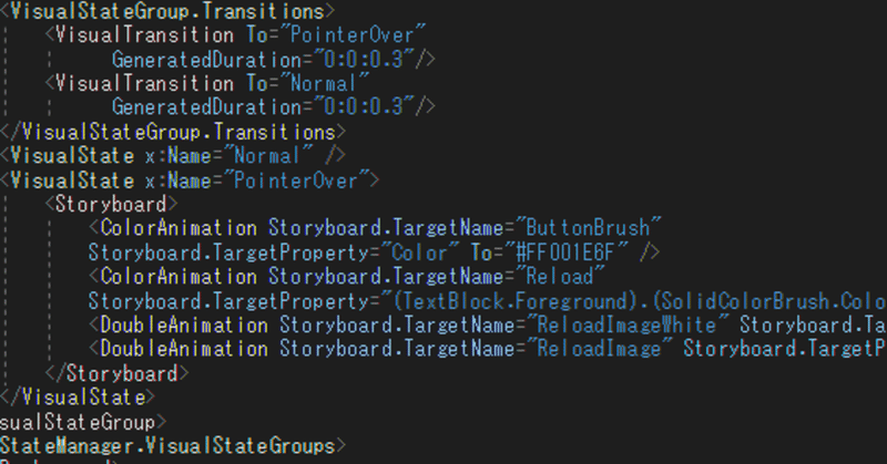
ホバーの挙動
<VisualStateManager.VisualStateGroups>
   <VisualStateGroup x:Name="CommonStates">
       <VisualStateGroup.Transitions>
           <VisualTransition To="PointerOver"
                   GeneratedDuration="0:0:0.3"/>
           <VisualTransition To="Normal"
                   GeneratedDuration="0:0:0.3"/>
       </VisualStateGroup.Transitions>
       <VisualState x:Name="Normal" />
       <VisualState x:Name="PointerOver">
           <Storyboard>
               <ColorAnimation Storyboard.TargetName="ButtonBrush"
               Storyboard.TargetProperty="Color" To="#FF001E6F" />
               <ColorAnimation Storyboard.TargetName="Reload"
               Storyboard.TargetProperty="(TextBlock.Foreground).(SolidColorBrush.Color)" To="White" />
               <DoubleAnimation Storyboard.TargetName="ReloadImageWhite" Storyboard.TargetProperty="(Image.Opacity)" To="1" Duration="0:0:0.3"/>
               <DoubleAnimation Storyboard.TargetName="ReloadImage" Storyboard.TargetProperty="(Image.Opacity)" To="0" Duration="0:0:0"/>
           </Storyboard>
VisualStateManager.VisualStateGroupsタグの中にホバーの挙動を書いていきます。VisualStateGroupはx:Nameに指定できる値が決まっていて今回はPointerOverを持つCommonStatesを指定します。VisualStateGroup.Transitionsで状態遷移の指定です。To="PointerOver"を指定することでホバーで状態を遷移させることができます。またNomralの指定で通常状態に戻る指定になります。後ろのGeneratedDurationは状態遷移にかける時間です。
VisualState内Storyboadの中で状態遷移の詳細を書きます。ただ具体的なカスタムが要らなくてもVisualStateが無いと遷移しなくなるので必ず入れます。
ColorAnimationで色の変化、DoubleAnimationでImageの透明度変化を行っています。これらAnimationにはTo,Fromの片方指定,ToFrom両方指定する方法がありますがそれぞれ前者と後者で変化のタイミングが違うので統一しましょう。微妙なアニメーションのずれで悩むことになります。ContentPresenterタグを使えば適用先の子要素を取得することもできますが、今回は使っていません。
初めてUWPを触りましたがなかなか苦労しました。なので同じような問題に直面した方の助けになれば幸いです。
参考文献
第4回 “見た目”を決めるコントロール・テンプレート (3/3)
コントロール テンプレート
この記事が気に入ったらサポートをしてみませんか?