Webデザインの基本 タイポグラフィ編

イントロダクション
ウェブデザインにおいて、タイポグラフィは非常に重要な要素です。適切なフォント選びや文字の配置によって、ユーザーエクスペリエンスが大きく変わります。フォントはサイトの個性を表現するだけでなく、コンテンツの可読性にも大きな影響を与えます。特に、テキストのフォントサイズや行間、文字間隔は、読みやすさや視認性を左右する重要な要素です。また、フォントの使い方次第で、サイト全体の印象を大きく左右することができます。本記事では、初心者でも簡単に実践できるタイポグラフィのベストプラクティスを紹介します。これらのポイントを押さえることで、見た目が美しく、読みやすいウェブページを作成する手助けとなるでしょう。ぜひ参考にして、魅力的なウェブデザインを実現してください。
前提
この記事はWebデザインの基本を説明していくシリーズの第1話です。
過去の記事を読んでいただくとよりわかりやすくなります。
過去記事一覧
スタート材料
これデザインが全くないHTMLファイルであり、これをスタートにどんどんデザイン要素を加えていきます。
<!DOCTYPE html>
<html lang="en">
<head>
<meta charset="UTF-8">
<meta name="viewport" content="width=device-width, initial-scale=1.0">
<title>Isu & Bed Co.</title>
</head>
<header>Isu & Bed Co.</header>
<body>
<nav>
<a href="#">Our Story</a>
<a href="#">Our Product</a>
<a href="#">Your Voice</a>
<a href="#">Contact Us</a>
</nav>
<!--Story Telling-->
<div class="Container_StoryOfIsu">
<div class="Container_Words">
<h1>Story of Isu</h1>
<p>Lorem ipsum dolor sit amet consectetur adipisicing elit. Blanditiis quam voluptatibus ex nulla aliquid soluta, obcaecati voluptates ut perspiciatis ea aperiam vero commodi? Debitis ullam nihil mollitia unde praesentium nisi.</p>
</div>
<div class="Container_PhotoOfIsu">
<img src="pics/isu.jpg" alt="isu" width="240px">
<p>This is a Isu. There are many Isus but this one is mine.</p>
</div>
</div>
<div class="Container_StoryOfBed">
<div class="Container_Bed">
<h1>Le Lit</h1>
<img src="pics/bed.jpg" alt="bed" width="240px">
<p>Bacon ipsum dolor amet frankfurter biltong hamburger, ball tip drumstick burgdoggen porchetta pancetta beef ribs filet mignon cupim kielbasa. Leberkas frankfurter rump meatball ham hock. Spare ribs venison doner turkey, drumstick tongue pork loin ball tip rump sausage beef porchetta. Kielbasa tail meatball andouille tenderloin pork chop ground round capicola kevin buffalo pig shoulder spare ribs.</p>
</div>
<div class="Container_WineBed">
<h1>Il Vino</h1>
<p>Well, the way they make shows is, they make one show. That show's called a pilot. Then they show that show to the people who make shows, and on the strength of that one show they decide if they're going to make more shows. Some pilots get picked and become television programs. Some don't, become nothing. She starred in one of the ones that became nothing.</p>
<img src="pics/bigwinebed.jpg" alt="winebed" width="240px">
</div>
</div>
<footer><p>Copyright © by フルスタコマツ</p></footer>
</body>
</html>こんな感じで見えるはずです。
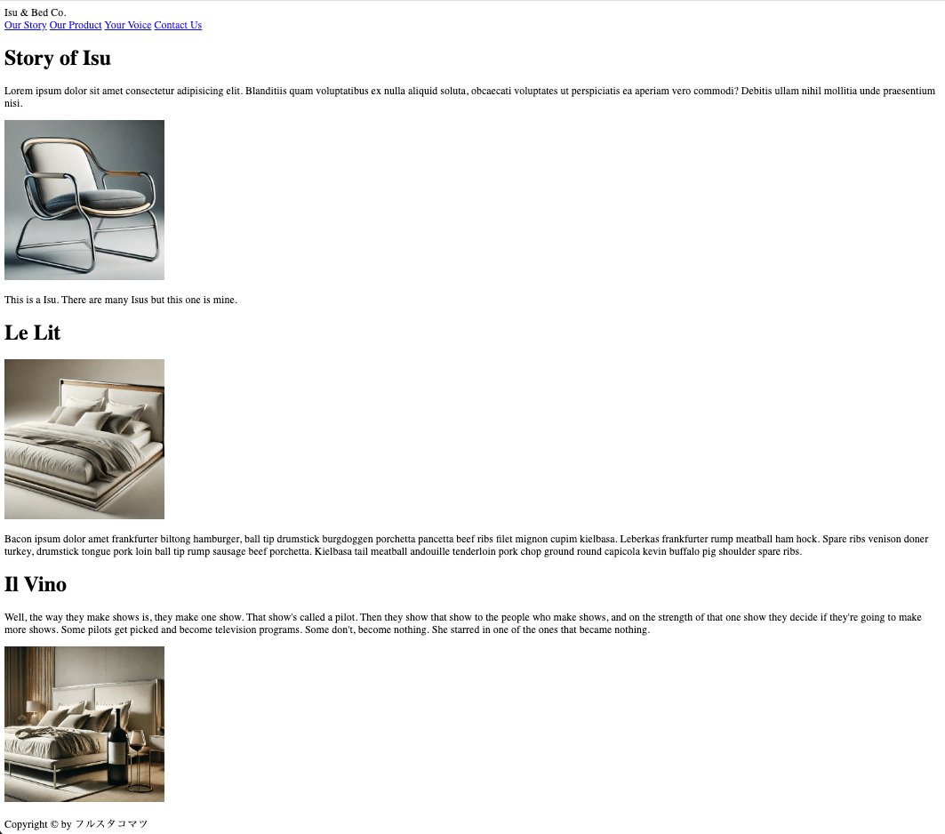
スタート材料の全てはGithubのここにあげました。
フォントとタイポグラフィのベストプラクティス
ようやく本篇です笑
基本的なフォントの選び方
良質で人気のあるフォントを選びましょう
フォント選びは慎重に行い、信頼性のある人気のフォントを使用することが重要です。これにより、サイト全体の見た目と使いやすさが向上します。ページごとのフォント数を制限しましょう
一つのページに使用するフォントは一つでも問題ありません。もし複数のフォントを使用したい場合は、二つまでに制限しましょう。これにより、デザインの一貫性が保たれます。サイトの個性に合わせたフォントを選びましょう
サイトのテーマやブランドに合ったフォントを選ぶことが大切です。これにより、サイトの雰囲気が一層引き立ちます。
フォントサイズと行間の設定
フォントサイズの選び方を工夫しましょう
フォントサイズを選ぶ際には、制限を設けると良いです。「タイプスケール」ツールや既定の範囲を利用すると効果的です。通常のテキストには16pxから32pxのサイズを
一般的なテキストには16pxから32pxのフォントサイズが適しています。これにより、読みやすさが確保されます。長文テキストには大きめのサイズを
ブログ記事などの長文には20px以上のフォントサイズを試してみましょう。読みやすさが大幅に向上します。見出しには大きくて太いフォントを
見出しには50px以上の大きなフォントサイズと、600以上のフォントウェイトを使用しましょう。サイトの個性に応じて調整することがポイントです。フォントウェイトは400以上を使用
どのテキストにも、フォントウェイトは400(レギュラー)以上を使用しましょう。これにより、視認性が向上します。
レイアウトとスタイルの工夫
一行あたりの文字数は75文字以下に
テキストの一行あたりの文字数は75文字以下に制限することで、読みやすさが保たれます。行間の調整をしましょう
通常サイズのテキストには1.5から2の行間を使用し、大きなテキストには1.5以下の行間を使用しましょう。適切な行間は読みやすさを向上させます。見出しの文字間隔を調整
見出しの文字間隔が不自然に見える場合は、文字間隔を減らして調整しましょう。これは経験により判断します。短いタイトルには大文字を試してみましょう
短いタイトルには全て大文字を使用し、文字サイズを小さめにして太字にし、文字間隔を広げてみましょう。通常はテキストの左右両端を揃えない
テキストの左右両端を揃える(ジャスティファイ)は通常避けましょう。読みやすさが低下することがあります。長いテキストブロックは中央揃えにしない
長いテキストブロックを中央揃えにするのは避けましょう。短いブロックであれば中央揃えも問題ありません。
以上のことをスタート材料に試すとこんな感じになります。
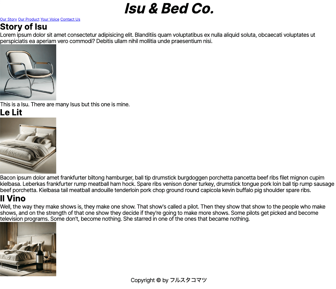
HTMLはこんな感じで
<!DOCTYPE html>
<html lang="en">
<head>
<meta charset="UTF-8">
<meta name="viewport" content="width=device-width, initial-scale=1.0">
<link
href="https://fonts.googleapis.com/css2?family=Inter:wght@100..900&display=swap"
rel="stylesheet"
/>
<link rel="stylesheet" href="style.css" />
<title>Isu & Bed Co.</title>
</head>
<header>Isu & Bed Co.</header>
<body>
<nav>
<a href="#">Our Story</a>
<a href="#">Our Product</a>
<a href="#">Your Voice</a>
<a href="#">Contact Us</a>
</nav>
<!--Story Telling-->
<div class="Container_StoryOfIsu">
<div class="Container_Words">
<h1>Story of Isu</h1>
<p>Lorem ipsum dolor sit amet consectetur adipisicing elit. Blanditiis quam voluptatibus ex nulla aliquid soluta, obcaecati voluptates ut perspiciatis ea aperiam vero commodi? Debitis ullam nihil mollitia unde praesentium nisi.</p>
</div>
<div class="Container_PhotoOfIsu">
<img src="pics/isu.jpg" alt="isu" width="240px">
<p>This is a Isu. There are many Isus but this one is mine.</p>
</div>
</div>
<div class="Container_StoryOfBed">
<div class="Container_Bed">
<h1>Le Lit</h1>
<img src="pics/bed.jpg" alt="bed" width="240px">
<p>Bacon ipsum dolor amet frankfurter biltong hamburger, ball tip drumstick burgdoggen porchetta pancetta beef ribs filet mignon cupim kielbasa. Leberkas frankfurter rump meatball ham hock. Spare ribs venison doner turkey, drumstick tongue pork loin ball tip rump sausage beef porchetta. Kielbasa tail meatball andouille tenderloin pork chop ground round capicola kevin buffalo pig shoulder spare ribs.</p>
</div>
<div class="Container_WineBed">
<h1>Il Vino</h1>
<p>Well, the way they make shows is, they make one show. That show's called a pilot. Then they show that show to the people who make shows, and on the strength of that one show they decide if they're going to make more shows. Some pilots get picked and become television programs. Some don't, become nothing. She starred in one of the ones that became nothing.</p>
<img src="pics/bigwinebed.jpg" alt="winebed" width="240px">
</div>
</div>
<footer><p>Copyright © by フルスタコマツ</p></footer>
</body>
</html>CSSはこんな感じです。
* {
    margin: 0;
    padding: 0;
}

header,
body {
    font-family: "Inter", sans-serif;
  }

header {
    font-size: 60px;
    text-align: center;
    font-weight: bold;
    font-style: italic;
}

h1{
    font-size: 36px;
    font-weight: bold;
}

p {
    font-size: 24px;
    line-height: 1.1;
    letter-spacing: -1px;
}

footer{
    text-align: center;
}
今回はフォントだけに留めておきます。
次回はカラーについて説明していきます!
Githubでも公開してるよ!
先ほどのコードはGithubで公開しているよ。
ここ見てね!
この記事が気に入ったらサポートをしてみませんか?